How to Make a Dental Website that Pleases Your Clients
There are almost 200,000 registered dentists in the USA. That means for every dentist there are around 1,800 patients. With figures like that, it’s no wonder it’s a competitive business to be in – and it is a business. In the modern world, dentists are responsible for looking after their brand, marketing and – perhaps most importantly – their website.

As a dentist, your patients trust you to deal with their oral health. It’s a relationship built on knowledge, experience and trust. It’s also a relationship that is, for some at least, one that they may not want to have, with many experiencing fear of the dentist.
How to Make a Dental Website
A functional and well-built website is the basis for a successful business. Information is clear, your credentials established and multiple touch-points are created to stimulate interaction with your customers. We are going to show you how to make a dental website that looks professional and promotes your services simply and efficiently with MotoCMS dentistry website templates and dental website builder.
Generating Respect, Creating Trust
As a dentist you will have gone through many years of training and continuing professional development to stay at the forefront of the field. You want new and potential patients (and even existing ones) to understand and appreciate this – which is why your site needs to create trust.
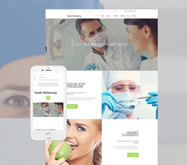
There are many ways of doing this, many of them illustrated on this template below. The bold photo puts you at the forefront of the site, the easy navigation making it clear where visitors need to go for information and the testimonials – one of the best ways of creating trust in your brand – are clearly there to be seen.
Dental Web Template with Header Slider
The changing photo gallery enables you to show a number of facets of your business, with each building upon the strong look and feel of the site. You could feature staff, feature your building or even feature patients (if they allow it to you).
The great thing about using a template is its simplicity in making changes. You can also use the easy to use dashboard to regularly change the homepage, testing out your messages, changing photos and even adding promotional offers, as and when you wish.
A Simple and Transparent Offer
Going to the dentist isn’t free, so you’ll want your site to be open and transparent about both the services you offer and how your patients can pay.
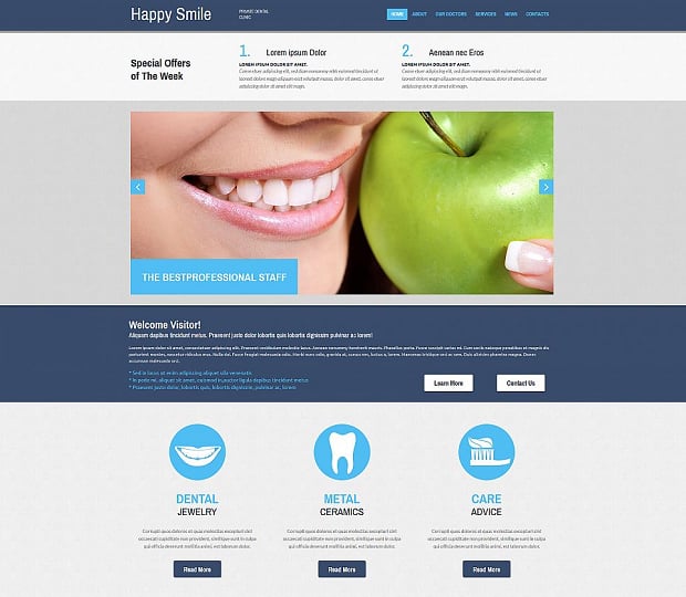
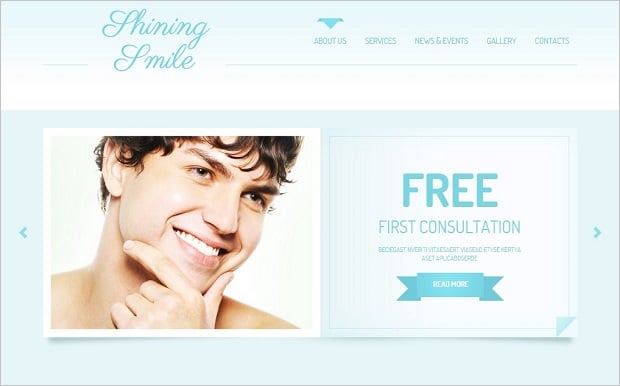
A bold and blue site like this gives off a clinical air, with the comprehensive landing page offering your visitor just about everything they need to know about your business on one page. Visitors can easily navigate through to the services page, with it clearly marked what you offer and what you do.
Blue Website Template for Dentists
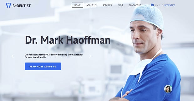
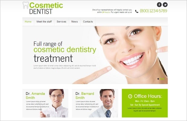
There is freedom in what you do. Your website should exemplify your service offer. For those offering cosmetic dental procedures a more fashion-oriented site may be more appropriate. It’s up to you to decide how you want to present your brand, but there’s a template out there for you.
Responsive Website Template for Dentistry
Rich and Interesting Content
Dentists have a responsibility not only to provide treatment, but to provide on-going oral health information and advice to their patients. This is where you’ll want to add content to build your relationship with patients.
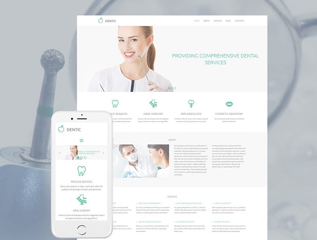
Medical office website templates offer you the ability to include photos, videos and links to other materials. There is lots of content out there for you to use, some of which is available free of charge for you to share with visitors to your site.
Clean Web Template for Dental Business
You may want to generate some of the content yourself too. Page templates with CMS make adding content easy, with text formatted and stylized to provide a consistent identity. You can also create and link pages using the back-end system with no knowledge of coding necessary.
Whether it’s tips for teeth brushing or advice on how often to visit the dentist, this extra content not only establishes your brand and builds trust, it can also have benefits for search engine optimization too.
Helping Patients Overcome Their Fears
Between 5 – 8% of Americans avoid the dentist because they’re scared. It’s unlikely that your website is going to stop this fear, but you can help to break down at least some of the barriers your visitors might face.
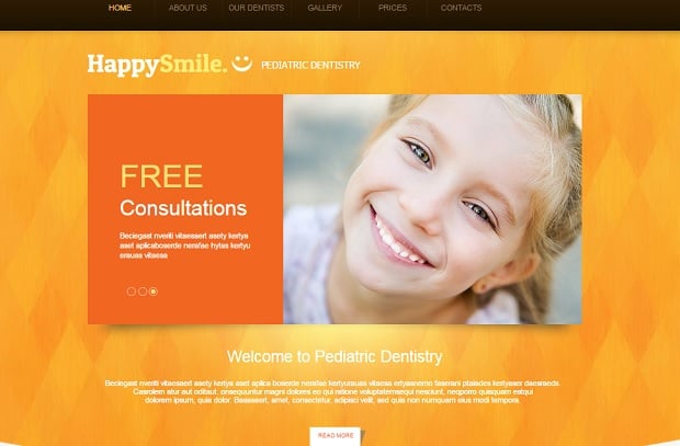
For younger children, a trip to the dentist is a new and potentially difficult interaction, which could have a lasting impact on the way they perceive dental treatments for the rest of their lives. This well presented site focuses on the core of the brand, appealing to the child and the adult decision maker.
Bright-Colored Website Template for Dentists
The attractive landing page and simple scrolling layout opens up a range of information to put the patient, and their parent, at ease.
Another way of dealing with fear is the coping strategy known as visualization. Quite simply, you imagine yourself in the situation.
You can aid your website with visualization too. A comprehensive photo gallery for letting patients know what to expect before they arrive. This site template below uses photographs to present a strong brand, but also to allow potential customers engaging with your business and getting comfortable with it before they walk through the doors. It’s easy to create and update, and can be added to by simply dragging and dropping.
Dental Website Template in Light-Blue
Making Customer Contact Easy
Dentist websites can sometimes become what professionals refer to as brochure sites. They may present your brand beautifully, but it’s about creating a human interaction that matters.
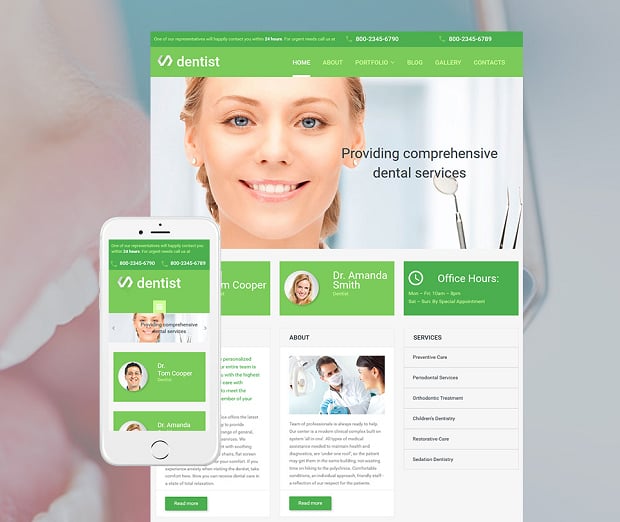
The easiest and simplest way is through email or phone, both of which can clearly be seen in this template. It’s all about making interaction as simple and easy as possible.
Green Website Template for Dentists
But that’s not all. Many dentists are now using social media to promote their businesses and interact with potential and existing clients. Moto CMS templates make social media content easy-to-include, with buttons and widgets a mere click away. It’s important that, if you take this step, you continue that investment for the long term, but there are real benefits.
Dental Website Template in Pure White
This customer contact can also take the form of promotions, with the site offering customers special promotional deals or prices. You can even link these through to your social media channels. It’s all about being interesting, creative and engaging with your patients.
Conclusion
A website is never really finished, which is why a template and an easy to use content management system offers the best means for you to take control.
It’s also true that we never stop learning, with analytics providing ongoing real-time feedback into not only the amount of people visiting your site, but how they navigate through it, what works and what doesn’t.
Building a website is like building a business. If you want to make a medical website, it takes time, commitment, a strong brand and a clear will to succeed. It’s not an easy process, but it’s made a lot simpler with Moto CMS.


Leave a Reply