Best Educational Website – Cheat-Sheet, Tips and Designs
The Internet has grown by leaps and bounds. More people are looking for cyberspace to provide them with answers to common issues and problems that they face in life. Also, they are looking for a website that can give them helpful information about improving their knowledge. This post will teach you how to create the best educational website and what blocks and features to include to attract the target students.

How to Make an Educational Website
Education is one of the things that’s in huge demand given its ability to transform lives. When you want to launch a platform for promoting your services, you should pay attention to the specific details for business aims. For the best educational website, accurate proves of reliability and quality is essential. It’s unlikely to succeed only with the help of bright call-to-action buttons. Thus, such a source should be created regarding particular tips and even rules we’ll discuss below. Suppose you are looking for ideas on how to move your business online and a simple way to make an educational website. In that case, we offer you to view some of the fully featured and convenient education website templates from MotoCMS.
What Makes Us Different
Online course website templates are a convenient way of establishing your online presence without worrying about the technical angle of creating websites. Our templates come ready to use, and you don’t have to be a website developer to customize the template you like using a teacher website builder we provide.
Thus, you can choose a theme tailored to your needs and guarantee a good user experience. With its help, you won’t lose potential students who leave your site because of bad navigation, lack of responsiveness, and necessary information. Even if you decide to change something in the structure of pages, you can do it easily in the admin panel with the help of various widgets and ready blocks that you should only insert where it’s necessary. Be sure the content will look fabulous on any screen resolution and load fast! We are happy that we can present successful solutions to every user despite their knowledge of programming. Let’s proceed to the key steps for the best educational website creation.
Know Your Goal and Vision
Education websites are like other websites with a few exceptions. To begin with, you need to have a clearly defined goal and vision before picking out your template. If you’re offering tuition services to 9-year-olds, use the e-learning website builder to customize your website in a special way. It should appeal to both the children you’re looking to target as well as their parents.
On the other hand, if you would like more individuals to enroll in your institution of higher learning, your website should feature a balance of young and hip design elements. It also has to adapt to a more serious edge to appeal to freshmen, postgraduate students, and Ph.D. prospectors.
Example:
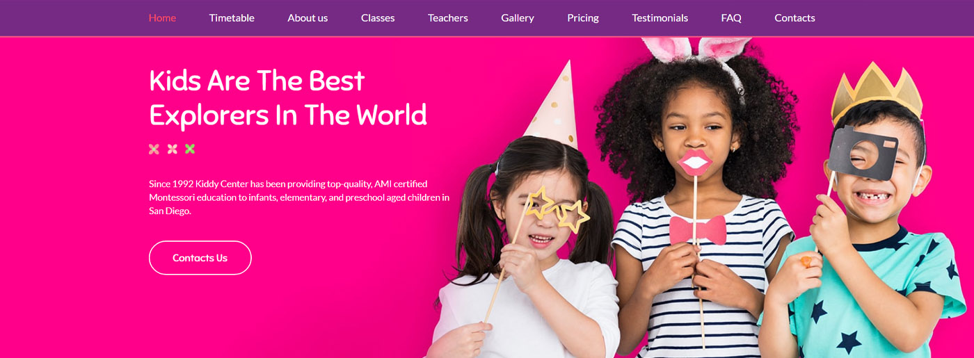
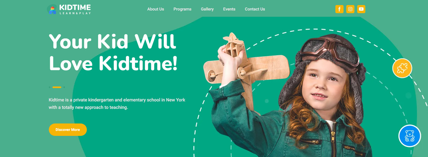
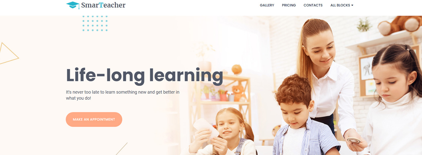
For a kindergarten website, the main goal is to ensure parents that this institution is what their children need; it’s the place where their kids will feel happy, free, and comfortable. With this theme, you can show:
- core values you follow, f.e. teach and take care of children;
- your vision, f.e. learn while playing in the modern environment, and help to explore this world;
- why children will love kid time and will be pleased to go there;
- what programs and classes for different ages and skill levels do you have.
Regarding the functionality of the theme, you’ll be pleasantly surprised by: the modern and bright design(every font, icon, line, shape, and widget fits the thematic ideally); flexible blocks for presenting information about teachers or programs; various galleries with high-quality images; social media integration and CTA buttons; subscription form, Google maps, and many other benefits. This template is ideal for childcare centers or any activities connected with teaching and bringing up children.
Information Should Be Your Cornerstone
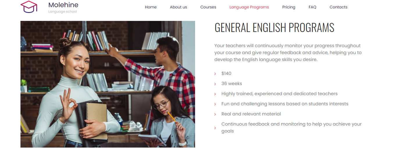
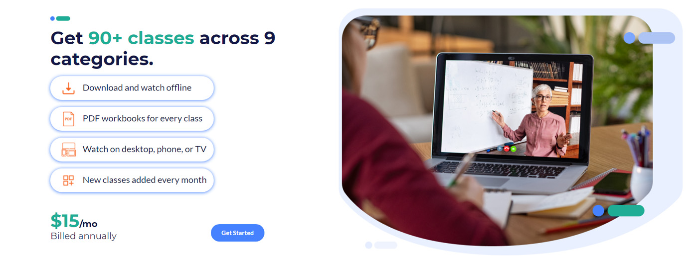
The education website needs to provide as much information as it can. People looking for the best educational website need more details regarding your institution and courses offered. In some cases, some top educational institutions, such as universities, may have different faculties. All of them need to be featured on your website in keeping with the idea of convenience. A prospective student should be able to navigate through the different tabs and pages quickly. Look at how the website design of StuDocu makes it easy for students to navigate and search for the information they’re looking for. A prominent search bar on the home page allows site visitors to quickly find the courses materials, books, or documents they want to download. If your website offers professional certification courses or practice exams, make sure to include dedicated sections for them. For instance, students looking for Microsoft PL-300 Practice Tests Dumps should be able to find relevant resources easily, helping them prepare effectively for their exams.
One should find the necessary faculty and other information on the fly. It will mean that you’ll have to concentrate on content more than the design on such websites. You can also have a website section offering downloadable resources to make it easy for people to get and fill in the forms they need to complete before enrolling.
Example:
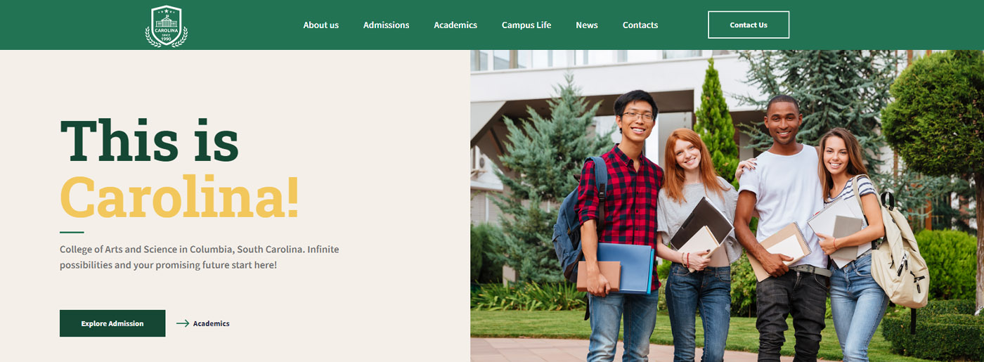
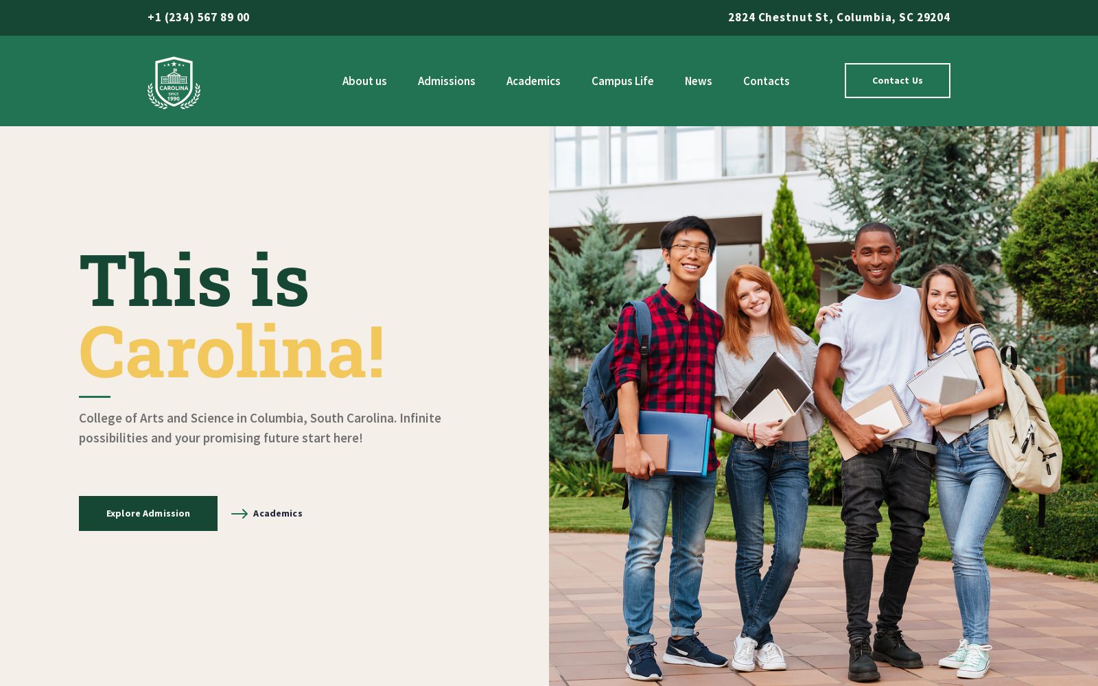
Universities’ websites are designed to inform applicants about entrance exams, contain a schedule of classes, information about teachers and management, training areas, and additional courses. Licenses and permits for educational activities must be visible. Thus, if we take College website design as an example, we’ll see that it genuinely impresses by the number of blocks for a detailed information presentation. It covers not only the studying process but also students’ campus life and essential news. After visiting such a friendly and flexible site, entrants will want to feel themselves as a part of your community. Still don’t have such a site? Try this demo!
Start Best Educational Website Blog
Blogging is an additional tool for building trust relationships with the readers who can become your students. So it’s a good source for boosting traffic and increasing your clients’ base. In the MotoCMS admin panel, you can add many posts and tags according to particular categories. Also, you can choose among the variety of blog templates so that they’ll match your vision of future articles on site.
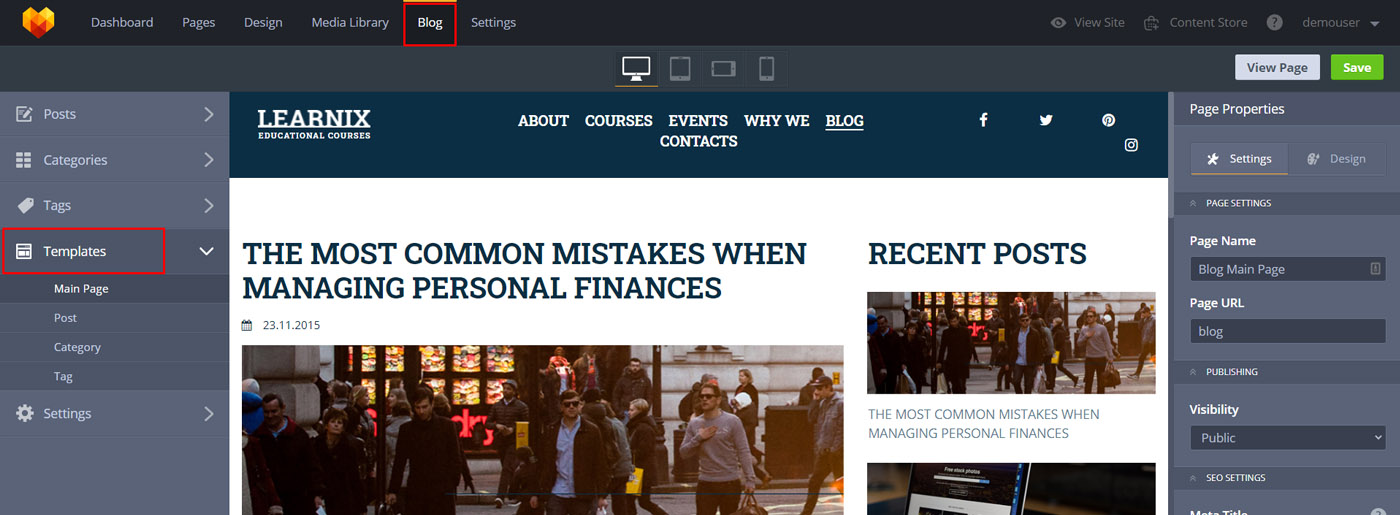
Here are some ideas for you to start a blog:
- describe the modern and innovative teaching methods;
- share your tips considering an educational process;
- tell funny stories from your experience of being a teacher/tutor;
- create guides on rules of admissions to schools/colleges/universities;
- make lists of free or paid sources for self-study and good ways to increase your students’ knowledge.
All in all, you should only choose your niche according to the activities/services you offer. Present your readers with valuable information, and your blog will grow without a doubt. Who knows, maybe you’ll become a cool blogger and get an additional source of income!
Preferred Colors for the Best Educational Website
Regarding the color scheme you should use, you need to pay attention to your institution’s look and image. Before setting out to create an online presence with a website builder, you should have the material in the form of brochures, newsletters, and posters. Ensure that the colors fit the existing material to create cohesiveness both online and offline.
The best educational website has to communicate the idea of learning concepts and skills. That being said, you should gravitate towards neutral and affirming colors such as green, brown, blue, and white. They give the illusion of growth, possibilities, openness, and potential. People want to feel that they can trust you during the learning process, and color psychology can help you go a long way in achieving this goal. Still, even bright colors may work if you use them correctly! Please, have a look at some examples.
Add a Variety of Media Elements
Lastly, be sure to add media that depicts what people can expect from your learning institution. For example, if you own a driving school, apply a few videos detailing the training process. You could also have photos of your facilities. They will give prospective students an idea of what they can expect when they finally enroll in your classes. You can even go a step further to add interactive elements such as a chat feature to answer some students’ questions.
Furthermore, you even can provide interactive games that allow students to earn points that they can use as discounts or some pleasant bonuses(f.e. “for 100 extra points, you get a lesson for free). The idea here is to make students feel like their diligence matters and that their input is appreciated. Having a website that combines different facets of web design can go a long way in fostering trust and attracting more students.
What Is Media Content and Where to Take It?
It is represented by audio, video, and graphic content, mainly pictures, photographs, videos, audio recordings that allow you to sell information, product, or service in a vivid visual form. Such content is incredibly profitable to use for the best educational website creation, online stores, and reviews pages. It’s in demand primarily because of human nature – many users are simply too lazy to read huge volumes of text, but watching a few bright pictures, or a fascinating video is indeed more interesting.
Considering the source of content, of course, it’s essential to provide genuine, unique, and professional images on site. However, if you’re just launching your site and don’t have time for managing media content, you can choose stock photos(there are such free resources as Unsplash, Pexels, or Pixabay, for instance).
Example:
If we take an educational website template to create an e-learning platform, it undoubtedly attracts attention with bright and colourful inserts on the white background. Moreover, its design includes lots of successful web decisions. Here are some of them:
- a chosen font plays a good role genuinely; it ideally matches the overall image of the theme;
- lovely dark blue icons attract visitors’ attention to the described features of the services provided;
- chosen colors present subscription forms, buttons, and call to action in the most favourable way;
- the prices, programs, statistics, every detail looks like a separate good decision.
All in all, the color adds a fresh view to the pages and doesn’t allow users to get away.
MotoCMS Features You’ll Appreciate
SEO Integration
SEO tools are included in the cost. Therefore even if you aren’t a SEO specialist, you’ll be able to optimize your site. Delving deeper, you’ll add meta titles and meta descriptions with appropriate keywords to the pages and Alt texts to the images. To check it, try the demo version free for 14 days and find out how it works.
Google Analytics
No paid plans for getting a clear image of your business success with MotoCMS – it’ll help you track your traffic, find out what marketing strategies work, and understand users’ behavior on your site.
Besides, we provide beneficial terms and conditions for those who are ready to cooperate with MotoCMS. Thus, every client gets free hosting and an SSL certificate that guarantees data security and ensures that your site is safe for users. Also, we offer free domain names for a year, lifetime updates, and reliable support, ready to answer all your questions to achieve the desired results.
If you want to get payments on-site, we support such platforms as:
- PayPal
- MoneyBookers
- Payoneer
- WebMoney
- Wire transfer.
The admin panel is intuitive and easy to edit to avoid problems with template customization. Nevertheless, if you doubt that you can cope with it or simply don’t want to waste your time, you can follow the link, and we’ll present you with a full-featured site in up to 10 days.
More Free Educational Website Templates
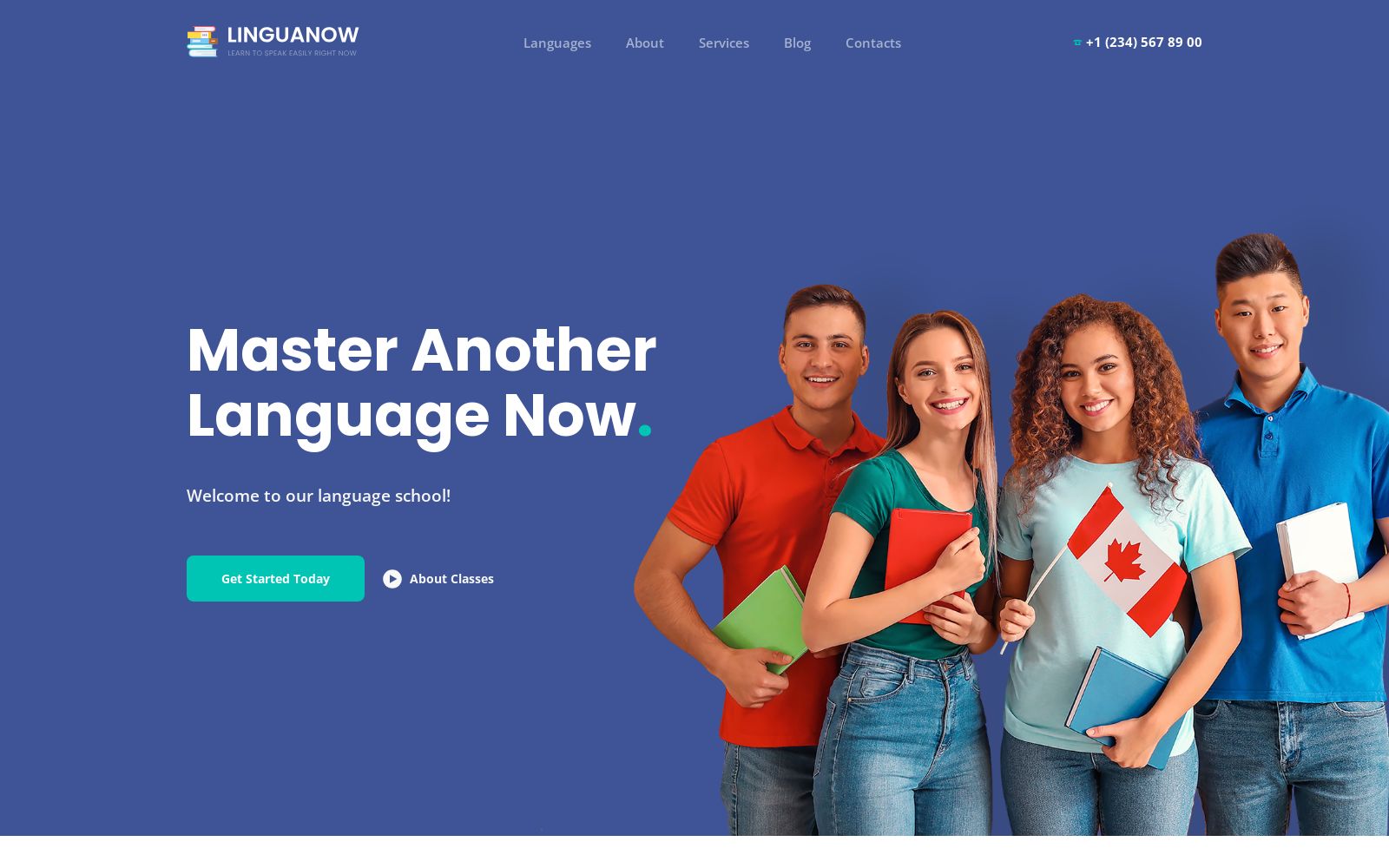
Language School Website Template
The Language Academy template on Weblium is designed for school-focused websites, highlighting communication and learning. Ideal for students and teachers, it features images of conversations, international teams, and interactive blocks with vocabulary and practice activities. It supports both online learning and training, offering individual lessons, group classes, and coaching for fast, effective results. The design emphasizes education, translation, and interpretation—both oral and written—helping users achieve diplomas and qualifications. It inspires foreign language study, travel, and a truly global school experience.
Oratory School Website Template
This website design on Weblium is perfect for showcasing courses, workshops, and masterclasses in communication and public speaking. It features sections for lectures, seminars, and teacher profiles, plus tips from coaches to boost self-confidence. Conference pages, oratory training, and leadership-focused content help students master performance and communication skills, supported by speech and study resources for ongoing growth.
College Website Template
This Weblium design is ideal for education-focused websites, highlighting academics, arts, and science. It features programs for degrees and diplomas, modern learning methods, and both online and offline options. Campus life is brought to life with images of classes, clubs, sports, labs, and a lively canteen. Scholarships, tutoring, and research opportunities support student success, while arts and sports activities enrich the learning experience—perfect for institutions, educators, and future graduates.
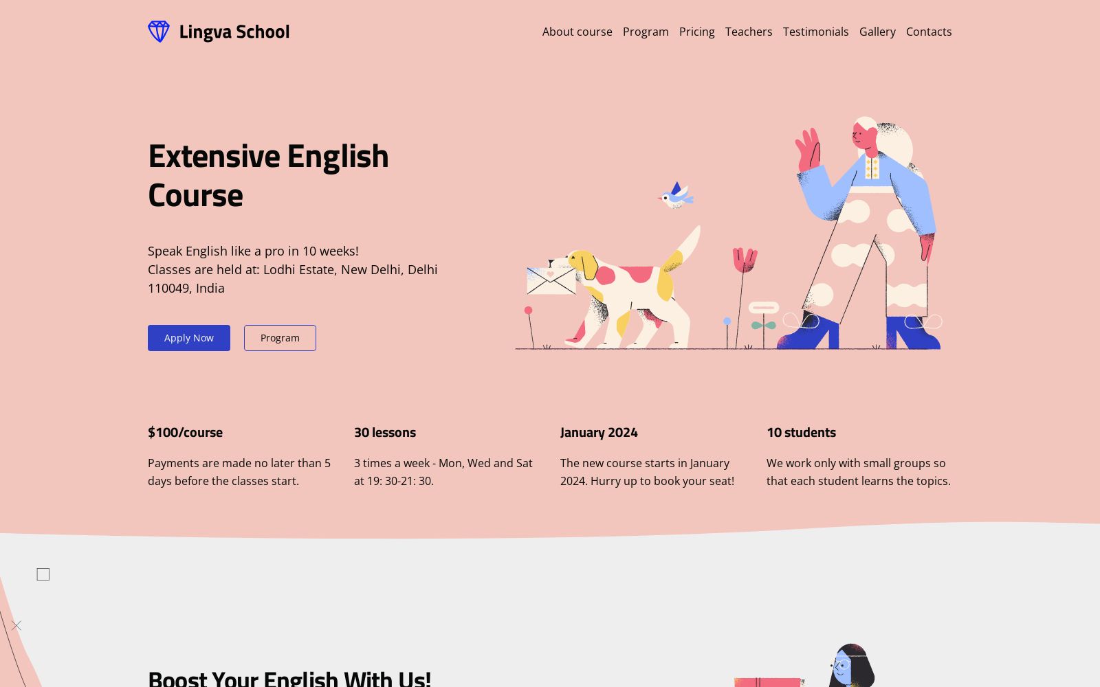
English Course Website Template
English Horizons on Weblium is perfect for English language schools and teachers, showcasing courses, clubs, and interactive sessions. It features grammar tips, translation sections, and methods for learning foreign languages, with a special focus on speaking English quickly and confidently. Highlights include club activities, extra classes, film-based learning, and the best English courses in India—ideal for students aiming to improve their skills with engaging, effective methods.
Education Abroad Consultancy Website Template
EduWorld Consultancy on Weblium is a dynamic design for education-focused websites, highlighting international study opportunities, scholarships, and grants. It features students, teachers, and campus life, along with sections on courses, internships, and career support. Visa services, educational counseling, and global networking make it ideal for institutions, consultants, and learners aiming to study or work abroad.
Take One of Our Website Designs for a Test Drive!
MotoCMS has a range of templates for educational website, all going at an affordable price. You can launch the best educational website with a user-friendly tutoring website builder or at least try it out risk-free. Please, follow this link to browse through our extensive catalog. Thanks for choosing us, and we look forward to helping you achieve your education goals!
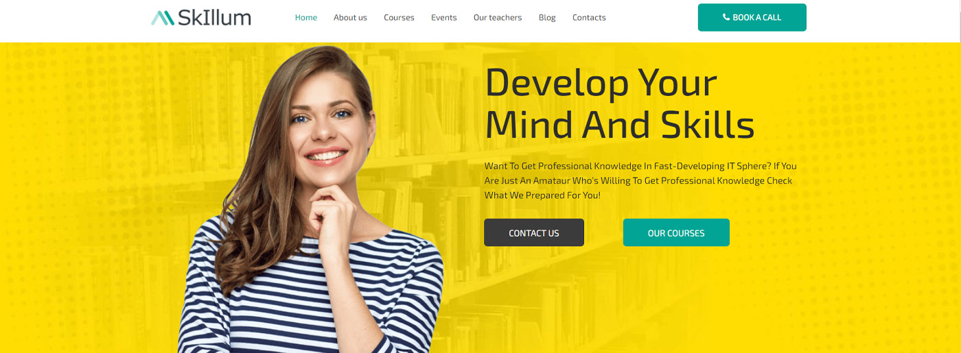





Motocms has an extent of instruction formats all trying at a moderate cost. In addition energizing is you can pick your layout and attempt it out for a month, danger free. Take after this connection to peruse through our broad inventory. Much obliged concerning picking us, and we anticipate helping you attain your training objectives!
Great, comprehensive guide! 🙂
A motivating discussion is definitely worth comment. I believe that you need to write more about this issue, it might not be a taboo matter but typically folks don’t speak about such subjects. To the next! Kind regards!!
Here is a superb Blog You may Find Fascinating that we encourage you to visit.