Top Design Trends For Flash Websites
Today Internet is full of creativity and variety of unique ideas. Web society became pretty fastidious, that’s why it’s very difficult for web designers to amaze it. This tendency can be noticed in any design field, flash design is included. Nevertheless, human’s nature always strives for beauty and perfection and lots of interesting concepts and fresh ideas are still coming to the global net. If you are a Flash developer or use Flash for your web work you will be certainly interested in the following design trends for Flash websites. They can come in handy in your creativity search.
1. Centered Content. Millions of people browse websites with the help of social networks every day. And fewer people go «full screen» while visiting a website. So centering your content is especially effective now as a way of grabbing visitor’s attention to keep his longer stay on the website.
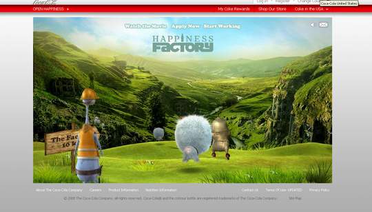
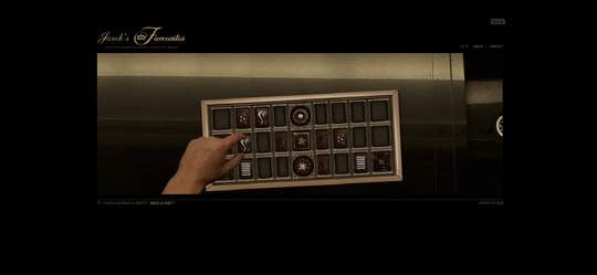
2. Full Video Background. Yes, you may think that this paragraph is contradicting the previous one.But this is not so. Actually full video background is a great way to immerse your visitor into the content. This trend is peculiar to the sites that are showcasing a product.
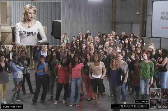
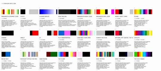
3. Pictured Navigation. A nice alternative to simple boring text. Here a picture will tell you what to expect. This is the best idea for websites with a whole bunch of menu items and it’s necessary to draw attention to a few featured areas. This is also a wonderful way to «push» visitor to enter first and ask questions later. In this case it would be reasonable to feature the main areas of your site.
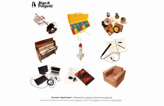
4. Looks like HTML. Sometimes it’s good to add to the static HTML website some tricky element made in Flash builder. You do not need to add any extra code library to do this, you just build it yourself for any effect you want. This will add some spice to your site.
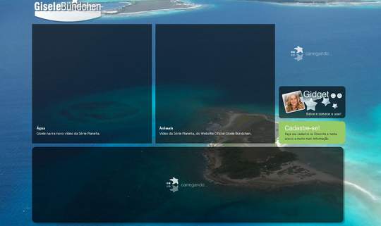
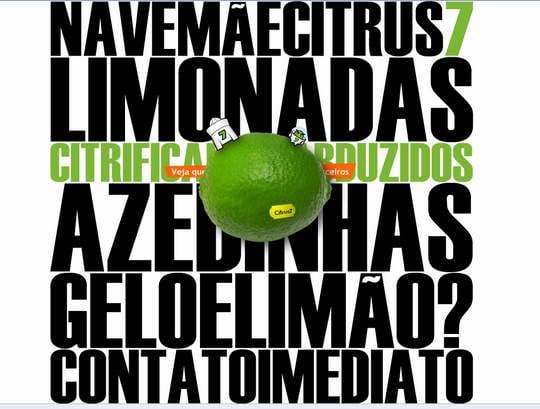
5. Large backgrounds, text and illustrations. Everything getting bigger is the most traceable up to date trend. One of the reasons for this is ever increasing sales of large resolution monitors. So naturally designers fill up the rest of that blank website space. They say it will be actual at least until web mobile era comes.
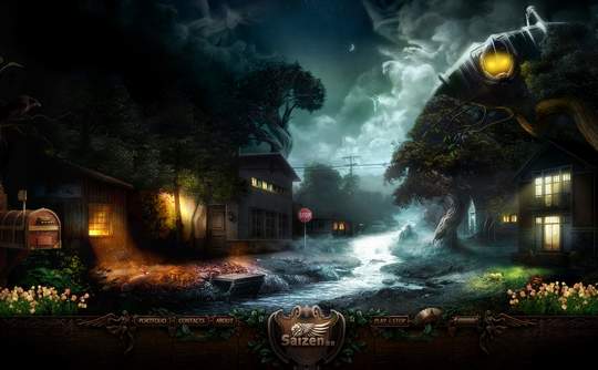
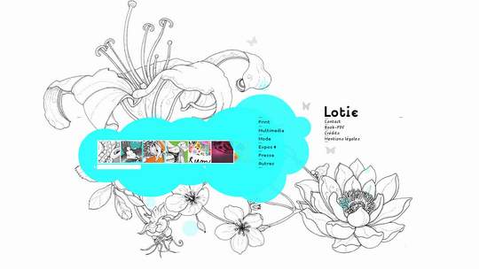
6. Hand made touch. What can add more special appeal to a website than hand-made looking elements? Websites of the artistic direction tend to be peppered with old school drawings, collages and sketches.
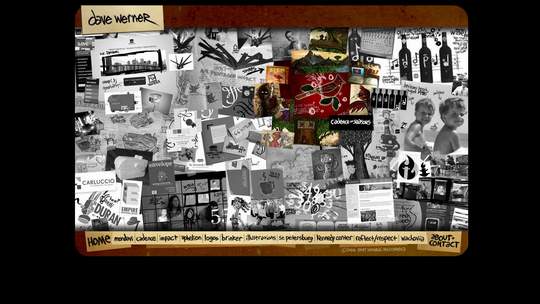
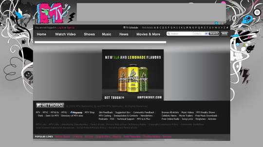
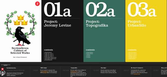
7. Multi column/Multi tabbed layouts. Now designers and web developers have to put much more efforts to grab attention of the visitors than a few years ago. This can be easily explained by decreasing of the overall attention span on the web. So trying to squeeze as much information as they can on one page is a very effective way to keep the incoming traffic stay on your website.
If you want to be successful you need to be well informed about the niche you are working in. By learning actual trends and tendencies in flash design you will stay up to date and gain more from your flash web projects. And our FlashMoto Flash CMS will help you succeed!


[…] Visit Source. […]
Awesome collection, thanks for sharing.
Great design gives me some nice ideas for sites of mine.
Flash is great for web 2.0 and most have little to no web 2.0 with their current sites.
Matt
[…] Top Design Trends For Flash Websites | Flashmoto7 Synergistic Way To Earn A Comfortable Living Online.Niche Socilaizer| Review|Bonus|Pre-launch | 8 Most Popular Nav Bar Links on NingBMW Product Navigator | Gofiguremag.comWebsite Promotion – 10 Mistakes to Avoid | Underrated.co.uk – Search Engine OptimisationJersey City Condos | locallylocatedKEXP 90.3 Blog » Blog Archive » Song of the Day: The Boy Least Likely To – Saddle UpReview: 2010 Lincoln Navigator L « San Francisco Ford Lincoln Mercury blogSonicbids Hosts a BYE Get-Together | Sonicbids Blog […]
[…] See the article and the list of seven trends in Flash sites here. Uncategorized […]
[…] More: Top Design Trends For Flash Websites | Flashmoto […]
[…] Download Your Free Online Niche Marketing Report | Business Tools ProTop Design Trends For Flash Websites | Flashmoto […]
Social comments and analytics for this post…
This post was mentioned on Friendfeed by A. Morloi Grazioli: http://www.flashmoto.com/blog… direi ok quasi a tutto, a parte l’utilizzo della “pictured navigation”. mi sa davvero di vecchio….
Pictured navigation: it’s also called “Mystery Meat” navigation (if absolutely no clarifying text is shown statically, i.e., when not using a mouse-over). And it’s bad. Very bad. Then again, people that *mainly* use Flash to create websites often tend to ignore usability guidelines anyway in favor of expressing their “creativity” in an artsy-fartsy way, which is the main reason why I (and many people that try to explain the importance of adhering to certain usability guidelines when it comes to web design) absolutely *hate* Flash-centered pages.
Most of the really great examples of modern web design that I know of are created using HTML and CSS (and the occasional minimal use of Flash elements), which should be powerful enough to create appealing web pages that adhere to usability guidelines while simultaneously allowing for easy separation of content and design as well as straightforward indexing by search engines.
these are really great designs, thank you for posting it, i like it really, amazing work, well done.
[…] Top Design Trends For Flash Websites | MotoCMS […]
Number 6 manages to put in a lot of images and less blank space, but it still doesn’t look cluttered. It probably has to do with the choice of colors.
[…] Top Design Trends For Flash Websites | MotoCMS […]
graphic design…
[…]Top Design Trends For Flash Websites | MotoCMS[…]…