Transparency is definitely not a new kid on the block. Web designers have tried and tested transparency to give a website a refreshing interface that scores high both on the aesthetic and usability fronts. However, working with transparency is easier said than done. There are barrages of issues for you to face while working with transparency. The first issue would be like – how much transparent you want an element to be. The problem is you can’t get a straightforward answer to this question, it is your call.

The reason behind the rise of this designing trend is that transparency rarely interferes with the existing theme of the design. Elements are deliberately desaturated to make them appear transparent so that they don’t block the elements resting behind them and this is exactly where the power of transparency lies. Here we are going to take a look around some of the unique aspects of the transparency in web design.
Don’t Apply Transparency Over Crucial Elements
Transparent element should not be applied against any crucial elements of your website design. Say for example, we can’t add a transparent element on the tagline because that would be very foolish indeed. Whenever you are using transparent element, you have to be very careful about other important design items in order to keep them visible. Failure to maintain that would beat the very purpose of transparent design.
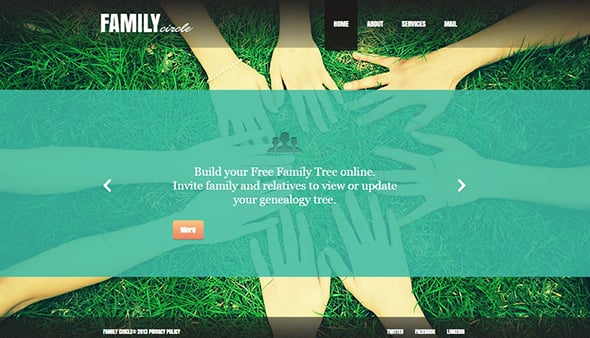
In the above Family Circle Template, the transparent slider background covers as much as half of the design but it does not block any important elements. Rather it makes it easy for designers to place CTA buttons and texts in the slider and ensure their better visibility by darkening or shading the otherwise prominent background image.
No Such Thing as Perfect Level of Transparency in Web Design
The good and probably the worst thing about transparency in web design is that there is no such thing as the ideal transparency level. Sometimes, just 10% transparency is ideal for a project whereas sometimes, it might appear that the transparency level needs to be at least 70%. It all depends on the design requirements. Take a look at the design and try a different level of transparency to figure out which one suits the purpose.
In the above example Kitemo Kitesurfing Club, the transparency level is not very high. It has been kept at that low level to blur out the background image and make the Call to Action texts more attention-grabbing. But if the background image is any different, maybe there will be no need to keep the level of transparency to this low. The rule of thumb is to try out different variants to pick the best.
Background Transparency
It is a fact that transparent elements are usually used at the forefront of the design but there are some designers who dare to do different. They are applying transparency against the background image and the result is astonishingly stunning.
In the above example StarLight, the background image is blurred out and the transparency is also reduced to give prominence to the element placed at the fore. This technique makes the design look like multi-dimensional.
Don’t Use Too Many Effects
The power of transparency in web design lies in its simplicity. You should not be adding too many effects on your design as this might lead to distraction. The purpose of using transparency is to create visual interest and therefore, you should be careful while applying additional effects. Try to keep it simple and sweet, that is all.
Don’t Use Transparency as an Auxiliary
Some designers tend to treat transparency as a secondary element. But we can make a transparent image dominating on the design and so turn the website into perfect visual experience. Since transparent elements rarely interfere with other elements of the design, creating something visually intriguing is not that difficult.
In the above Consulting Website Template, the large transparent image dominates on the design but not at the cost of other elements. All the other designing elements like Texts, Buttons, Menu, etc. manage to grab the users’ attention thanks to the clever use of transparency.
Creating Contrast with Transparency
The biggest benefit of using transparency in web design is that it helps you to create contrast. By reducing the transparency of a layer, designers will be able to create a perfect focal point. This will also help them to achieve a desired level of contrast which will eventually increase the website readability. Texts, when used against transparent image, gain better visibility and they go easy on the eyes. This is the primary reason why so many designers are using transparent elements on templates.
In the above Codex Template, special attention is given to the text and it looks rather prominent due to its position over a transparent layer. It will help communicate the message successfully to the targeted audience.
Some other Factors
It makes sense not to apply transparencies on design elements that are high in contrast. Transparency works best on white or black color background.
You do not have to make transparency a big part of the design all the time. There is no need to use multiple transparencies; rather you need to learn how to stick with one particular transparency style throughout the design process as this will help you to maintain consistency and also to eliminate discrepancies in the design. The impact of transparency can be felt even if it is used sparingly.
Conclusion
Transparency is not the latest web design trend but it has been widely spread in the past few years. There are a lot more ways you can explore this trend. Go wild with background, images or with hover effects to figure out which works best for your project. Since the concept of transparency is nonintrusive in nature, you can use it almost in every imaginable way. So, continue your trust with transparency.


