How To Wrap Your Head Around UI Motion Design: Comprehensive Tutorials and More
Along with the shift toward UX-driven website design, new tools come into play. One of them is Motion UI, which made it to the top 10 web development trends 2018. Motion UI takes the floor as it lets you make your website UX more intuitive by visualizing the change and making the journey of your users more streamlined. Fortunately, wrapping your head around UI Motion design and using it for your projects isn’t that hard. Today, you’ll learn how to get started with Motion design with best tutorials out there.
By reading this article, you’ll learn about Motion design and it’s major draws. Next, if you bear along with us to the more practical part of this article, you’ll learn what are the most comprehensive and well-written tutorials to get started with UI Motion design today. Finally, you’ll find some suggestions on incorporating Motion UI into your website/app design most effectively. So, fasten your seatbelt and let’s get started!
Introducing Motion UI
Motion UI is a stand-alone Sass library for creating custom CSS transitions and UI animation prototyping. It includes more than a dozen of animation and transition classes, which make prototyping simple. In addition to this, Motion UI gives you a lot of freedom, as the number of ways you can apply and mix the classes is literally limitless.
In fact, the library is new to the web design world by now. It was created by one of the leading web design companies, ZURB, as a part of their Foundations for Apps framework. By October 2017, they redesigned the Motion UI library and made it open-source. This is where all the fun begins. Many developers were just stunned grasping to what a high degree UI Motion design simplifies their lives. Once you grasp the way it works, you’ll join them with the following expression on your face:

Currently, the updated version of the library consists of the CSS file with all the rules for stunning transitions, Sass files that let you power your own Motion UI animation effects, and Motion .js files that account for the JavaScript part of it all. The takeaway from here is that the basic knowledge of HTML, CSS and JavaScript would suffice to power stunning transitions with Motion UI.
Main Draws of Motion UI
All the front-end developers are crazy about it. It’s pretty reasonable on your part to wonder why. Let me explain. Actually, I’ve got a list to better present all of the Motion library major draws. Here you go:
Most importantly, Motion UI helps you get going quickly. The library includes a number of pre-made CSS classes, applying which to your UX elements is simple as ABC.
Secondly, this library is highly flexible. With Sass mixins, you can fully control the values of each effect, e. g. its intensity, direction, speed, etc.
Thirdly, Motion UI is now universal. Back in the past, this library was designed to work with ZURB Foundation frameworks exclusively. After it went open-source, you can adapt it to work with a number of animation libraries, including the popular Angular and React JS.
Next, Motion design really takes the website/app UI up a notch. It makes designing expressive user interfaces, giving users clues on visual hierarchy in web design and bettering their special orientation on the website possible.
Moreover, powered by ZURB, Motion library is well-tested and optimized for speed. Having a sound authority behind it, Motion UI delivers you polished-to-perfection code that runs lightning-fast and failure-free.
Finally, Motion UI animations are multifunctional. The first function they can play is drawing attention to the website elements that appear (e.g. indicators, notifications). The second function is the connective and storytelling one. The third one is feedback amplification, which is achieved by animating ‘success’ messages, acknowledgments and other results of user-initiated interactions.
Given the simplicity, flexibility, and applicability of Motion UI, it becomes a must-have tool in your 2018 web development toolkit. Fortunately, mastering it won’t take much time if you have the basic command of HTML, CSS, and JavaScript.
Best Comprehensive Tutorials to Get Started with UI Motion Design
So, you’ve hit the point when you know what you’ll be learning today and why you need it to take your web projects up a notch. Below, you’ll find a number of Motion UI tutorials that we dub the best. They stick to the nice balance of comprehensiveness, depth, and interactivity. So, no matter which one (or a couple of them) you go after, you’re bound to enjoy the upcoming mind-expanding experience.

#1: How to Create Animations and Transitions with Motion UI
This tutorial, published on Hongkiat, teaches you the main things to do with Motion UI: creating animations and transitions. It invites you to start with the basics (leaving out working with Sass) by downloading Motion UI starter kit that includes only the ready-made CSS transitions and animations.
With the starter kit, you can drill your UI animation prototyping skills out of the box. First of all, the tutorial teaches you how to build the Motion UI HTML adding the behavior and modifier classes. In the given example, users will trigger the image animation by pressing a button. Next, you’ll learn how to trigger a transition or animation using Motion jQuery. Finally, you’ll learn how to customize the predefined effects within the Sass files. Each of the effects comes with the corresponding Sass mixin file, where you can adjust the values of the effect. You’ll see that the process is pretty straightforward.
All in all, this tutorial shows you all the basics you need to know before you use Motion UI for a project for the first time. Moreover, it’s not a long read, so you’ll master Motion UI with it within a short period of time.
#2: How To Create Custom Animations With Motion UI By Geoff Kimball
The next tutorial on UI Motion design extends your Motion design command even further. It touches upon the aspects left out by the previous one.
Firstly, you’ll learn how to use Motion UI with some other plugins shipped with it as a part of the Foundation framework. For example, you’ll learn how to combine Motion UI and Toggler to animate elements in and out on click. Next, you’ll learn how to make Motion UI even more powerful combining it with Foundation’s Reveal and Orbit plugins. Next, you’ll see more examples of animating elements with Motion UI and customizing the effects. Finally, you’ll learn how to add a series of effects to animate an element. By reading this part of the tutorial, you’ll learn how to make effects play one by one or with a predefined offset.
As you can see, this tutorial plays well with the previous one as it extends the knowledge you gained earlier. So, check it out to master the magic that becomes possible with Motion UI, and you’ll get the hang of UI Material design.
#3: ZURB Motion UI Playground
If you prefer interactive learning, head to the official Motion UI Playground. Within it, you can play with the effects this library offers by animating the Yeti. See the image below sampling the process:
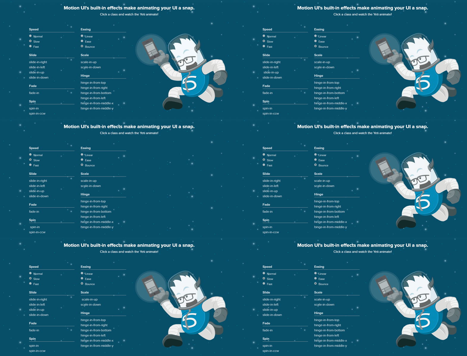
However, if playing with the effects is not what you’re after, move along. Below, you’ll find the detailed setup instructions, which let you copy all the needed code snippets in one click. Next, carry on to the next part and practice with UI animation prototyping. Press the green buttons to see the examples in action. If you practice along the way, examples are a nice way to check whether you’ve done everything correctly. The last section of the Playground introduces you to creating series of animations in a neat and digestible way.
To sum up, if you’re after interactive tutorials, this is the one you need. If your thirst for knowledge isn’t satisfied with it, ZURB team invites you to dig deeper by reading the full Motion UI documentation.
Applying Motion UI: Some Ideas
With UI Motion design, you can provide an exciting experience to your website/app users in a number of ways. In fact, using it, you can animate shapes, text, lines, illustrations, 3D objects, videos and other content of your project. Below, we bring you some suggestions on what elements prove most effective when animated with Motion UI. Hopefully, these ideas prove useful to you and further stimulate your creative thinking.
Firstly, use animations to full-heartedly great your users. If loading your website/app takes time, it’s wise to keep user’s attention occupied with a neatly-animated greeter. Although keep it minimal. 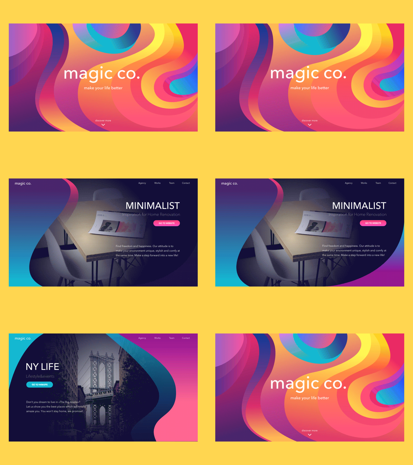
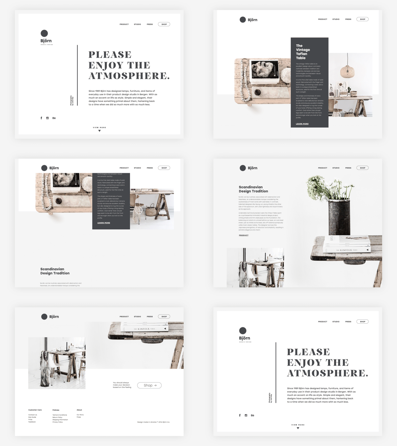
Secondly, animate it on the scroll. It’s the classics, but it boosts your UI manifold. Look how natural scrolling feels on a sample website below:
Thirdly, use it to power microinteractions. Animated buttons, switchers, and toggles inform users about a change in a jiffy and help them stay alert.

Next, employ Motion UI to entertain users while they wait for your web page/app to load. This effective strategy helps you decrease bounce rate by keeping users’ attention busy.
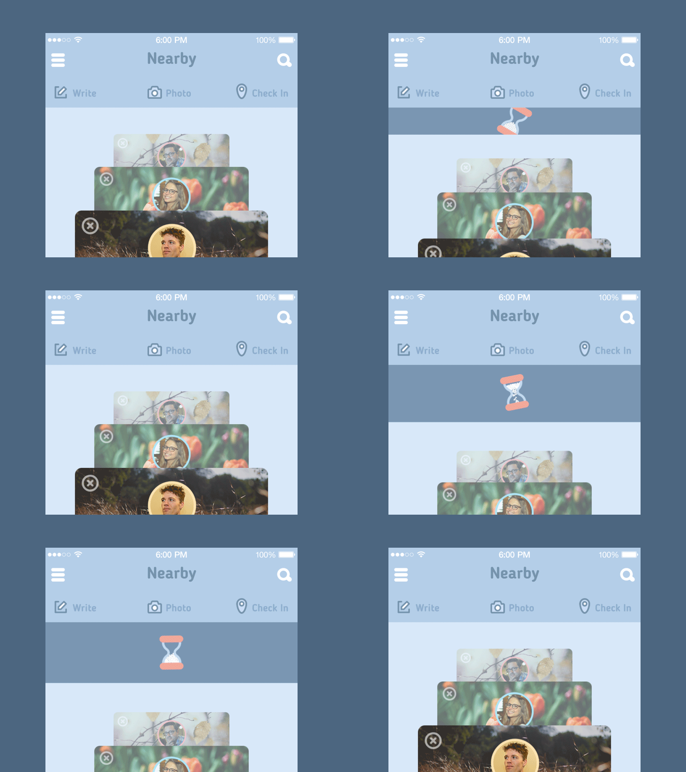
Finally, use Motion UI to make it more fun. This is the point when your creativity comes into play.
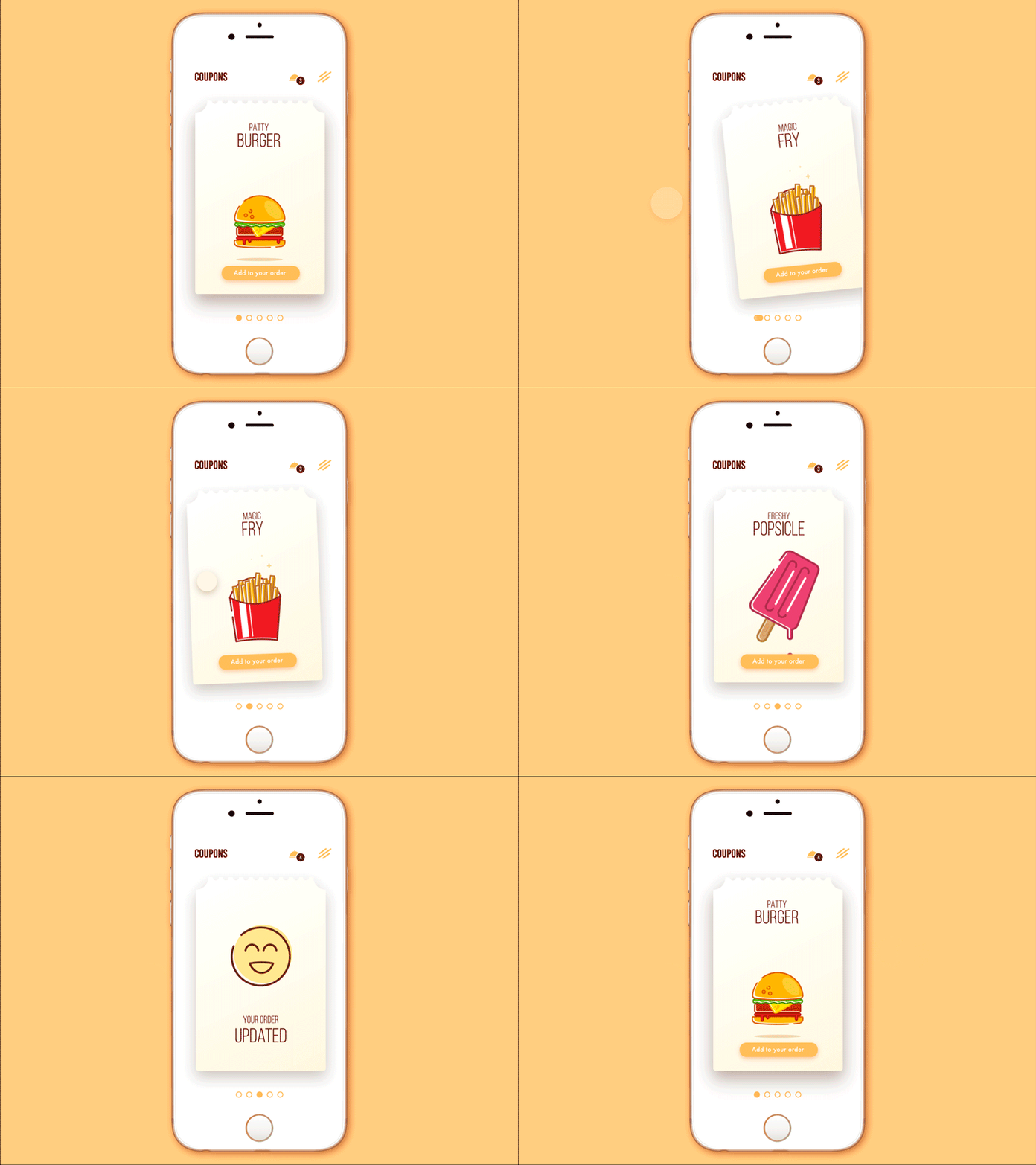
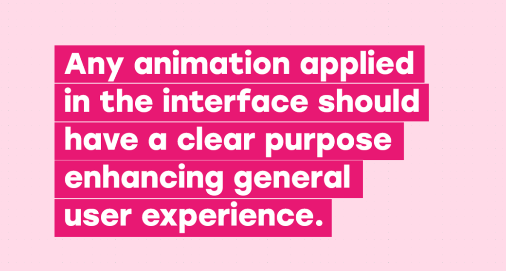
The takeaway from this section is that you should think out of the box when you use Motion UI to make your project more engaging and fun to browse. However, the main thing is using it to the measure and with the purpose in mind. Below, you’ll find the rule that’ll help you stick to the happy medium and make the most out of using Motion UI for your upcoming projects.
Wrapping Up
Congrats! By reading this article, you made your first step to establishing a lasting relationship with UI Motion design. This UI library is new and has a rich potential. So, you’re bound to keep benefiting from mastering it all this year long. It’s simple and effective, dynamic and creative. That’s why it’s worth your time and effort. All in all, we wish you good luck in mastering UI Motion design and reaching new heights with it!
Are there any other resources that you found helpful drilling Motion UI? You’re welcome to contribute by sharing the links to them in the Comments section below!
Stay tuned!



Looks like the best thing for online stores that are apps or encyclopedias like Wikipedia. I say that because, for a blog or a news site, where content is uploaded and updated often, on topics that are, let’s say more mundane, it would be a challenge and not that rewarding…