Process of User Centered Design: The Ultimate Guide
Most web designers are in the habit of designing interfaces that aim either at meeting the business goals or at incorporating some shiny new features to make the outcome look stunning. However, they tend to ignore the obvious fact that designing is not just about adding some fancy elements rather it is about making the interface accessible and useful for the users. In simple English, if you are neglecting the users, you are probably making the worst mistake of your entire web designing career. That’s why today we want to learn more about the process of user centered design and how it can help improve your site.
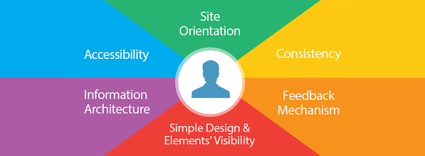
The users’ aspirations should be a part of the design process, otherwise, the interface will lack the impact. Since too many designers were creating web templates without concentrating on the likes and dislikes of their targeted audience, the idea of user centered design came into being. The process of user centered design focuses on the users first. Unlike the traditional web designing process where the user’s feedback is incorporated at the last stage of the development, due to the principles of user centered design, this feedback should be taken into consideration throughout all the stages of the design process.
What Is User Centered Design?
The first stage of the process of user centered design starts with understanding what the targeted audience actually wants and then coming up with an interface that embraced those needs. However, the job does not end there; at each stage, the feedback of the users helps to create a design that satisfies everyone.
From the early stage of conceptualization to the finalization of the design project, the interface will be tested with the targeted audience to get a feel of what the larger audience needs. In short, in user centered design approach, users play an active role in determining the final outcome of the design. Be it product prototyping or implementation of the concept, users have a role to play and this is what changes the course of the design process.
Here in this article, we are going to take a look around some of the most prominent aspects of the process of user centered design to have a better understanding of the subject.
It Is All About Accessibility
Users want to access information without facing any hassle along the way and therefore, as a designer, you need to go the extra mile to ensure that the interface that you are designing is going to score high on the accessibility front.
1. Navigation
To make all the information on your website easily accessible, you need to start with the website navigation. Don’t make the navigation complex by adding fancy features. Try to stick to the good old top navigation with links to prominent sections of your website. Maybe you can think of adding breadcrumb as it helps users to get an idea of their current position on the website. Mega menu is certainly another cool feature that is increasingly popular among designers as it allows them to make a large section of the website accessible via the top navigation.
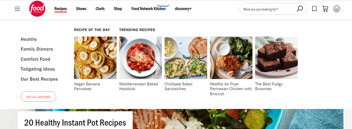
Food Network is a good user centered design example – it makes use of a mega menu and it seems it has simplified the navigation of the website in a never before way. The mega menu contains links to all important sections of the website and thereby makes it easier for users to browse the website and access information without wasting much of their time. The use of images along with links make Food Network’s mega menu stand apart from other websites of the same clan.
2. Search Option
You can make it easy for users to find the information they are looking for by adding a search box in the design. The search box should be placed at a convenient location on the website so that people don’t have to struggle to find it. Use ghost texts to make it easier for people to understand its purpose.
Since Winter Fashion is a large store website template, it includes a search box in the top navigation so that users can make a search in case they can’t find something. Though ghost texts have not been used, the use of search icon gives users a clear understanding that it is a search box.
3. Sitemap
Sitemap is a good option to help users locate a page. Since people have become habituated to the idea of visiting the sitemap whenever they fail to locate a web page, it makes sense that you should keep a provision for a sitemap on your website.
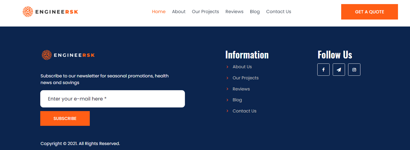
The sitemap of EngineeRSK follows a certain structure and thereby, it becomes very simple for users. The sections have been categorized carefully. This is a perfect example of a simple and user-friendly sitemap. By the way, in the MotoCMS admin panel, you can easily generate a sitemap automatically.
Orientation of the Website
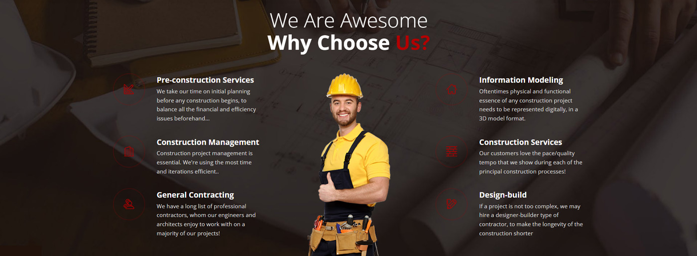
Site orientation is another factor that has a decisive impact on the user centered design. Site Orientation includes factors like the visibility of different design elements, descriptive links, etc.
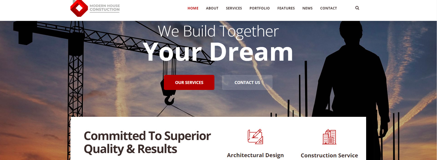
Modern House Construction scores high on the visibility front. Such crucial Elements like the “Call to Action” button, clean navigation, and descriptive links and texts have been given proper attention in the design. Every element in this design gets its share of attention.
Consistency
Your design has to be consistent throughout all the website sections. You simply can’t tweak with the navigation or change the position of the design elements haphazardly, as this would make users feel disoriented. People might find it tough to browse a website if its top navigation goes missing in some pages or if the top horizontal navigation gives way to vertical navigation in sections of the website. From a user’s perspective, it is totally baffling if the design and elements keep shifting all time. Consistency is the key to success when it comes to the process of user centered design.
Incorporate Feedback Mechanism
The concept of the user centered design does not end at the completion of a design project rather it is an ever-going process. Therefore, it is imperative for a designer to add a feedback mechanism in the design process so that people can share their likes and dislikes. Say for example, what a user is supposed to do if he is unable to fill out a form because of some strange error? In that case, a feedback mechanism can help him to inform the webmaster about the issue. The feedback mechanism can be anything like a form or a Chat box etc.
Make The Design Look Good
Just because you are concentrating on the users’ needs, it does not mean that you should cut down on creativity.
An ugly website is definitely not going to please the targeted audience. The purpose of the user centered design is to make it easy for users to navigate the website and access the information they have been looking for without any inconvenience. It has got nothing to do with the look and feel of the website. Technically the design of a website should be simple and straightforward. Complex designs rarely score high on the user-friendliness front. A good looking website tends to instill confidence among users and can make them feel that the site is going to serve them well.
Visibility of Different Elements
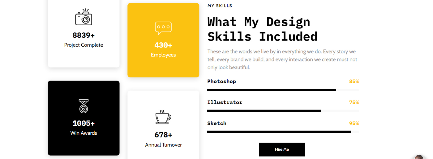
Just adding cool designing elements in the interface is not going to offer much help to the users. The elements should be placed in such a way that they can grab the users’ attention but that should not be done at the cost of other elements. Visibility of design elements directly influences on the interaction between users and website. Less important elements should not grab all the attention as this would be disastrous for the conversion rate of the website; moreover, it will make it even more difficult for users to locate the sections/elements that actually matter to them.
Kerri’s CV Card website template has included myriads of elements on the home page without messing up the interface.
Do Away With Information Overload
Too much information can overwhelm the users. It usually happens with content and image-heavy websites. A proper information architecture, which means its organization and structure, should be maintained strictly; otherwise, you will end up confusing the users. Proper uses of categories, sitemap structure, breadcrumb, etc. are some of the unique aspects that should be taken into consideration when you are dealing with large and content-heavy websites.
Some Good Examples of User Centered Design
Conclusion
The process of user centered design aims to allay users’ apprehensions that it would be hard to find the information they need on a website. Try to understand what the users want even before you start working on a design project. This will minimize confusion and will make the website browsing easy and joyful for users.



Congratulations guys, quality information you have given!!!Your blog is really helpful for final year students…