Visual Content vs Text Content – Epic Face-off with Obvious Winner
In the information society, cognitive processes have become technology-intensive. It’s easier to browse the Internet and find everything you need in a few minutes. People no longer spend hours in the library looking through multiple pages of old books or newspapers. Moreover, today there are a ton of data on the web, so that information takes many forms and is easily accessible. However, sometimes it’s hard to find what you need, and the visual content vs text content battle becomes more severe. Marketers and designers do all possible to attract visitors’ attention. That’s why today, we will be the judges and find out which side wins and works better in 2021.

Today’s Realities: Scrolling or Reading?
Our research from several months ago has already touched upon whether people are tired of reading. They suffer information overload in all life spheres, especially regarding significant texts. Children, in most instances, also don’t like reading. Bulky books make them shudder and think, “It’s going to take a lot of time.” Nowadays, time is worth its weight in gold. It’s another reason why people tend to read less.
Why read when information can be perceived differently and save precious hours?! That’s why audiobooks became so popular, and movies based on books are often more popular and more famous than the original story (How many of you read ‘The Lord of the Rings’ or ‘Game of Throne’s books before the movie or TV show had emerged?).
On the Internet, the problem is even more apparent. Instead, People would look through the article or website content rather than read it carefully. Studies reveal that most of readers tweet about posts they haven’t read thoroughly, and most of the sharing happens in the first lines of the text. So, how should websites react to that trend, and what do their owners do to keep visitors’ attention and convey their ideas and messages? How to develop a content strategy that suits their brand? Let’s go deeper.
Visual Content Features
Visuality today is the best way to deliver most of your precious thoughts to the audience. The human mind tends to perceive information in images – as it did in the early ages when people first created cave paintings. It was a perfect way to provide the necessary information to others, share news and ideas. And today, small children start their cognitive process with games and drawings. Moreover, most people often scribble sketches or meaningless pics during boring meetings, lectures, or on their way to work. Psychologists say such activity helps the human mind to relax and clean itself from unnecessary thoughts and information. In other words, visual interaction is natural and comfortable for our minds. To truly optimize this process for digital platforms, many companies turn to a user experience research agency to better understand how visual content resonates with different audiences.
Text is a much more complicated thing that requires more extended learning. Visual information can be processed 60,000 times faster than text and is easier to remember. Researchers say that people tend to remember only 20% of what they read, while around 37% of the population are visual learners. That means they perceive visual information like images or infographics better than text or audio. All that represents that visual means of communication are much better for the Internet, and website builders now tend to create sites and templates based on visual content.
Types of Visual Content
- Photos and Pictures;
- Infographics;
- Videos;
- Slideshows.
All these types of visual content may be used in websites and website templates as distinct elements or combinations with text and typography. Suppose you are not sure that you can make a perfect and harmonious design with top-quality images and proper typography for your website. In that case, you should choose one of MotoCMS responsive templates or hire a professional web designer/agency, i.e., Tauranga Web Design.
How Visual Content Influences Human Mind
Visual elements affect people in both ways – cognitively and emotionally. Cognitively a person learns how to interact with some objects, and gets the point of certain information. The knowledge and communication skills are improved thanks to visuals. Visual content helps people with low literacy to perceive and understand the information they find challenging to read.
Emotionally visual content connects a person with an object, stimulates our imagination, and improves comprehension.
The human brain consists of two parts – the right and left sections. The left one is responsible for our language, cognitive functions, logic, and reasoning, while the right area is associated with emotions, intuition, and creativity. Visuals make both parts of the human brain work together, stimulating logic and cognitive functions using bright and creative images.
You may use website visuals for:
- Practical demonstration of how the product works;
- Emotional engagement with visitors or brand customers;
- Attracting visitors and making them stay with your site to learn more;
- Aesthetic satisfaction of the user;
- Clarifying a message and making it easier to understand and memorize.
Visual Content Organization Tips
Today Content Management Systems adapt to modern trends and offer more opportunities for visual content organization. Their functionality may vary from adding pictures and videos to creating slideshows, managing galleries, and typography. Let’s consider some examples of the successful use of visuals.
Background Images: Visual Content vs Text Content
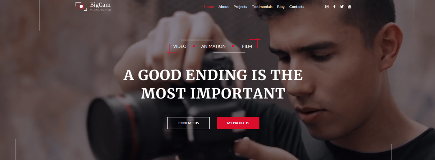
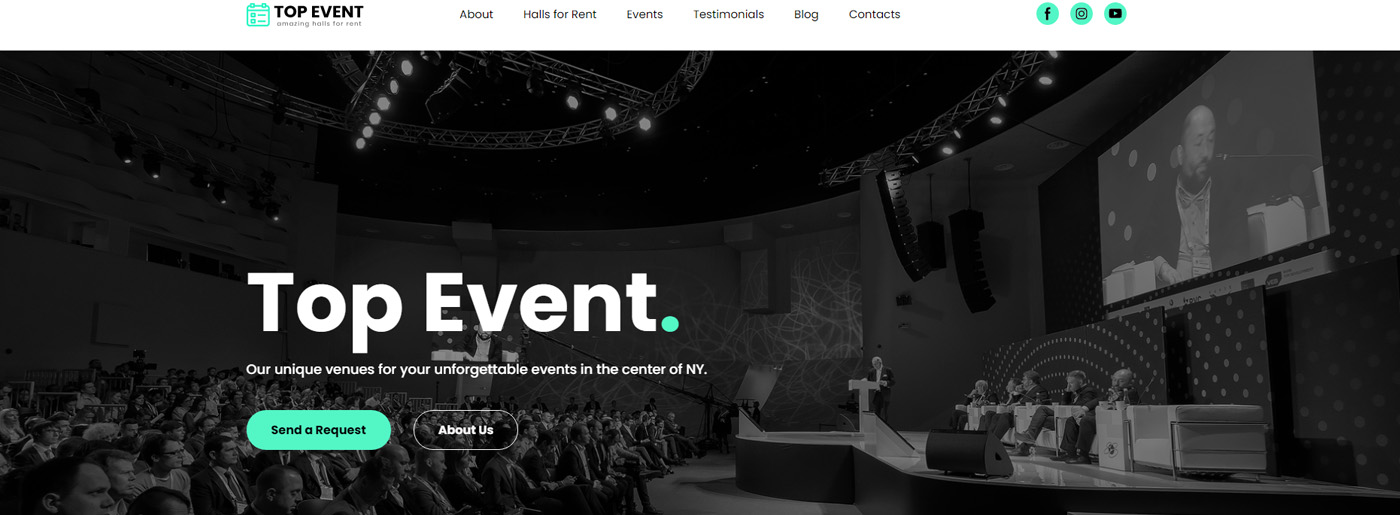
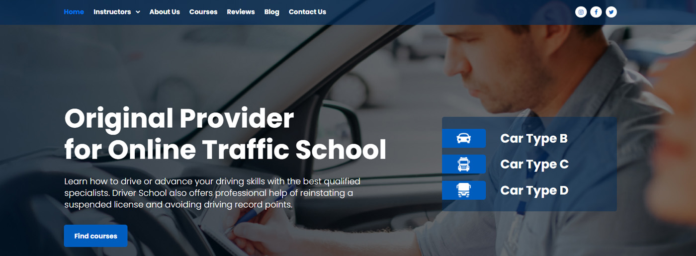
Photos and various images are the main elements of modern web designs. Most websites use large pics for the background, but those are no longer simple textures or patterns. Huge background sliders provide a good impression and make the visitors stay longer with the website. Still, we should warn you that they can worsen SEO and slow down the site, so you should be careful. Page speed optimization is a great decision in such a situation. Besides, such a design will not work for web app development. If you build a web app, you need to focus on a simple visual design that will not distract users from their goals. Beyond visual design, you should consider proper web app performance optimization techniques for the speed and responsiveness of your application.
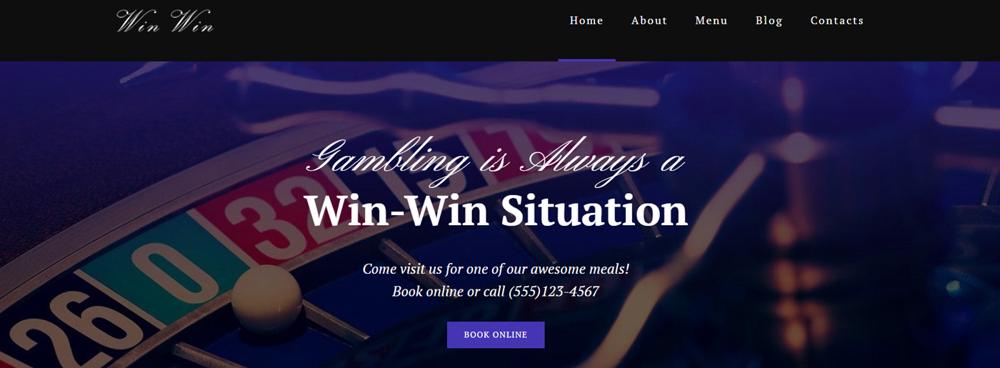
At the same time, attractive custom logo design and catchy icons allow the establishment of an emotional connection between the site and its visitors. For instance, photographers widely use large pictures to show off their work and draw attention to the websites.
Sliders and Product Highlights
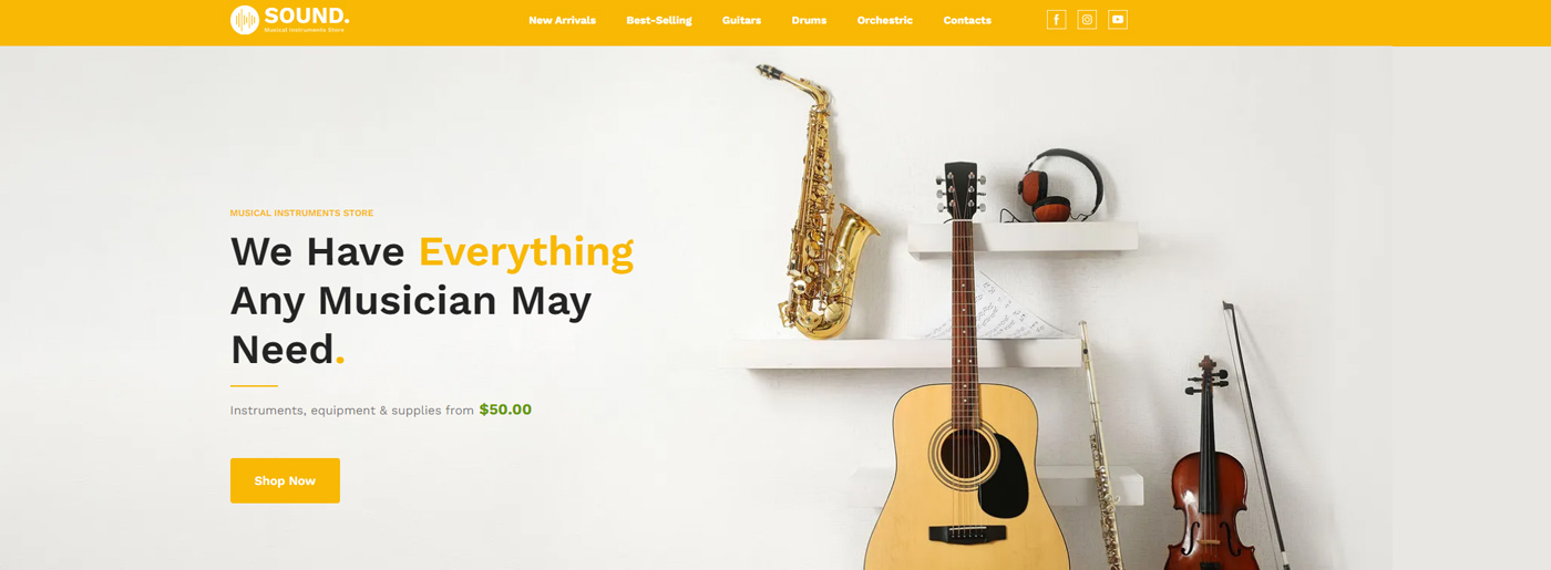
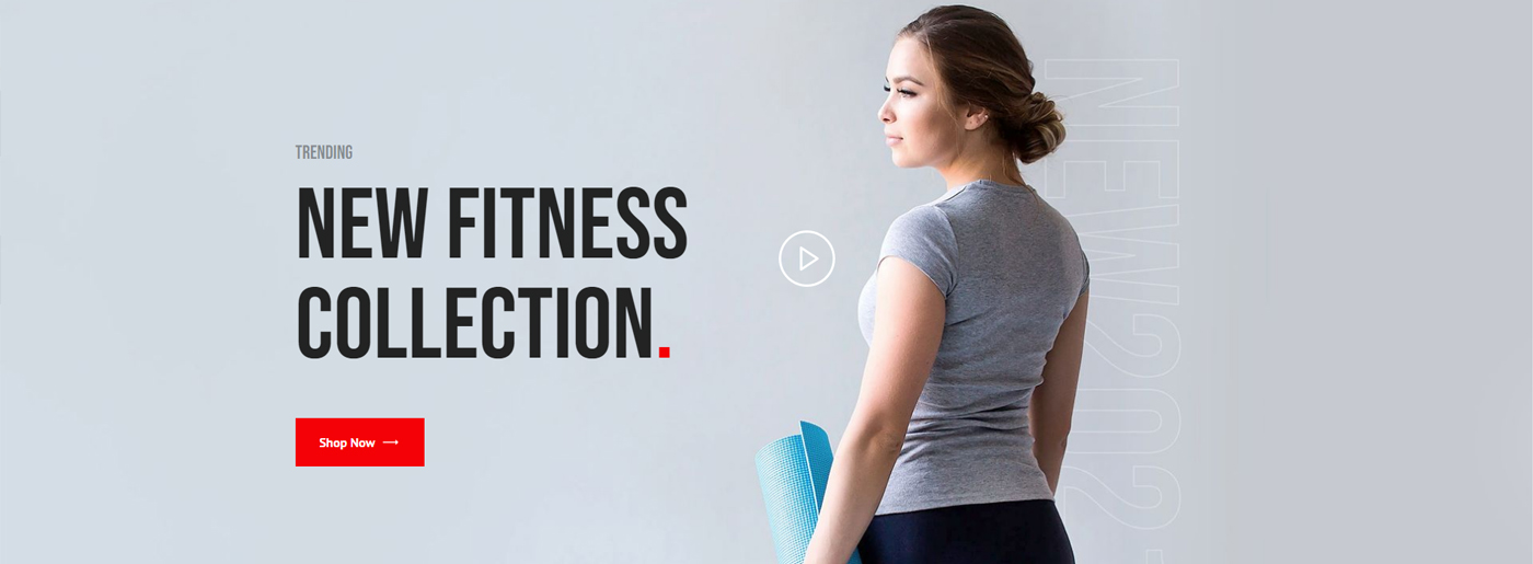
Large background pictures are a perfect way for retailers, designers, or manufacturers to demonstrate how the product may be used, its general features, or essential details. Thus, interior design websites may include large images for the background slider to present their best works to potential customers. Online stores widely use images and slideshows of their products as the primary means of content organization.
Video Content and Media
Video content is essential because it’s an excellent way to replace textual content without losing an informative aspect. It is usually used for the demonstration of product features and their essential parts. Cooking websites often use videos instead of writing detailed step-by-step instructions and recipes. Fitness and sports websites include video classes, interviews with celebrities, and product roundups. Some modern sites even use videos as the background to deliver their message.
Graphics and Visuals Go along with the Text
Besides the visual content vs text content battle, visuals and text should go in pairs. Without graphics and visuals, the text would be too difficult to read and boring. In contrast, visuals would be useless without text. Moreover, text content is crucial for proper SEO. Most websites offer home pages heavily loaded with visual content and links that lead to other pages with more text information. In such a case, visuals stand for small hooks that stop people with a promise to show more. After all, it’s recommended that a professional agency or team of specialists be addressed to get a comprehensive consultation and expert ecommerce SEO services to ensure visuals, texts, and technical elements enhance the website’s or online store’s SEO.
Infographics – Another Essential Form of Visuals
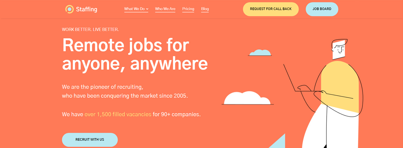
Its primary purpose is to simplify the presentation of complex material. Suppose developers of visual content use enough imagination and ingenuity. In that case, the data that could make up a complicated and tedious text will become a comprehensive picture with small verbal comments. With a successful implementation of the idea, your infographics will become a powerful marketing tool that is popular among media resources.
Also, infographics can help grow your business: share any information and customize it quickly. You’ll stay unique and build your brand awareness in such a case. Moreover, you’ll generate leads, improve SEO and provide link building.
How to Use Visuals Right
- Pay attention to the choice of its location – everything should look coherently and in the right place; fortunately, it’ll be easy with our pre-made blocks;
- Support images with descriptions – text without an image doesn’t attract, while the message of the image without text is not clear;
- Try to catch the user’s attention with the help of visuals that lead to critical elements of the page;
- It’s essential to decide where to buy images for website; nevertheless, try to refrain from using cliched stock photos;
- Avoid the low quality of visual content – undoubtedly, it’s better to get rid of image/video in case it doesn’t cause a wow effect;
- Do not use photographs with tiny details – their purpose should be clear from the first moment.
Mobile-Friendly Website Is a Must
Today, it is evident that mobile devices are the drivers of internet consumption. For specialized fields like healthcare, including oncology EHR (Electronic Health Records), a rich visual experience can significantly improve user interaction rates. Therefore, having a mobile site automatically opens the door to a larger audience. Thus, it’s essential to launch a mobile-optimized website. If you still don’t have a unique online platform, know that all MotoCMS and Weblium templates are responsive and look great on any device.
Summing Up Visual Content vs Text Content
With the growing use of mobile devices, it’s essential to fill websites with content that is easily perceived from a smaller screen. Thus, bright and readable visuals appear as a perfect idea. In any case, there should always be a balance between all types of content.
Besides, we want to pay your attention to the fact that visuals should be used wisely not only to attract potential customers, increase trust, and promote services/products but also regarding page loading speed, which is one of the ranking factors in search results.MotoCMS page speed optimization boosts website traffic and provides media content optimization, hosting settings improvement, and gzip compression enabling.













Usually posts some extremely interesting stuff like this. If youre new to this site.
we just did 46 hat
Hey there! I just wanted to ask if you ever have any trouble with hackers? My last blog (wordpress) was hacked and I ended up losing many months of hard work due to no back up. Do you have any methods to stop hackers?|