Visual Website Designs – Are People Tired of Reading?
With every passing year, website designs are getting more posh, polished and chiseled. When the visual supply is getting better and better, the global audience is becoming sharper and more demanding as far as visual perfection is concerned. Even the moderately web literate population demands to see innovative things that catch the eye and gravities eyeballs right there. Anything less is just worth nothing!

Research testifies that 94% of ‘First Impressions’ of online businesses are design related. Without a good design which pays profound attention to the most petite visual enhancement elements of a template, you simply are not allowed to expect a healthy volume of traffic on your website.
Most design masters would swear by the importance of colors, hues and simplicity with which a design is created. But there are various small and big factors that play significant role in deciding on the overall look of a web template. Things like the menu bar, the image and text orientation, the ‘catchiness’ of the Search button, the fitting pattern of an image gallery, many more such things are the base on which a strong brand can be built out of a simple website. We dedicate this piece of writing to a precise look at how three of these elements are being used in template design.
Menu Bar
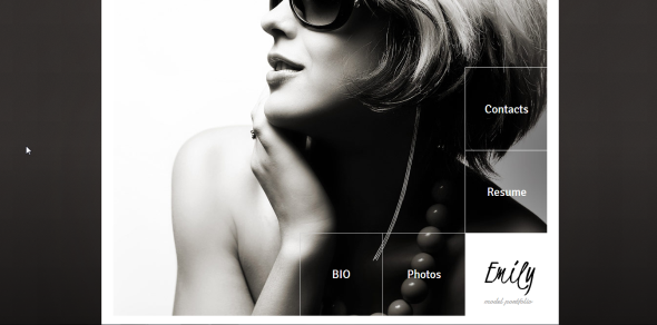
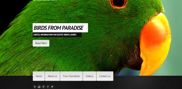
You might not have paid a lot of attention to the menu bar of the template that you have chosen for your website… Of course, we are all very familiar with the top horizontal arrangement of five to six small words! But the dimensions around which menu bars have evolved, are phenomenal. Starting from the shapes of the tabs, the shadow and hovering effects to as extreme an innovation, as changing the very position of the menu bar!
- Alignment
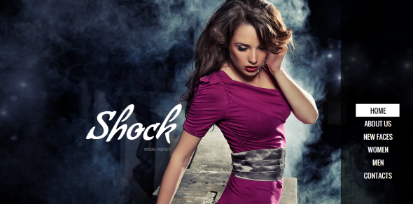
Apart from the conventional horizontal stuff, the trending ways to align a menu bar are the vertical and the zig-zag alignments. And you see most of these positive mutants in photography and fashion websites. They somehow beat in sync with these kinds of businesses.
- Position
Right, left, top and bottom menu bars are becoming common these days. The display enhancement factor of web templates is, to a large extent, decided by where exactly the menu bar is located. There are static menu bars as well, which, no matter how much ever you scroll on the pages of the template, will stay at the same position. Where you want your menu bar, depends on how you want your navigation and website clarity to be.
Icons and their Presentation
While extensive statements are getting obsolete, icons are emerging as the new replacement for words. Especially, flat web designs demand an extensive use of icons. Graphic designers and web design visualizers have come up with an icon for almost everything. These can however be used solely or as complements to text, depending upon what the communication motive is.
- Plain Icons
These are integral in flat and minimalist designs. Here, there is no text inclusion and no element of any visual effect, laden with the icons. These kinds of representations are very simple, easy to decipher, less time consuming and bang on, to the point. Businesses, which are crystal clear about what exactly they want to communicate, should go for sole iconic representation, since any translucence in thought depiction through icons can be misinterpreted by the target audience and bite out a considerable traffic chunk.
- Icons along with Text
This is a bit more elaborate way of showing your audience what exactly you want to convey. Most business owners like to seek solace in this kind of representation. The complementing text actually helps clarify things to a higher degree and remove any kind of confusion that could have been otherwise created by icons alone. The combo things however, should be well framed in the template, since a lot of text, randomly scattered around an icon would lead to the page looking cluttered. It is basically necessary to keep things clean, while still going that extra inch to explain things better.
Image Gallery and an Inbuilt Image Editor
This factor has the off lately, pulled on an elephantine importance in templates’ design. People want their images to be beautiful, well-arranged and overall effective. As such, many templates nowadays, come with an inbuilt image editor that eases out design task. You upload an image, tweak it till it suits your eyes and finally, publish it. It is possible to lend various effects to images, crop them, make adjustments in brightness and many more such things, without taking them to your Photoshop wall. This is an extremely handy development.
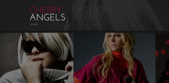
There are different patterns of Image galleries that have come on stage as well! The conventional ‘Click to go Next’ type of a gallery, hidden in some inner page is no more in fashion. The visitor wants the gallery right there, on the first page! And yes! That is the trend! If you have to show some good mind-blowing pictures, make them stand right on the home page! This reportedly increases the time people would spend on your website and reduces the bounce rate.
- Sliding Gallery
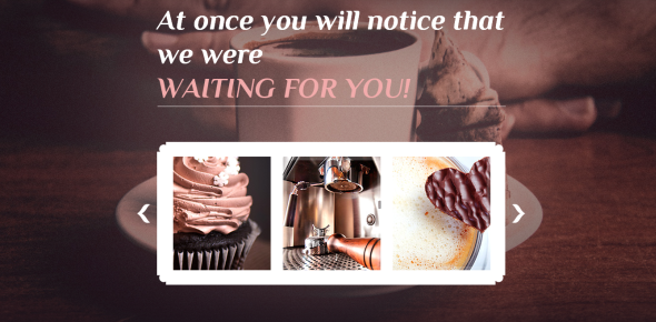
You will find a vast majority of templates that use this Gallery type. Images are basically arranged in slideshow format, so that they keep sliding out after a specified time frame. Sliding galleries are generally kept big and catchy at the bottom of the page. There is also an integrated provision to slide through the images manually. A sliding gallery is maintained in equilibrium with the rate at which our brains assimilate visuals. This makes them extremely soothing and holding.
- Strip Photo Gallery
Here, the gallery panel houses images, stitched with each other, such that the gallery wall appears more like a film roll. Images slide at their own pace and more than one image are displayed at a single point of time. You can hover the mouse pointer over any particular image to see it in a zoomed out state.
- Grid Gallery
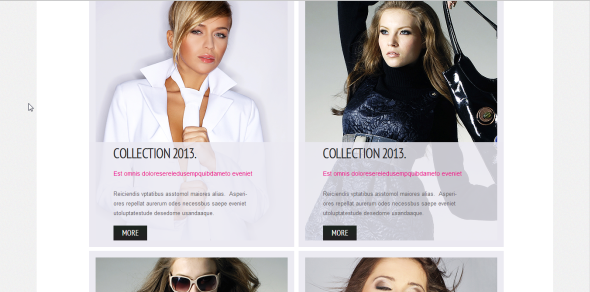
Templates housing a grid gallery are relatively rare. Images are arranged in grid format, either evenly over the wall or overlapping one another. This gallery type is trending. Expect it to make a frequent appearance in templates, in the years to come!
The ending voice – Design trends evolve at a quick pace. What is in today, will become obsolete tomorrow. However, there are certain things that stay evergreen. The above mentioned factors are some of those core elements that would keep determining the visual impact of templates, for ages to come.



[…] View post: Visual Website Designs – Are People Tired of Reading? […]
[…] Visual Website Designs – Are People Too Tired of Reading? […]