Styles in Web Design: Typography Based Websites
Typography makes up most of the content you find online today. Over the last several weeks, Moto CMS has been looking into various web design styles that are common today:
How to Create a Wonderful Clean Website Design
An Introduction to Realistic Web Design
Unconventionally Fresh: Grunge as a Style in Web Design
Today’s post will focus on typography-based web design and what it can do for a website’s impact in regards to its target market.
It’s estimated that over 95 percent of the internet is made up of text content. This means that typography has to play a large role in the creation of a website if one wants to have the intended impact as well as beat the competition.
Typography simply means the style of font that’s used to present content. Over the years, this is a craft that has evolved by leaps and bounds to become an essential part of web design. There are two types of fonts that govern the world of typography.
These are:
- Serif fonts.
- Sans serif fonts.
These two have a few differences which are obvious to the naked eye. For instance, sans serif fonts are plain and unassuming, without embellishments. This makes serif fonts easy to read, making them great for the main content in a website. Serif fonts, on the other hand, have little ‘feet’ or arcs at the ends of the edges of their letters, giving them an artistic flair. While this makes them aesthetically pleasing, reading content written in serif font can be difficult since this font doesn’t translate well when it’s used to write walls of text. That being said, they are ideal for headings or titles since they’re catchy when blown up font-size wise.
Typography-based websites use different fonts to come up with something eye-catching and impressive. However, it’s important to note that using too many variations of fonts in a website may make a reader feel overwhelmed given the contrast differences that they would have to deal with flicking through different pages on the website. One important rule when creating typography-based websites has to be to exercise moderation when using fonts. For example, one can decide to use a single font type for all headings and titles, another one for the content and one more for additional information prompting web visitors to check out various sections of the website.
There are various other things you need to consider when choosing fonts for your typography-based website. Here are a few of them:
1. Contrast
This has got to be one of the most important factors to consider when choosing fonts or typefaces for your website. This is because contrast helps letters stand out from a computer, tablet or mobile background, making it easy to read content. Using two similar fonts side by side may makes it hard to read content. At the same time, juxtaposing fonts creates tension between them, drawing the eye of the reader towards the text, thus making it easy for them to read it.
2. Message
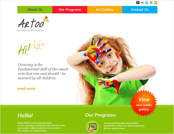
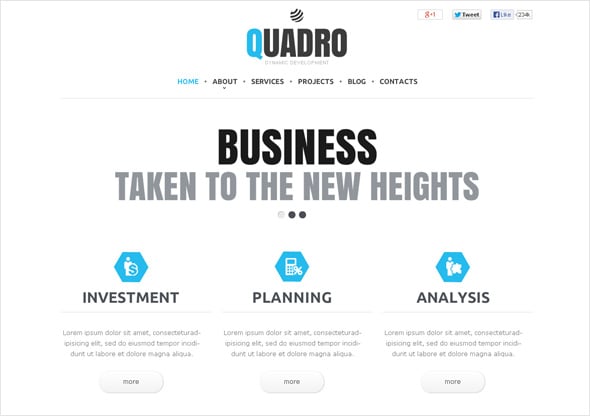
It’s important to pay attention to the message you want to convey. This will help you choose the ideal font to use to ensure that your typography is in line with your message. For example, if you have a children’s site, built with a website builder, where you’re selling toys and kids furniture, you’d be better off with serif typeface as this will give a sense of playfulness and fun. At the same time, if you have a website selling stocks and giving advice on trading options, sans serif fonts will give you that business-oriented theme that will inspire a sense of respect and authority among your readers.
3. Pairing Typefaces
If you’re undecided on which fonts to use due to the sheer number of typefaces available at your disposal, you might want to choose a serif and sans serif pairing which looks similar. Take a look at the example below:
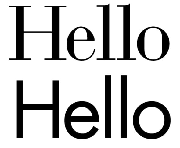
The fonts above have a similarity and difference which makes them ideal to use in a website. This simplifies things as well as gives the website a uniform theme from the titles to the content font. This will give the typography a common theme which is ideal for content-heavy websites.
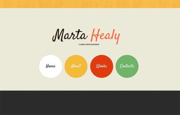
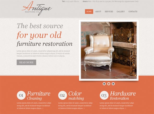
Also, look out for fonts which were created under the same principles such as the ones featured in the image below.

Typography is such a sensitive matter that it can break a website. Ensure that the font you use in your typography-based website is easy on the eyes, and that it doesn’t take away from the content and message that you’re trying to convey.




[…] Styles in Web Design – Typography-based Website […]