Web Design Trends 2020 – Top 12 You Need to Follow
Can’t believe it, but it is true. The web has turned 31 years old now! And we have seen varieties of websites surfacing on it (coming & going) – from bland HTML ones to flash media websites to AI-centric automated websites (the chatbots one?). We have come a really long way. Transitioning websites according to the latest web design trends has become a lifeblood for every digital business (literally everyone). Because these new web design trends each year are created or approved by your internet users or more specifically, your would-be customers only. And in this fiercely competitive market, you can’t fail to dissatisfy your “future customers”, would you? Just like previous years, this year too, we have some mind-blowing web design trends 2020 prowling around, making a huge impact on the website’s growth in terms of customer engagement, brand value & revenue creation.

12 Amazing Web Design Trends 2020 You Shouldn’t Skip
It may sound weird but – “Website design is like a joke, if you have to explain it harder, it won’t make any sense”. Similar to a joke, your websites need to be effortless at the first look, self-explanatory in the second scroll, and convincing to explore & take a further step (like your joke would, to make them laugh) at the third look.
Without much waiting, let’s get into the 12 amazing web design trends 2020. They are effortless to follow, self-explanatory to look at, and convincing for visitors to enter the sales funnel.
1. Bold & Vibrant Colors Are In… More Than Ever
This year, we are seeing bold, bright, flashy colors taking the forward leap. The full bold colored websites with undertones of contrasting and less vibrant colors around the edges of images & texts will be big this year. The designers today are focusing on creating a web design that creates an equal experience for everyone. A color scheme with little contrast of a different color that people even with special abilities can feel and enjoy.
You can add bright colors to your website palette too based on the theme or vibe of your brand. Don’t choose a color that’s totally non-relatable to your niche.
2. Web Design Trends 2020 Make Chatbots More Obvious & Much Powerful
This year, chatbots will be mainstream and much more efficient at reaching visitors’ quey (all thanks to evolving AI & machine learning). The chatbots will be much more customized than ever. Also, they will appear as if there are real business reps behind the screen. Moreover, they will be in more loud & popping colors. They will reach faster & better at users’ silly to crucial queries with a personable face (maybe of business rep, cartoon character, or some mascot for the brand).
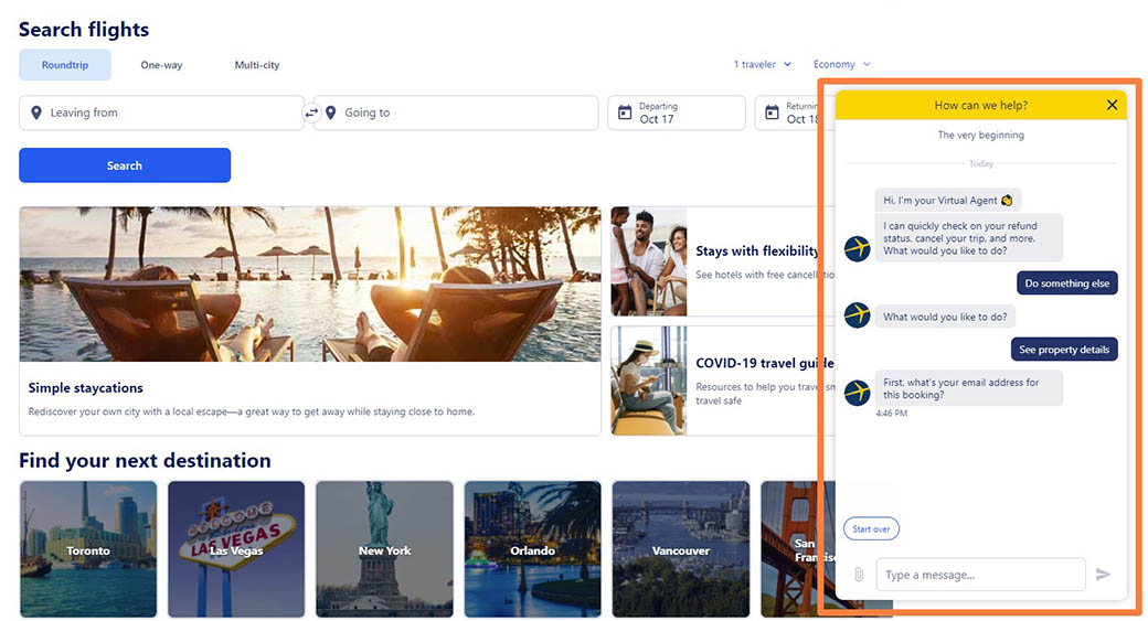
Chatbots are of different types, the ones with choice based questions, the humorous ones, etc. Additionally, you can choose to script the chatbots per your brand’s conviction & image in the market by partnering with any professional company for web design.
3. Motion UI – Graphics Will Not Be Just Still
Motion UI is another soaring trend, from which websites can’t keep hands-off. The graphics with slight to full swing animation can add a volume to your simple & static website. This year, websites will be all about winning the users’ hearts with animated graphics at the micro-interactions of the website.
Mobile UI can be added in a mobile screen picture as a moving mobile screen, or on a clothing eCommerce website, where the model gives a 360 turn in product pictures to give buyers an interactive & appealing look. You can experiment with Motion UI anywhere on the website from top to bottom. However, animation should be approachable and should be neither too fast nor too slow – to make sense to website visitors.
4. Web Design Trends 2020 in Color Palettes
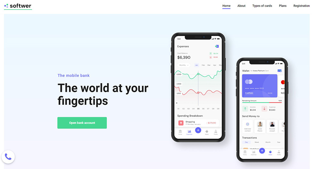
Every year, there is a new color that dominates the web design trends. According to Web Design Company experts, yellow was the main color for 2018 trends, blue for 2019 trends, and this year, it is said to be the cool & breezy color “mint”.
TRY FOR FREE
Apart from just mint or any particular colored websites, we are seeing designers taking the websites to a whole new level with gradients – that has hues of a different color. It is best for businesses that can’t point fingers at just one solid color scheme. The gradient fluid will give more depth to the viewers in the first look.
Another color trend will be based on your brand theme, type, and target customers’ behavior or thinking pattern.
Like:
- For information & other backgrounds – Colors like soft grey, teal or blue will be a great match to make the content part more readable for users.
- For CTAs and buttons – Colors as warm and flashy like red, green, orange will be much triggering to click on those buttons.
If you are unsure of what color scheme to follow, your company for web design can help to find the best color palette to splash over your website type.
5. Fonts in Web Design Trends 2020 Are Bold and Edgy
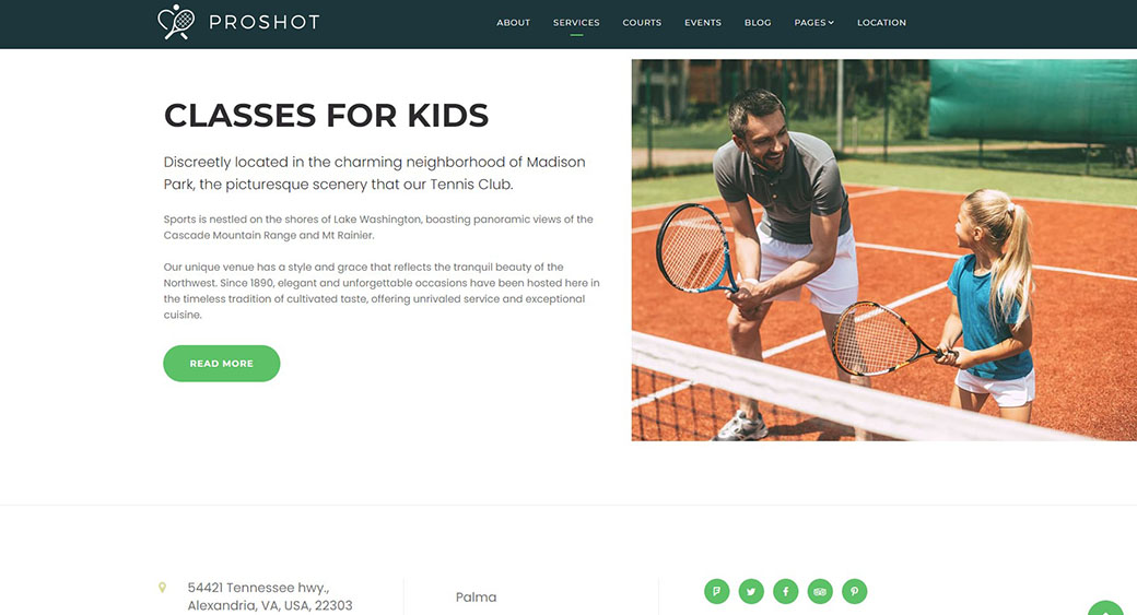
San-serif and serif font are the two popular fonts. They will see a continued use this year too with outlined or more dark colors to make them stand out. The bold and broad fonts in landing page headings or subsection headings will steal the users’ attention in a thunder.
The fonts in the website’s banner or header will either have solid colors or some still or moving illustrations to make a lively connection with the visitors. The fonts will stand out on the surface of either light grey or other soft colors or extra edge pop-up colors.
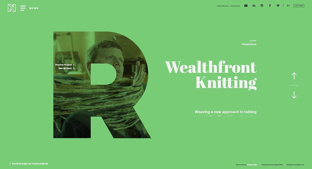
Also, note. You have to decide the typeface & font type based on your brand’s notion, the company’s overall goal, and your audience’s behavior pattern.
Ask your web design company to choose a font and typeface that’s easy for readers to read as readability also counts big in the enhanced UX. Avoid adding complex and cursive fonts as it might confuse the readers and compel them to move out from the site instantly.
6. Minimalism Still Looks Full
Minimalism is a classic and never-getting-old design concept. A minimalistic design means fewer web elements, content, as well as more white spaces, and limited typography. Consequently, it gives the user room to think and explore the website much better.
This year too, the trend of minimalistic design is shifting from previous trends and despite being less, it will be more to the visitors.
You have to pull in minimalism with a lot of care. Make sure the design is understandable and has basic things that a user expects over your website. Keep the images, animation, content limited but in a way that readers are still able to connect the dots to satiate their queries & fall into the sales funnel.
7. Videos Are Dominating in Web Design Trends 2020
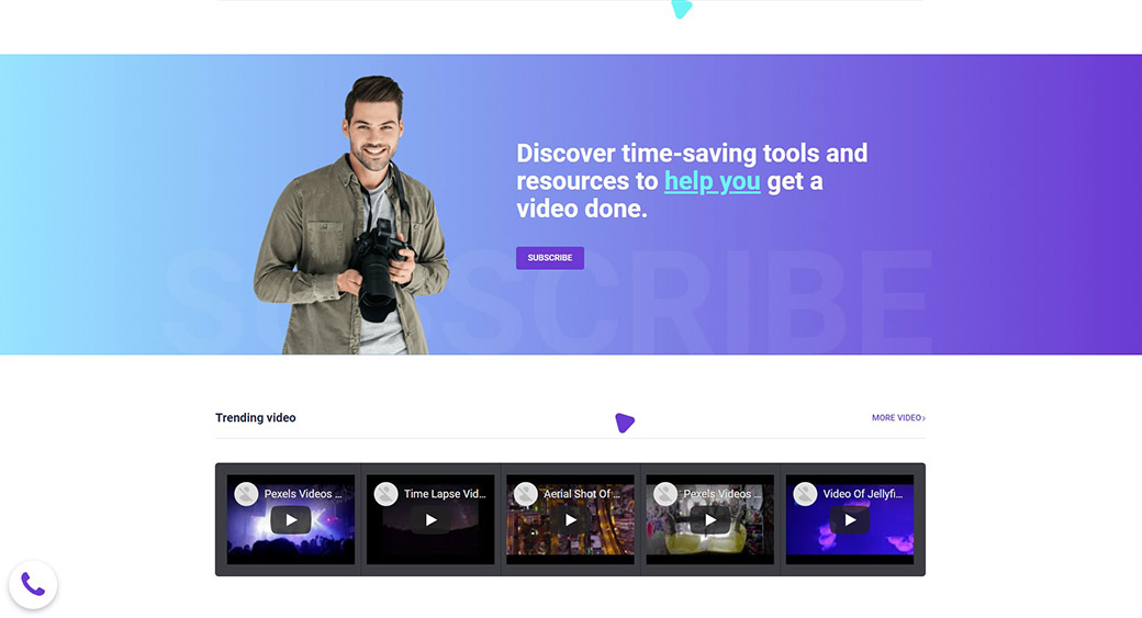
Videos are the timeless & most classic thing to add to modern web design trends. Try having a combination of text, visuals, and audio-video content. It creates a balance and caters equally to both the “patient” and “on-the-go” readers.
Readers who don’t have much time & are looking for information on the instant, for them, videos portraying the brand message, animation, or small collage of photos can create a long impact on their choice to stay and explore that website.
A general user loves a website that can showcase its content or offer – in other than just a boring wall of text. Companies today are exploring video-based content and are integrating such videos over their interfaces to serve on-the-go aesthetics.
You can add videos about anything, like product description, use, tutorial, step by step guide, social messages, and brand story. Likewise, you can even integrate your Youtube videos to look like a very well-established brand.
8. More Interactive Micro-interactions Are in Focus
Micro-interactions are the small actions or interactions throughout the website that grab the eyeballs of readers. Additionally, they attract visitors to different sections or elements of the website. Think of the red icons displaying the number of friend requests on Facebook. Or, remember a beep sound on refreshing the Twitter page. All these small icons before any text are all sorts of purposefully-done micro-interactions.

This trend is clamoring this year too. Actually, it is the best way to transfer the information or message to the audience with a more appealing UI. You can decide any type of micro-interaction at different sections of your website. Yet, you have to ensure they are creative, not overdone, gives a subtle overall UI look.
9. Increased Attention to UX and UI – Hand in Hand Web Design Trends 2020
The modern web design trends are showing support to UX (website functionality) and UI (website’s creative interface), congruently. This year, websites with smooth functionality along with impeccable UI are in more limelight. The web design company is focusing on creating a website that gives glitch-free and completely smooth user experience, with:
- Less cluttering elements – more of white space for breathing
- Navigable, easy to read and SEO-optimized content
- The fast loading speed of the website
- Balance of rich multimedia as visuals, infographics, videos, 3d illustrations & more
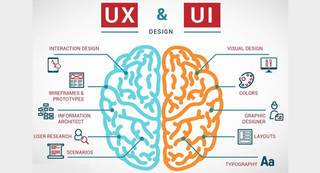
And to keep the user experience in great momentum, designers are focussing on creating more edgy and intuitive interfaces to maximize the UX of visitors with:
- Transcribing the videos
- Adding a caption of the image
- Making voice-supportive interfaces
- Having balanced UX motion & other animations
- Easy to skim content framework
- Removing cluttering elements or features that are not necessary
- Mobile responsive interface (more than 50% of internet traffic comes from mobile devices)
10. Web Design Trends 2020 Include Illustrations Tailored to Tell a Brand Story & Beliefs
Modern websites have a range of multimedia, from visuals to illustrations to stock photos to icons. They appear on the website not just to bring more colors or visual appeal to readers. In fact, they are used for a much bigger purpose.
And that bigger purpose is to weave an exceptional brand identity. So, you can achieve it by telling a brand story, beliefs, use cases, or thought- process from the core level.
If you see NPO websites, you will notice how such websites are surfaced on top of positive deeds & optimism, such websites’ pictures deliver an out loud message (about helping the marginalized communities) for visitors.
You can have a splash of real photographs or have vector collections. Additionally, you can try street-art inspired graphics, icons, or illustrations that truly encapsulate your brand’s identity and visions. Ask your web design company to weave you some high-quality images or visuals. The latter should correlate with your brand and have a purpose to convey to the readers.
11. Large Elements Are “In” in Web Design Trends 2020
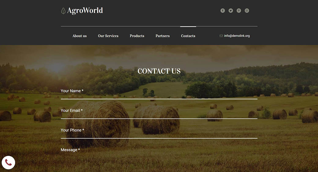
This year’s theme is all about going for bold, big, and users’ screen size elements to deliver a fuller look. This year, the contact forms for businesses too will have a broad appearance.
The contact forms are for picking a product inquiry, signing up for a service, service analysis, and much more. Users generally ditch the contact forms due to their limited size. This year, we will see websites going for full-length lead forms. They will be visible enough for users to fill in, without ditching them in one-go.
To make the forms appear less tedious or boring, you can add micro-interactions around as. For instance, try showing procedures to fill the form, some additional words to inspire people to fill up, if it is a lengthy form, divide that into different sections & give interactive scrolling buttons at the bottom.
12. Luminous, Fluorescent 3D Artworks Are Calling in For Great Attention
3D images and artwork have been there around the block for quite a long now. But this year, we are seeing the luminous, fluorescent, or neon-colored 3D visuals taking an edge more than ever.
The neon colors visuals or illustrations in the 3D effect on top of the minimal and basic template are grabbing the users’ attention much widely.
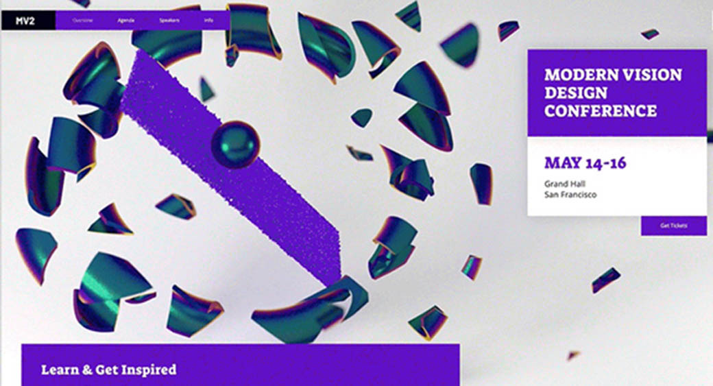
3D artworks are more prime this year to give the website more intense interaction with users and neon colors to give that lively & energetic look to the website layout. Together they combine to give an edge or personality to any UI.
P.S. While going for this trend, ask your company for web design to use the collection of neon colors in cohesion & moderation and scatter them around the overall UI. Too many concentrated neons can create a dizzy or noisy look. Surface these artworks on primary & subtle colors like white, grey, or light blue to make that artwork highlighted promptly.
Final Takeaway on 12 Modern Web Design Trends 2020
Each year new design trends come and go. If you fail to follow them, your scope for winning impactful brand identity and sales may be long gone with that obsolete trend too. Netizens love exploring a website that steps out from its comfort axis and has something spontaneous to offer (according to changing trends). They longer like a website that was made long years back and hasn’t changed anything to participate more actively in its audiences’ concerns & beliefs.
We just chalked 12 amazing web design trends 2020 that your website too needs to address – to be counted as a genuine and evolving brand – that your target audience expects you to be.
Are you determined not to put your audience’s interest down? Follow the above and many other stunning web design latest practices. Also, you can also for the help of a professional web designing company.

Leave a Reply