Those who have even the slightest idea about where websites borrow their beauty from would be quite frequented with how important website templates are. A good template is actively responsible for holding visitors on the website. But as the general audience is growing more sensitive towards the look and feel of websites, it is becoming increasingly important for web templates to stay up to date with fashion and fulfill the hunger for a visual treat. Templates have to follow a cycle of dissolving and evolving. Web design trends of 2014 will bring to life the evolution of many great looking template designs. Let’s review some of these trends.
Minimalism
This style has met wide acceptance world-wide and is supposed to stay on the stage for years to come. A minimalist template would basically not promise you much but will in fact provide a lot. It revolves around just one principle – a clean and uninterrupted navigation is the sole right of a visitor. Thus, with a minimalist template at your disposal, you can safely ensure that your visitors are not getting distracted and driven away from your website because of stuff like unnecessary cluttering, piercing colors, a fantastic circus of fonts, flashing pop-ups, self-suggesting images and a lot of other things that we are conventionally used to stuffing our websites with. The main reason why minimalism in web design and in templates are grabbing so much attention is the fact that people have literally grown tired of anything that resembles promotion. Stick an automated pop-up, and your visitor would not give you a second chance. Many businesses have realized the tonnage of damage that is caused to their traffic and conversion due to a cluttered website. So anti-cluttering has become an imperative approach.
Flat UI
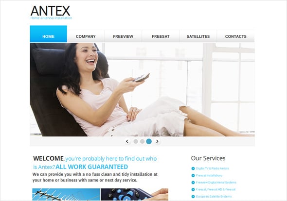
A flat UI is an extreme of the minimalist type and the web design crowd has absolutely fallen in love with it. There is no gradient, no 3D effect, no dingy-dangy additions to create awe in visitors, no fabulous images to complement your text, no other fancy stuff that no one can prove to be useful. It’s just plain text, embedded in a sensible selection of geometrical patterns. The small images that are iconic in nature, just to communicate the message to the visitor. A flat UI is extremely easy to understand and to go through. And most importantly, visitors do not feel load on their immediate memory. It is all very organized and clear. Although critics have blamed this web trend to be boring and extra-clean, we still can completely certify its presence in the 2014 web design arena.
Large Background
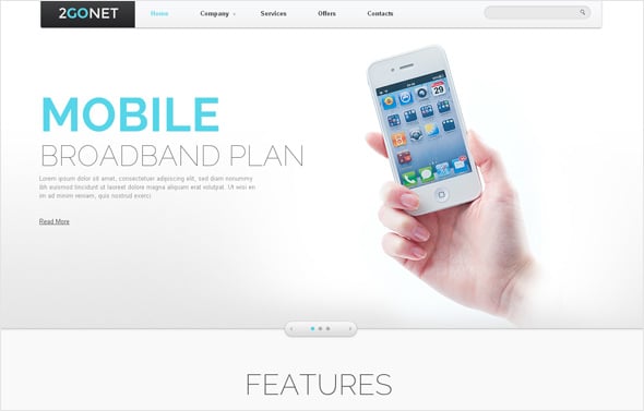
This is really trending these days and is supposed to stay on for a comfortable span of time ahead. A static large background helps a visitor to immediately connect to the business. Imagine this… When you open a website and you have a big good clear background of a plate of pasta, what would you think it to be? I would confidently say, “These people are great at pasta!” When we look at an image, our mind subconsciously enters a conclusion and prepares a list of ‘to be expected’ factors. Big background images, chosen in the right manner, can help you target your audience bang-on! More importantly, a large background, whether in static or in slideshow mode, eradicates the necessity of including smaller images here and there on the website. The complete motive is to direct the focus of audience towards what is written and conveyed.
Fixed Header and Body Sections
Scrolling is a pain at times, specifically when you do not find the proper navigation links at the place where you have just stopped scrolling. Though this might seem to be a pretty big of an issue, it would not be wise to ignore the amount of traffic that exits a website just because of navigational issues. While the conventional way out has been to include a “back to top” button, right at the end of the web pages, it still remains a problem for those who want to navigate to some other page before reaching the end of the page they are currently on. A wonderful solution would be a fixed header. So no matter how much you scroll, that header would always be there at an easy reach for a better navigation facility.
Vertical Content Alignment
Well well! This is something entirely new and there are actually very few current users of this template, compared to the acceptance and usage of all other templates. While in most cases you would find a horizontal alignment of all kinds of resources, including text, image, contact form, everything; in vertical alignment, all of it is vertically arranged. So whatever you click on, quickly gets aligned. Yes, it is not ordinary, not common, but it is definitely very refreshing to the visual sense. Vertical alignment is set to stay on for quite some time.
On an ending note, 2013 has seen a number of successful and widely accepted template trends. Some of them would be carrying forward their merits into the New Year while others would be left behind, to be replaced by better ones. The list of “the end of the year” prospective rulers for 2015 would be large and extremely impressive with a whole lot of new features and functionality. What’s your thought on this?


