Website Examples Built on MotoCMS – Check Out Astonishing Sites
Do you want to share your services or products with the world but still have doubts? Nothing is impossible with MotoCMS’s intuitive website builder. Check out our collection of spectacular website examples and make sure that launching a website has never been so easy! Meet our regular column with the hashtag #madeonmotocms to learn about our clients’ experience, check out awesome website examples and all the benefits of MotoCMS website builder.
MotoCMS Website Examples – Safety with ANT Cars Sp. ZO. O.
Meet a proven brand with many years of valuable experience on the Polish market that has chosen the MotoCMS template to create a beautiful site, convenient, functional, and pleasant to use. ANT Cars Sp. z o. o. offers roadside assistance throughout Europe, high quality of service, and low price.
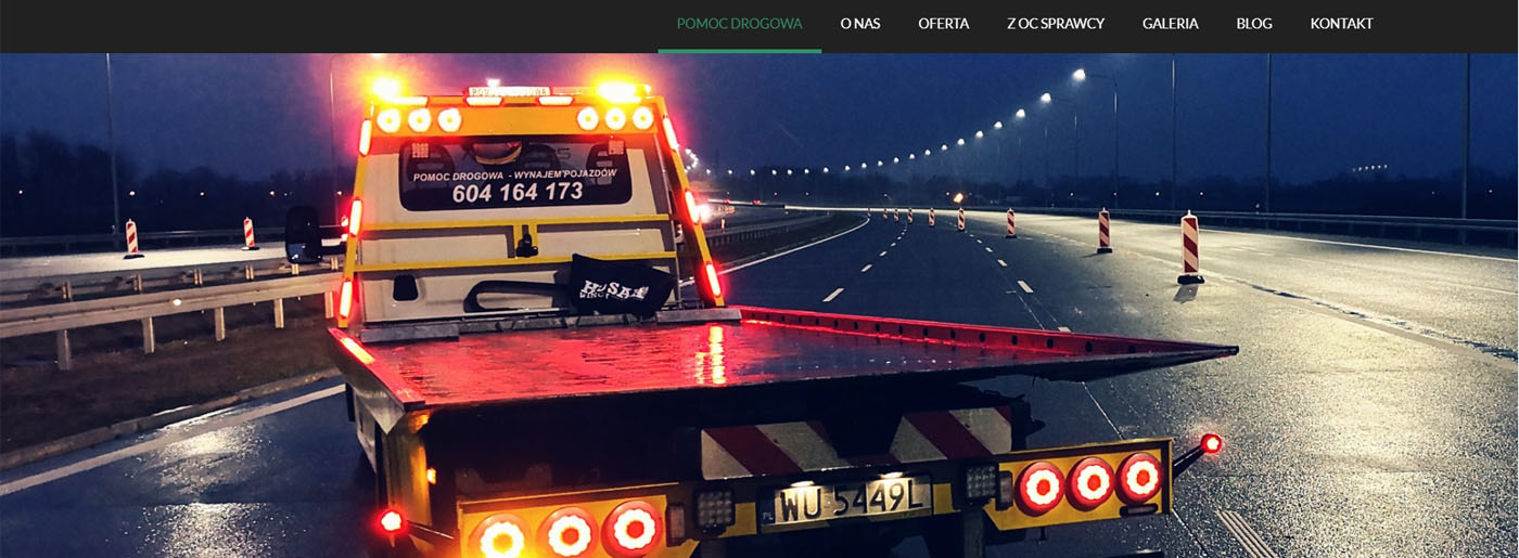
A Competent Approach
The company has taken into account:
- audience analysis to create the most suitable conditions for customers;
- user-friendly blocks for visitors’ convenience;
- impressive content (detailed information);
- unique icons to share their services and the area where they provide them;
- green and black colors to present the website’s design;
- social media integration buttons (Facebook, Instagram, Youtube) to promote their company;
- call-to-action buttons with a map;
- a page About us to mention the history of creating their business and enumerate their strengths and reasons for choosing them;
- Gallery to present their work;
- qualified SEO optimization;
- Analytics tools to get data on traffic and user behavior on the site;
- trustful meta description.
Site Interface
ANT Cars Sp. z o. o. presentable appearance attracts visitors, and the ergonomic arrangement of tabs and services makes the resource intuitive and understandable for every customer. Thus, convenient navigation and use of site services are their highlight. With MotoCMS, it’s easy to make the resource genuinely successful and maximize results with minimal effort.
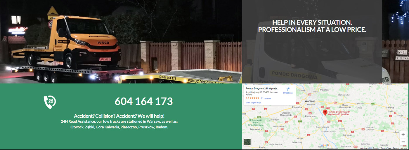
Website Design
The content design and collection of all graphic elements on a web page are thought out to the last detail. Visual design, user convenience, analytics, and competent information structuring make the site stand out from the crowd. Thus, it facilitates user interaction with a web page, positively affecting conversion and behavioral factors.
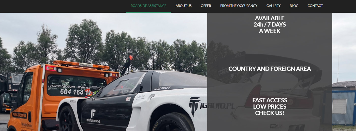
Adaptive Platform
A website is a marketing tool representing a company on the Internet. A client who lands on the page should easily and quickly find the information he needs; otherwise, he will simply go to competitors. For ANT Cars Sp. z o. o. It isn’t a problem, as responsive web design ensures that web pages display correctly on most devices. The user can view the page from a computer, tablet, or phone screen, regardless of their resolution.
In conclusion, a thoughtful design creates the right impression of the company. At the same time, competent construction of this site allows the owners to gain a competitive advantage and take high positions. With MotoCMS flexible templates, you can arrange content, primary elements, and blocks on the site in the blink of an eye.
MotoCMS Website Examples – Studying Easy with CHEMPOP
Meet CHEMPOP, a landing page with a nice and attractive design. It is an educational platform specializing in the chemical sciences and bringing innovative, capable scientists into society.
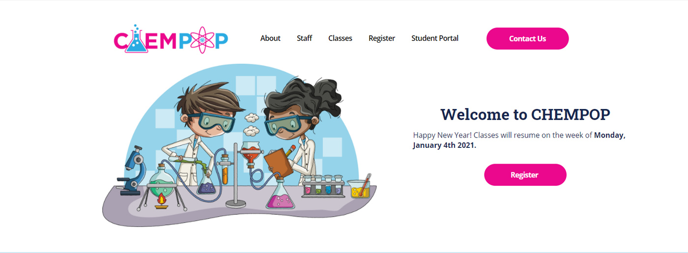
As we know, one-page sites are usually created with a specific purpose – to attract a target audience, and we are sure that CHEMPOP has coped with this task. It has drawn attention to the product, company and increased interest in receiving even more information, performing the desired action (subscription, request, call).
Website Examples – Why Choosing MotoCMS Is Their Good Decision
Attractive Design
Lovely images ideally match the topic, while blue and pink colors make you trust easily, and it becomes clear that the site is for students. Thus, color is one of the essential components of web design. The competent use of colors in the design of this website creates the necessary impressions and emotions that emphasize the company’s style.
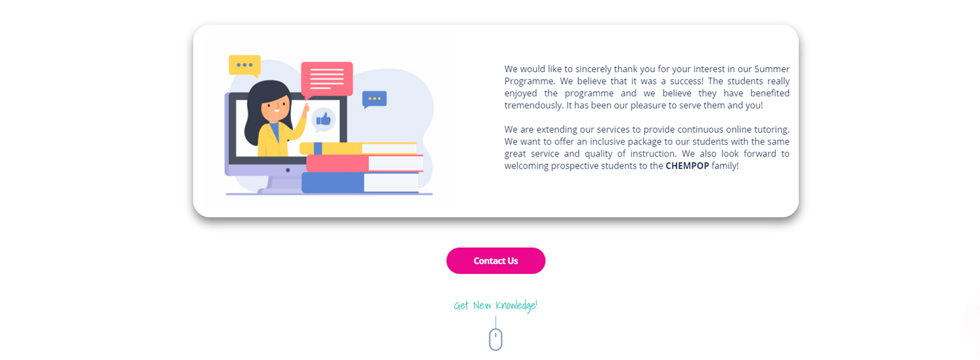
Moreover, the site is adaptive and looks perfect on all devices, guaranteeing full audience coverage. Another advantage of MotoCMS websites is fast loading – even on slow internet, landing pages load quickly. Understanding the meaning of color is necessary to convey specific information from the site to its users and visitors most effectively.
Structured Content
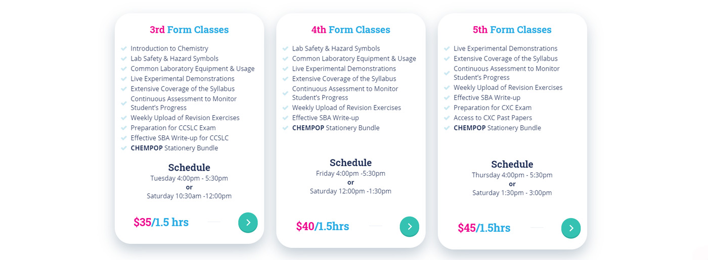
The schedule of lessons for different classes and their cost is indicated. The visitors can also read the information about tutors, their qualifications, interests, passions, and goals, and look at their photos, which is important when choosing a teacher. Moreover, since the landing page is targeted at a specific audience, its conversion is several times higher than that of an individual site.
Contact Us Buttons
Undoubtedly, it encourages making a choice faster. Moreover, WhatsApp, phone number, email, and the form at the CHEMPOP site are indicated to make an action.
In conclusion, MotoCMS templates can make life much easier for a business. A landing page can be created in a matter of hours and edited quickly and independently in a few minutes, as it doesn’t require programming or coding skills.
One-of-a-Kind Tenmasa Restaurant
Tenmasa is a marvelous landing page presenting the first restaurant in the Kuala Lumpur city center specializing in Japanese Tempura.
Eye-Catching Visual
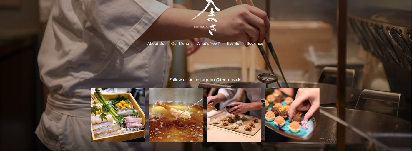
Beautiful photos and exquisite design make this site unique. Images are an effective tool that evokes users’ emotions, forms a product image, and increases sales. Thus, the correct use of images can improve the design itself and increase the site’s conversion rate. Also, images corresponding to the site’s general concept match the selected color scheme and are consistent with the restaurant theme.
Website Pop-ups
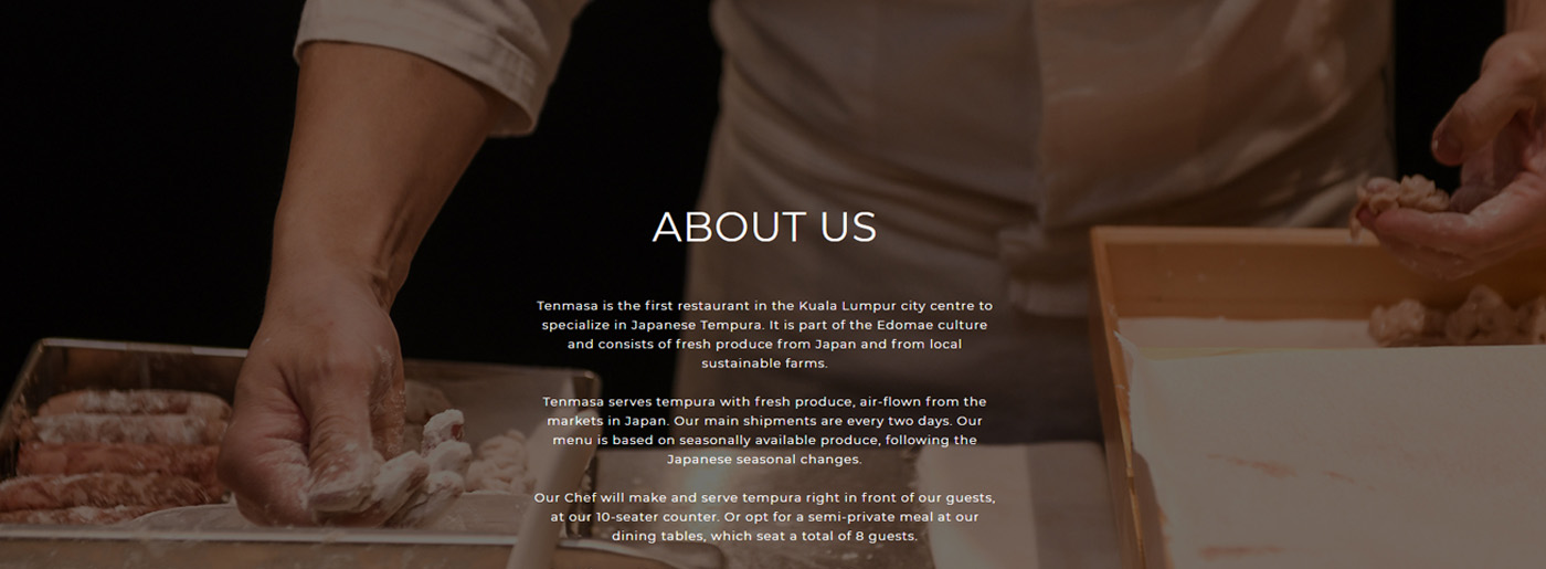
The Tenmasa uses a reliable and helpful internet marketing tool that informs visitors about the restaurant’s story, menu, upcoming events, and contact information.
Social Media Integration
If your business requires a rapid influx of visitors, prompt response, and an additional communication channel, your project’s integration with social networks will be an excellent solution. At the Tenmasa site, we see social media icons leading to their site’s “representation” on social media, which attracts additional traffic and increases the number of regular subscribers and backlinks from social networks (which search engines love).
Presenting Contact Information
Restaurants need to present potential customers with all the necessary information. Therefore, here we see:
- Address;
- Telephone;
- Whatsapp;
- Email;
- Opening Hours.
Besides, the correct design of the Contacts page on the site affects not only user behavior. The presence of some elements and data is taken into account by search engines and positively affects website promotion to the top.
All in all, the site is divided into semantic blocks with astonishing visuals and content that attract the client’s attention.
Top Website Examples – Comfort with Space4SENSE
Space4SENSE is truly created for people and their convenience as every detail is thought out. This welcoming, light, and discreet design is endearing while the content is perfectly sorted out. The owners managed to convey the atmosphere of ultra-modern space that harmoniously combines modern technology, comfort, quality, and a relaxing pastime with the MotoCMS user-friendly template.
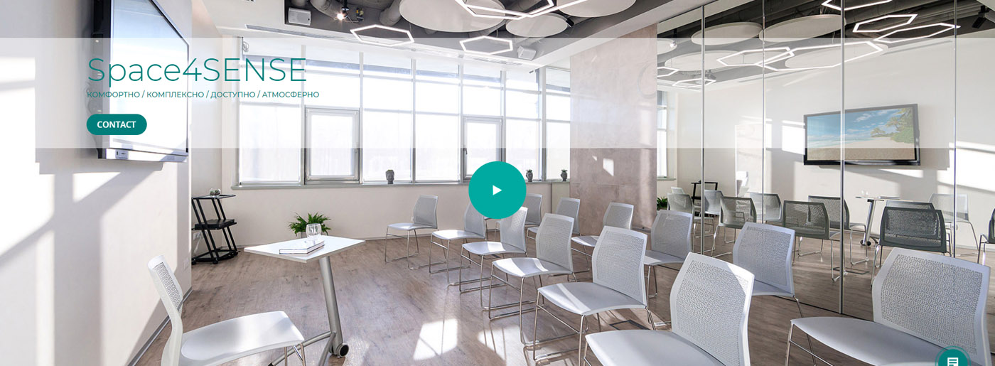
This company offers different locations (modern, comfortable rooms for meditation, psychological, intellectual, and physical practices), advanced and modern equipment, a unique atmosphere, and a high level of service. With the help of MotoCMS website builder, Space4SENSE:
- presents who they are and their strengths;
- shares their values and uniqueness;
- describes all their services briefly and clearly so potential customers want to learn more.
Easy-to-use Blocks
All the information is structured and presented in the best way with the help of an extensive collection of ready-made blocks that you can insert into the page, replace text with, and publish. Thus, the owner just added his content, and it didn’t take a long time. He also used bulleted lists for convenience and call-to-action buttons, which play an essential role in website building.

Best Website Examples – Let’s Look More Closely at Website Pages
Online
This is the page that presents video content services(comprehensive support of video shooting and broadcasting). Despite eye-catching photos and videos, one-of-a-kind icons for filming locations, equipment, professional video filming, etc., make the page unique.
Locations
You can choose from subpages like Space4SENSE thinking, meditation, mind, connection, relax and view all the spaces’ descriptions.
Prices
This page is one of the most important as people know how much money they’ll spend. Moreover, the prices are indicated per hour/ day/ month/ number of square meters, etc., with photos included.
Gallery
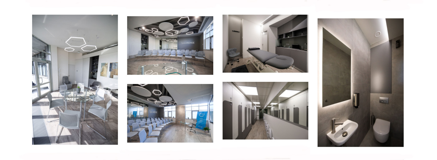
Here we see the eye-catching photos and videos of every room, every centimeter, which impact our decision. Even the videos of a coffee machine, curtains, and equipment are present. Also, one of the most exciting solutions here is the use of sliders in web design. The most crucial information that the user receives on the site is clear, concise, and visual.
Contacts
This page offers potential customers the opportunity to fill in the form, give a call, and find out all the necessary information. The map is also there for convenience. Also, there are сlickable buttons for social media integration, as social networks are an integral part of modern life.
All in all, Space4SENSE provides an unforgettable experience! After visiting their site, you feel relief, as everything is clear, and you don’t want to look for another site or company. It seems that you just won’t find a better one. Thus, templates shouldn’t be underrated – they provide a complete picture of your business!
MotoCMS Website Examples – The Direct Mail Shop
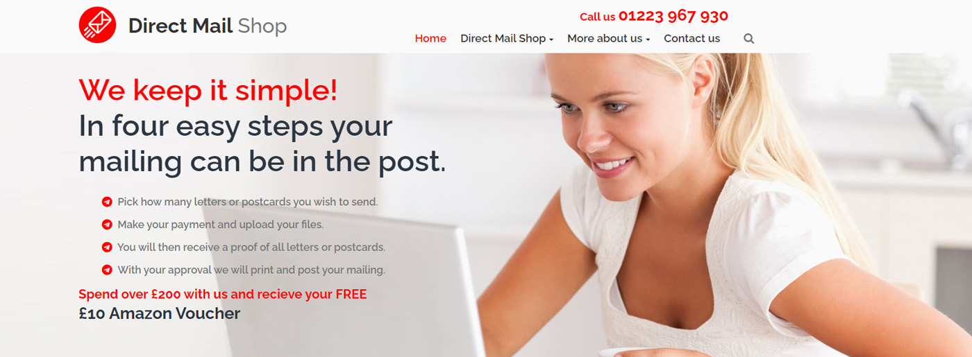
Everything is here: a bright design with unique content and icons, bulleted lists, eye-catching photos, prices, and testimonials. Established in 1998, The Direct Mail Shop, which provides a printing and direct mail service to both UK and International Clients, has decided to choose the MotoCMS template and launch its site.
Website Examples Built on MotoCMS – What Makes Them Unique
High Usability
It’s straightforward and convenient. Every word is in its place. The content is well-structured so the visitor can easily find the information he needs on the site. Thus, due to the usability of the pages, The Direct Mail Shop attracts attention and keeps the visitor on the site for as long as possible.
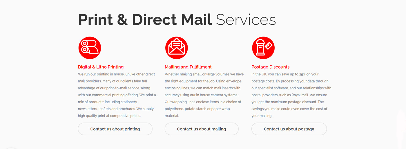
As a result, the potential clients don’t lose their way and can quickly move through the website with the help of:
- the internal site search;
- numbered and bulleted lists;
- information about all the news, discounts, promotions, and great offers. A catalog of goods, contacts, and information about the delivery on the homepage;
- readable fonts. MotoCMS offers a wide variety of fonts.
Besides, with MotoCMS, you can forget about a slow website loading speed and intricate design that scares customers and makes them leave the site.
A Chosen Colour
It has been proven that color affects consumer behavior, and we should rely on the users’ reactions when creating a new website. Thus, Direct Mail Shop owners have chosen one of the favorite colors of most people, one of the most saturated ones, which can attract the customers’ attention as much as possible.
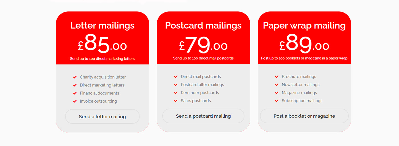
Remember that red has a real power to influence people, attract their attention, and is perfect for decorating elements on the site that call to action and, of course, is present on the pages of online stores to notify about sales and discounts. Choosing the right button color can increase conversions! So, you should pay attention to the choice of color for your website, and with MotoCMS adaptive design, it won’t be a problem. Evoke the emotions and feelings of your users to form their mood and persistent associations with your site.
Website Examples with MotoCMS Website Builder
Launching a website is a great way to increase your business income and attract new customers. A well-designed, flexible, and attractive template will put your products in the spotlight and help your sales soar. Explore these website examples based on MotoCMS and our collection of awesome templates and create a modern web page easy and fast with MotoCMS intuitive website builder. Be sure that every template is a ready-made design solution for the project, which one can view in a demo version, edit, and use.
Follow our rubric #madeonmotocms and be aware of new trends and changes in website building.



Leave a Reply