Website Usability Issue: Clickable Objects
Modern design styles tend towards simplicity and ease of use. Flat and Metro styles established this trend and changed focus from beautiful designs to clean interfaces and user-friendly designs. But everything has its dark side. With a popularity of flat and minimalist styles, it becomes harder to define clickable and interactive elements. Hamburger menu, ghost buttons – all these elements may be popular but sometimes it’s hard to understand whether it’s a button or just an attention-drawing design item.
Clickable Elements in Website Usability
Users don’t like wasting their time on a website trying to figure out which elements are clickable. If your links don’t look like links – it’s bad for the UX. If your non-clickable elements look like clickable – it’s even worse! Misleading your visitors may cost you reputation, traffic and conversions. Let’s check out the top 4 mistakes you may be making when defining clickable objects on a website. And, of course, we will find solutions to those website usability issues.
Mistake #1: Not Paying Attention to Device
Mobile devices era makes huge impact on the way people interact with websites on the Internet. Touchscreen phones and tablets require interaction techniques that are quite different from those used on a desktop. And here lies a major issue.
Most clickable elements on websites (buttons in the first place) are easy to define with a hover effect. Even a flat icon or a now-popular ghost button that often looks like a static design element may be highlighted when hovered and thus defined like clickable button. But you can’t “mouse” over the same button on a mobile device screen! Touch screens recognize mostly two techniques – swiping and tapping. Each of them helps performing a certain action. But none of those techniques will help user to define – is that a clickable button/icon or just a decorative/informative element.
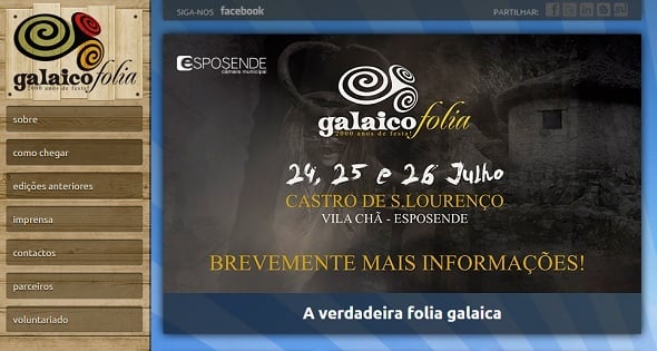
Galaicofolia
One of such UX fails in mobile and responsive design use is hover menu. This design element has been many times proved wrong even for desktop websites. I guess most people don’t like when something unwanted appears on the screen and interrupts interaction.
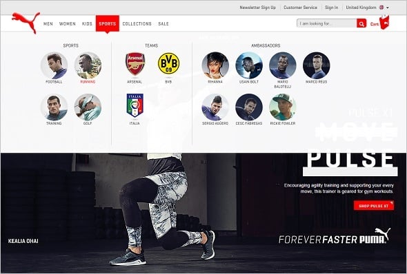
Puma
Another frustrating thing about hover menus with sub-categories is that they require users to move through so-called “hover tunnels”. When such sub-categories appear, a user can’t simply mouse to a chosen category via straight line. Usually it requires from a user to move a mouse straight to sub-menu and then to go to a selected item. If you ignore such pattern, the mouse will go beyond a hover tunnel and a menu will just disappear, so you shall start over again.
Such things about the hover menu become even more annoying when you have to perform such actions one a touchscreen device. It’s a real hell swiping finger across the screen following a particular pattern. And any mistake will force you to start from the beginning.
Solution: make links and buttons easily recognizable by highlighting them with color or size.
Whenever appropriate avoid hover menus. Make the menu simpler, avoid adding multiple sub-categories. Don’t forget that global mobile traffic grew 69% since last year. That means more and more users surf the Internet via mobile devices. And your website design should be mobile-friendly if you wish to get traffic in future.
Mistake #2: Text Links Don’t Look Like Links
In most cases defining text links is easy. Traditionally links are made blue since Tim Berners-Lee, the Internet inventor, noticed that blue color looks the best on a gray background of the early times browser.
Joe Clark offers more pragmatic explanation of such choice. He claims that brighter red and green colors can cause usability issues for people with color-vision deficiency. Blue color doesn’t has such limitations, it can be more or less definitely distinguished from other colors on the web.
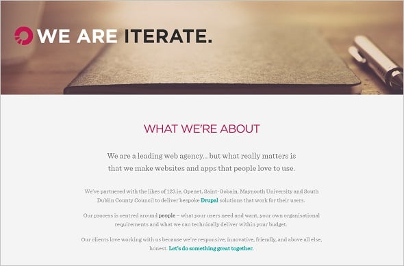
Sometimes you can trip over links that are underlined. And their clickability is defined only when they are hovered via change of color. It’s a huge mistake that ruins website usability. First, as I already mentioned, hovering doesn’t always help in clickable elements defining, especially on mobile devices that don’t offer such a function. Users won’t be able to clearly tell is that a link or just a text element if they cannot put a cursor over it. By the way, the good old trick of changing a cursor from arrow to a hand when it’s on a clickable elements will also fail here.
Iterate
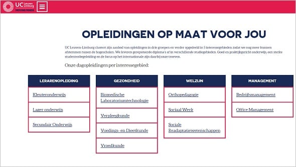
Using blue color for non-clickable elements may misguide users as well. Since blue is often used for text links, making a headline or a category title blue may confuse users.
Solution: while blue is still the safest color for text links, you can choose any other tone if it fits your design and helps to unambiguously determine a link. Always check your link color choice to make sure they are easily perceived by people with color blindness.
UCLL
Don’t use blue color for static text elements on a website. E.g. don’t incorporate blue image captions or other lettering. And keep your choice color for links consistent throughout a whole website.
Mistake #3: Non-Clickable Elements Look Like Buttons
Don Norman claims that people perceive certain objects via special indicators or “signifiers” that help to identify them as of a particular type/class. Thus, he calls an absence of people on a platform a kind of social signifier that helps us understand that train has already departed. This idea can be applied to almost all life spheres and the UX of clickable elements is not an exception.
Buttons, their shape, size, familiar patterns usually can act as signifiers that help users to interpret them as clickable elements. Most buttons are better perceived in a form of rectangles that are placed aside of the body text. Usually such buttons contain a call-to-action text like “Click Here” or “Learn More”.
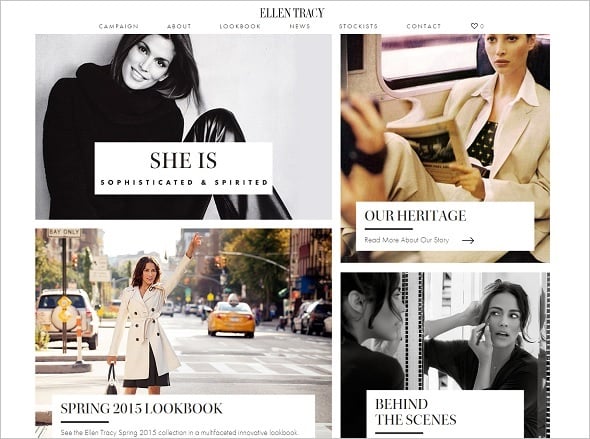
However, in Metro and Flat style designs there’s a threat of confusing clickable and non-clickable elements. In such designs we can spot multiple elements that can be subconsciously interpreted as clickable. Multiple-colored blocks that usually function as menu categories in Metro style are usually clickable. Additionally, they can include other clickable elements like titles, buttons and images. The similar issue is spotted with a flat design when a user sometimes can’t tell the difference between clickable and non-clickable block or button.
Ellen Tracy
On the screenshot above a top left block is non clickable. It works as an ordinary slider with pics. But you won’t understand it without trying.
The now-popular ghost buttons trend is often blamed of creating the same kind of confusion for users. These subtle elements seem to be a perfect fit for flat-style and minimalist designs but sometimes they get confusing for users. When you use a ghost button on a website you should not only make it unambiguously clickable. You should pay attention to not making other similar elements look like they’re clickable.
Peter Vachon
Solution: make buttons look clickable and avoid using similar patterns for non-clickable elements. If you are fond of flat and minimalist designs you should try using some principles of Google’s Material Design. It uses shadows making flat design looking less flat. In my opinion, it has some drawbacks for the UX since those shadows are often used for all elements – clickable or non-clickable. But if you use Material design principles wisely, you can create some great examples of the clickable objects which pay greatly to the UX.
If you use ghost buttons in your website design, opt for rectangular shapes. You may use shapes with slightly rounded corners to make your buttons look more like buttons. This solution will make it obvious for users that the object is clickable. It doesn’t mean you should make buttons look skeuomorphic. Use a thick frame to show it’s a button and avoid using similar frames for other elements that aren’t meant to be clicked.
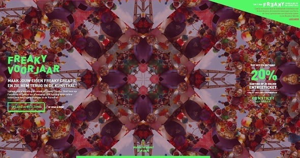
Freaky Voorjaar
Actually, not using similar patterns and designs for elements with different functionality is the main solution of the issue. I provided this idea above for the text links. The same is for the buttons. Never use the same color for clickable and non-clickable objects, especially when they are of the same shape. And avoid using a separate background for titles and headings – it’ll make them look clickable.
Create a proper content hierarchy on a page and keep consistency in design. If you use Metro style for a website, make all colorful blocks either clickable or non-clickable to avoid users’ confusing. Don’t use different colors for various buttons. If you use blue or white for button text – use this color consistently everywhere around a website.
Mistake #4: Crowded Space Around Clickable Elements
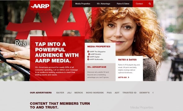
Sometimes a space around clickable elements is so overcrowded with various objects that it becomes hard to tell what objects should be clicked. In case of mobile devices, the question of space around clickable elements is even more vital.
As we all know, touchscreen requires using “tap” or “swipe” movements. Since they are performed with fingers instead of a mouse cursor, clickable elements require more space around and usually should be bigger than for desktop versions. Unfortunately, many website owners still ignore this rule and set many clickable objects too close to each other.
AARP
Another mistake in clickable elements placement is putting them inside of the text. It distracts attention and can even make buttons and icons invisible to users.
Solutions: don’t forget about responsiveness and make clickable elements attention-drawing. Your buttons should be large enough to make clicking easier.
Make sure there’s enough space around a button or icon. First, it ensures a touchscreen user will not tap other clickable items accidentally. And second, empty space around important design elements works as a perfect highlighter and helps focusing users on clickable objects.
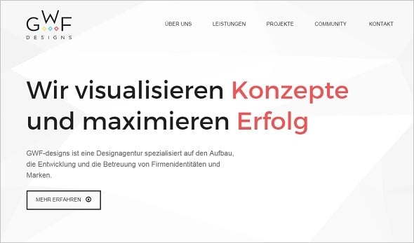
GWF Designs
Again, maintaining a proper hierarchy helps users determine if elements can be clickable or not. Locating navigation menus, CTA buttons and lists aside of the body text helps users identify them as clickable objects.
Whatever you do with clickable objects on your website you should think of making a user’s life easier. Make clickable elements easily recognizable, test often to find the best design for buttons and icons. And try to minimize users effort needed to perform actions on a website.




Leave a Reply