What is Minimal Design – When Less is More
Let’s explore the world of minimalism and learn what is minimal design, the fundamentals of minimalist web design, and the benefits it brings to the UI/UX in web development. Minimalism is the ability to provide an aesthetically appealing yet fully-functional design with only a few elements at hand. With technology going on a more sophisticated route, developers are adopting minimalism for web design. The movement aims to enhance the UX without making the design too overbearing.
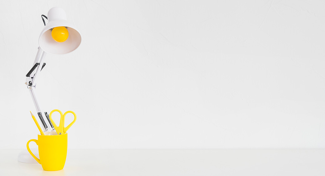
According to history, minimalism has been around since the early 20th century. The ‘minimalist – less is more’ ideology was first used in architecture before it was adopted in other arts and industries, including interior and industrial design, painting, and music. With the world moving toward digitalization, however, developers are keen to experiment with minimalism in web designing.
What Is Minimal Design
Before we look into the fundamentals of minimalism, let’s understand the concept behind the ideology and its importance to web design.
The minimalist movement originated in Switzerland, where it was applied to diverse media formats, including graphic design, architecture, music, literature, and painting. In recent years, web design was also added to the list.
In its basic form, minimal design is a simple layout without any superfluous elements, vibrant colors, shapes, and textures. Its purpose is to bring the viewers’ attention to the pivotal point of the product. Additionally, minimalism eliminates any gaudy elements that create visual clutter leading to an aesthetically appealing result.
The minimal design cuts off any feature that doesn’t contribute to its primary function. For example, mid-century furniture foregoes excess ornamentation for a cleaner, simple design. The concept was timeless and adopted in present-day furniture crafting. Hence, ‘what is minimal design’ is the question of the hour.
In the field of web development, a minimal design website is a relatively unexplored area. It is evident in how the early days of the internet had sites with a lot of visual clutter, owing to its slow download speed, despite the lack of rotating logos, marquees, and bright neon colors.
With digitalization on the rise and more focus on the user experience, developers are taking on minimalist design for their digital products. New websites offer no unnecessary animations, ostentatious color schemes, or bold, irrelevant font styles. It only diverts the users’ attention from the content and the purpose, and also contributes more to the visual aspect than the UI/UX of the website.
Minimalism in Web Design
The ‘less is more’ ideology was first applied to web design in the early 2000s, but it wasn’t until recently that the subject caught the interest of many. The success of websites with minimalist-inspired themes makes developers eager to figure out what is minimal design and create their top-rating sites.
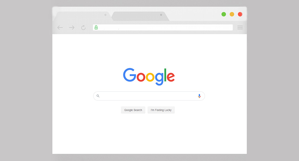
The Google homepage is an excellent example of a minimal design website. The layout centers around the search bar with no other features other than branding to distract the user. Additionally, with branding as the only other visual element, it makes the name more prominent. The entire background also lacks color, which contributes to the absence of visual clutter.
Why is Minimalism Needed in Web Design?
The innovation in technology enables developers to make digital products as complex as they wish, and yet, minimal design websites are on the rise. Dr. Ian Malcolm in Jurassic Park (1993) best describes the concept of minimalism, “…your scientists were preoccupied with whether they could, that they didn’t stop to think if they should.“
For web design, it implies that just because advancements in technology give you the power, doesn’t mean you should abuse it.
That said, with what is minimal design covered, let’s look at the reasons for its fast adoption in the development world:
Minimalism in Business & Marketing
Here is how the business and marketing world benefit from minimal design in web development:
With Less Focus on Design, You Put More Focus on the Website’s Intent
What is the use of a site that users can’t understand or navigate? A minimal design website has limited elements and limited room for wishful thinking. It means you have to be crafty and add only the fundamentals that serve a purpose. Each design element helps in conveying the message of the website.
Highlights Your Unique Sales Proposition (USP)
With nothing to distract your users from the website content, you have the opportunity to bring their attention to your USP.
For website developers, the lack of flashy elements in the simple wireframe best explains what is minimal design. It is the elegant layout that rests more focus on the message than the online graphic design. The simple overview of the website helps highlight the product or service you are selling.
Better Conversion Rate
Visual clutter is inversely proportional to the conversion rate for a website. The fewer distractions you put on a homepage or internal webpages, the higher the probability for visitors to subscribe for content updates. They’ll be able to easily navigate around the website and find the content they need. A minimalist design website highlights the CTA ambiguously, ensuring user engagement, and improving CTR.
Improves the Responsiveness of the Website
No matter how beautiful a website looks, it serves no purpose if it is slow to load and unresponsive. If you want to understand what is minimal design, then consider a website for smartphones. With such a small screen, you have minimal options in what you show your viewers. You have to be creative and apply only fundamental elements that serve a purpose in the functioning of the site and enhancing the UX. Follow the UX design guidelines to discover how to manage user experience on a website professionally.
In a nutshell, it is convenient to make a minimalist design website more responsive for both mobile and desktop users.
Minimalism and User Experience
Whitespace Brings a Sense of Calm
Opting to eliminate extra elements from the website and leaving clean whitespaces brings a calm outlook for the user. Any extra splash of color, bold font styles, and over the top animations only distract the mind from the main content.
Navigation is Easier
Simple navigation in a minimal design website makes it easier for visitors to find the essential items they were looking for, including products, pricing, blog, and more. If you want to understand what is minimal design in web development, keep the primary headings visible, and others tucked under ‘More’ to avoid clutter and make navigation easier.
Elegant Designs
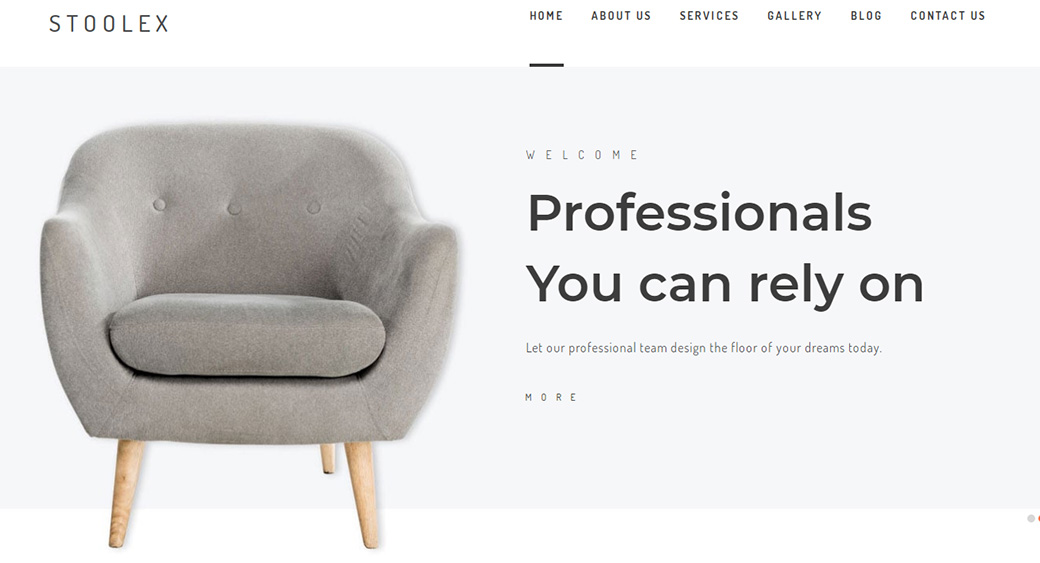
Minimalist web design keeps the site beautiful and sophisticated.
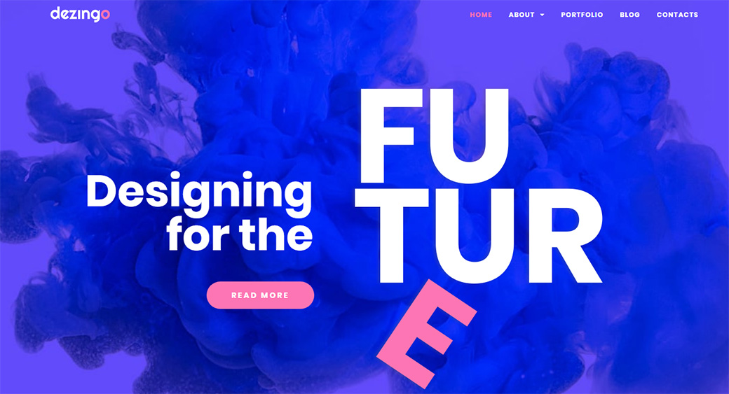
Minimalist Design Also Has Side Effects
Fewer Resources Means Less Server Space and Faster Downloads
Videos, heavy animations, and pictures increase the load time for a site, which affects the user experience. With a minimal design website, you have fewer resources at hand. Limited resources take up less server space and allow faster downloads. Explore the guide to discover 10 UI animation tools for designers.
Less Maintenance
It’s easier to maintain a website with a simple layout. With minimal design, you don’t have any plugins, libraries, or framework to update, then also ensure those upgrades are compatible with each other.
Fundamentals of Minimalist Design
You don’t need a background in art and design to understand minimal design. The basics include the small stuff under:
- Unity
- Whitespace
- Visual Hierarchy
- Usability
The trick is to understand what to remove or add to the design, so it looks complete without being overbearing. With a minimal layout, all elements are intentional and help highlight the purpose of the website. They direct the users’ attention to what they’re searching for; therefore, to ensure the success of your minimalist design, identify your goals for setting up a site. Increasing traffic or selling a product or service?
Unity of Elements on Minimal Design Websites
Randomly adding elements that are not cohesive only make the website look haphazard and unorganized. It makes the content unclear and distracts users.
Unity is an essential factor for any design. It is the harmony between the different elements that make up your website. How well the individual components fit together for smooth operations determines the success of the site.
Visual Hierarchy for Excellent UX/UI
Generally, when a visitor arrives on a webpage, the idea is to direct their attention to the primary features first before highlighting other aspects. Visual hierarchy is the sizing of each element that is the highest priority feature is the largest, and the lowest priority is smaller.
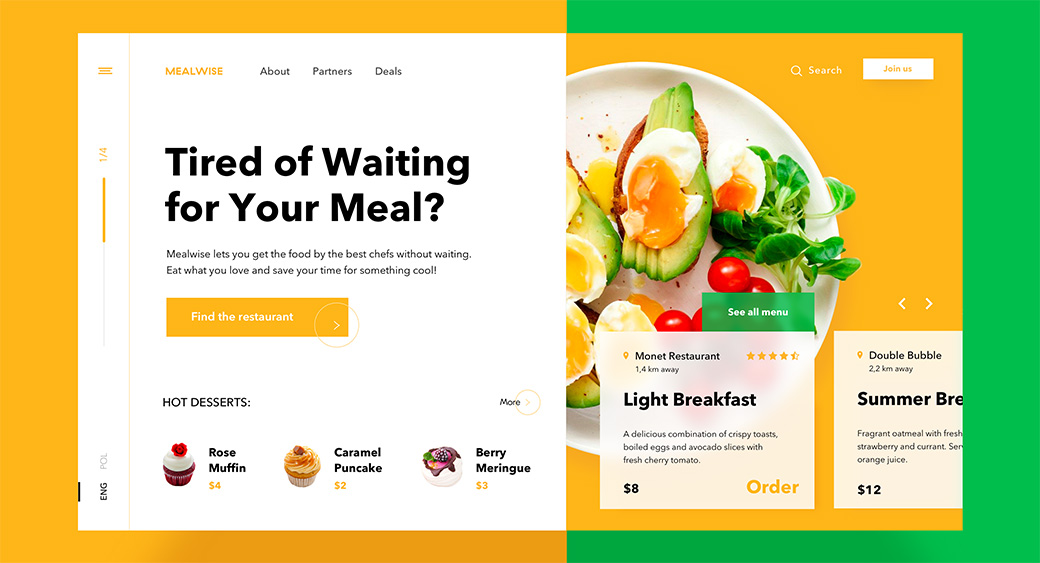
The purpose of visual hierarchy is to direct the users to the product or service you are selling. Consider the image above for a food order website. See how they gain the users’ attention with a bold font asking them a direct question? Their choice of color is contrasting, but also aesthetically appealing.
So, when designing a minimalist website, consider the size of each element. Think of what you intend to highlight and what needs to blend against the content.
Characteristics that you should focus on when deciding the visual hierarchy:
- Photography and Illustrations – “Pictures speak a thousand words,” and minimalism believes that less is more. That said, the images you choose should maintain the integrity of the minimalist layout.
- Flat Texture – With minimalism, the interface comprises only flat textures, icons, and other graphic elements, minus any highlights, shadows or gradients.
- Dramatic Typography – Words and content you want to emphasize should carry a dramatic font style to add a bold and intriguing visual.
- Color Palette – If you don’t have pictures to highlight the content, then a minimal color palette will do the job in heightening its impact.
- Contrast – Sharp color contrast is also a way to make the content noticeable. Instead of adding too many graphic elements, a few features with contrasting colors will be sufficient.
What is Minimal Design and Its Usability
What is the use of a website if your users can’t navigate to find what they need? So, usability is the most crucial aspect of web development. To make your minimal design successful, ensure its usability for the users.
Usability of a website refers to:
- Load time – Approximately 47% of users expect a page to load within 2 seconds. Even according to Google Analytics, the best sites have a load time of fewer than 3 seconds. So, what is the load time for your minimal design?
- Mobile-friendly – Each year, there is a rise in the number of smartphone users. Therefore, you need to make sure the website is fully functional on all devices.
- Navigation – Ask yourself, can the visitor see the menu? Is the navigation easy to understand?
- Consistency – Do the elements for your minimalist design show harmony and unity?
If your minimal design website checks all the boxes for usability, then it is sure to surpass users’ expectations concerning user experience.
What is Minimal Design with Whitespaces
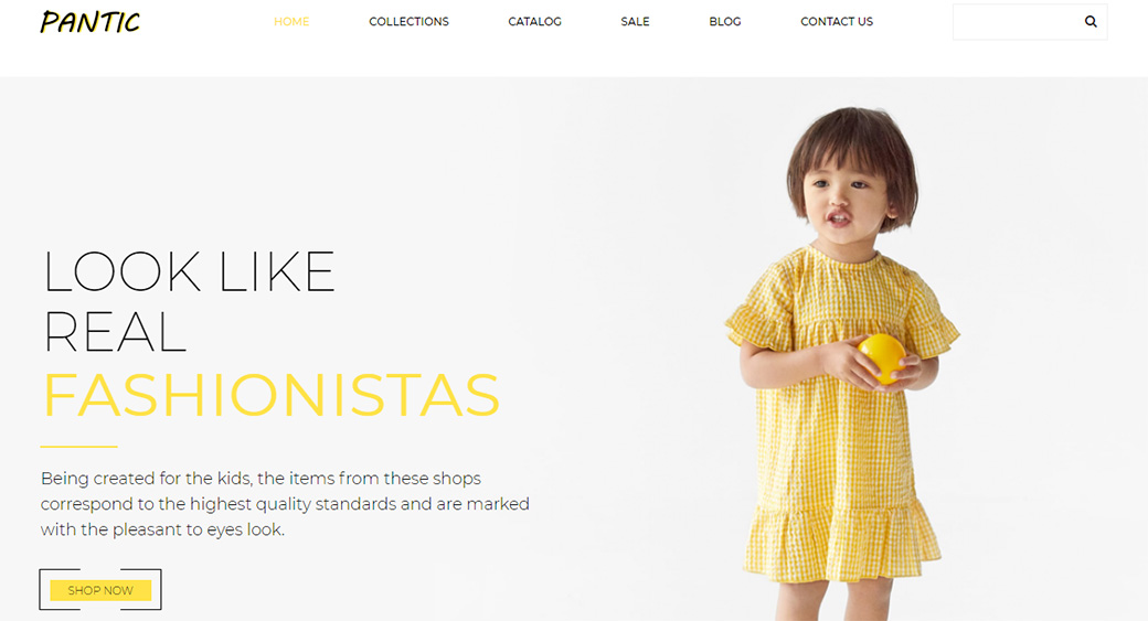
Whitespace is the empty or negative space surrounding the other elements in your design. Consider it a canvas on which you create the layout. Minimalism promotes blank spaces to let the individual factors speak out. It compels the audience to focus on the content and the product or service you are providing. Whitespaces also contribute to the elegance of the design by keeping the color scheme modest.
Additional Elements of Minimalism
Besides the fundamentals, a few other factors play a role in creating a minimal design. The color scheme and the brand logo are also crucial players in minimalism:
Color Scheme
Color is an essential aspect of any design, including graphics, architecture, literature, and more. Yet, many do not give it the credit it deserves!
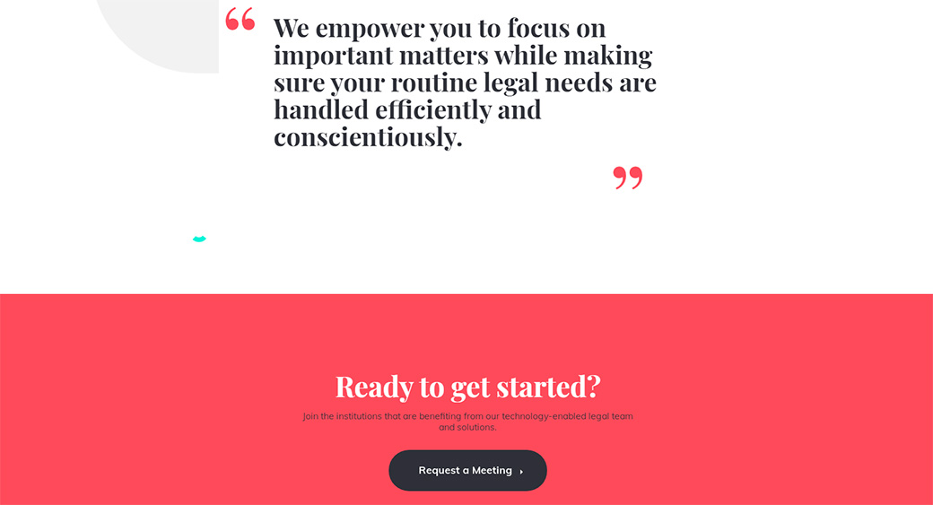
For minimal web design, color is the ideal way to leave an unforgettable impression on the users. However, it is imperative to stick to a limited palette to maintain the essence of minimalism. A splash of color over a neutral backdrop like white, grey, black, and red would give you an edge without being an eyesore.
Logo Design and Branding
Minimalist web design requires you to create a logo that reflects the ‘less is more’ ideology. A logo is also essential for your branding, which helps in building consumer trust in your brand. Additionally, a memorable logo is one that is simple in design!
So, if you want your visitors to not only remember your brand but also trust you for their needs, then design a logo and other branding elements with the minimalist ideology. A limited palette that reflects the rest of your website or dynamic typography with a single pop of color will also do the job.
Minimal Website Templates
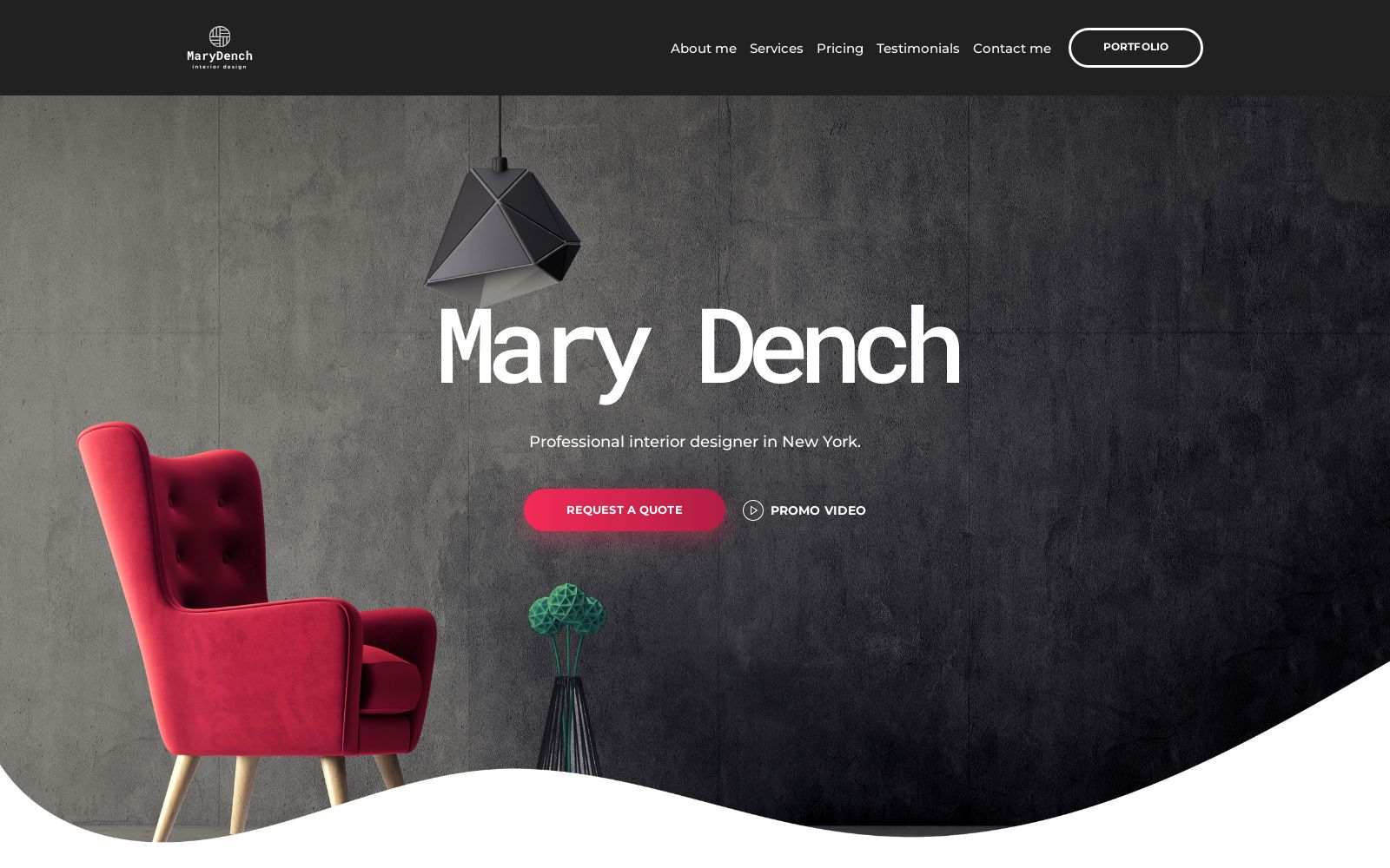
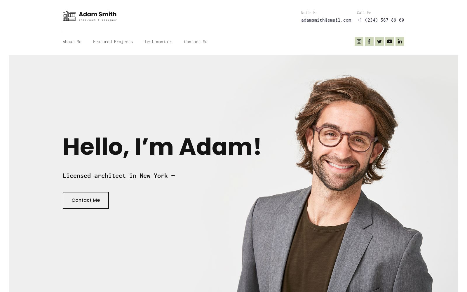
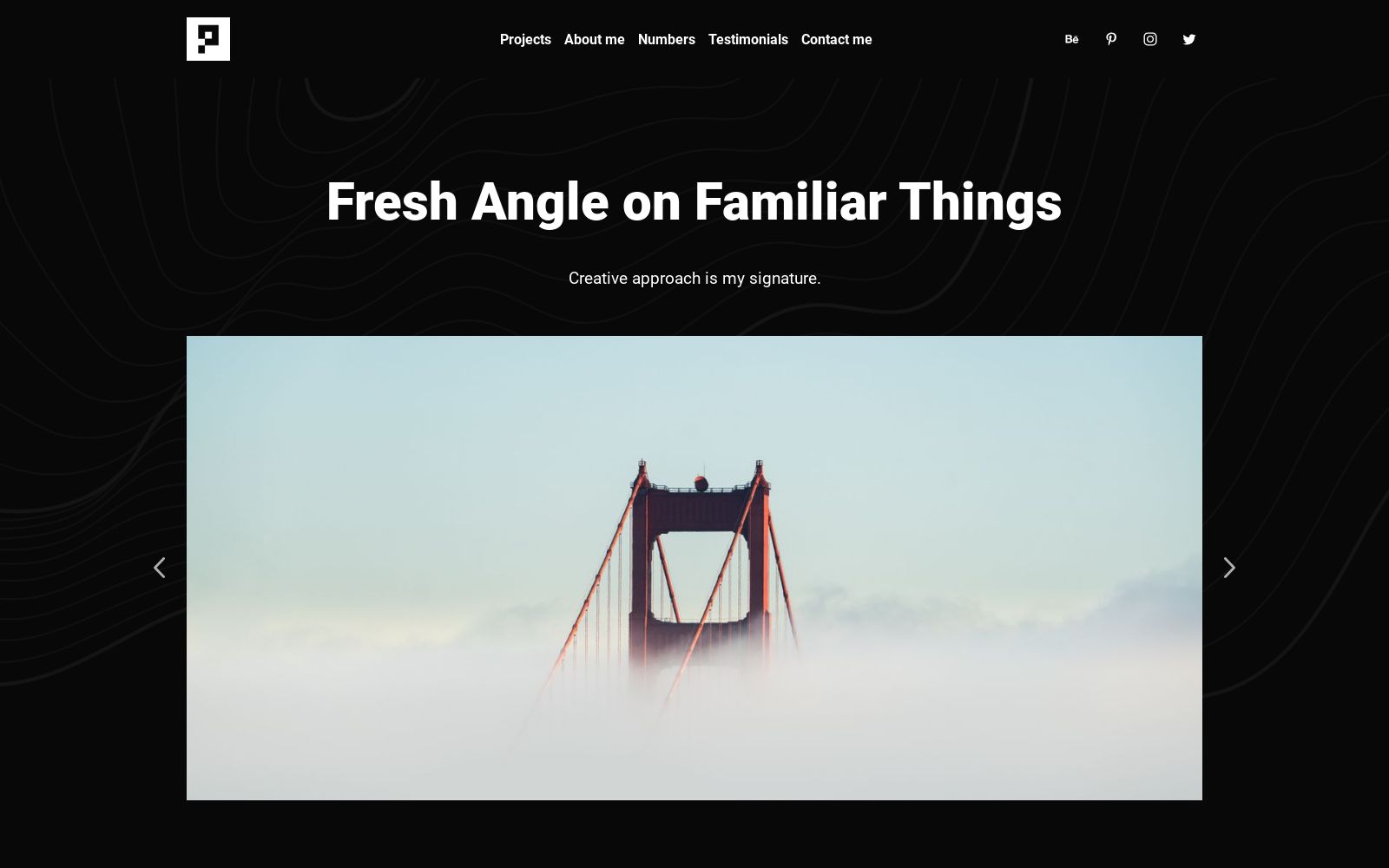
These are stylish and easy-to-read website templates that focus on the essentials: a clear structure, large white space, and emphasis on important content. They are ideal for creative professionals, agencies, freelancers, and brands who want to build a modern, clear, and aesthetically pleasing website without any unnecessary details.
On Weblium, you’ll find ready-made minimalist templates that are easy to edit thanks to the user-friendly builder:
Interior Designer Website Template
Architect CV Website Template
Minimalist Portfolio Website Template
Why Minimalist Design is the Right Choice for You?
Minimalism, in a nutshell, is the elimination of any element that serves no purpose or contributes to the primary function and user experience. In recent years, it is considered a powerful tool in web design. Stay trendy and discover the 15 best project management software for graphic designers in our guide.
I hope the article was sufficient to help you understand what is minimal design and how to add minimalism to your web design.
If you’re still unsure of whether it is right for you, ask yourself, ‘will minimalism help me reach my goals with the website?’ If the purpose is to increase traffic or engagement on the site, build your brand, or sell products or services, then the answer is yes!
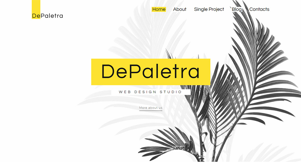


Shapes can be molded to represent a message about the business to its customers. Designers will keep implementing the trend to keep the whole design minimalistic.