Breadcrumb Navigation Explained: Types, Benefits, Guidelines
The concept of using Breadcrumb navigation in website design is strange for many designers. Many of them still don’t believe it’s an integral part of the design. They treat it as an appendage with the only purpose to fill up the vacuum in the design someway. But if used correctly, breadcrumb navigation can enhance the users’ experience and the accessibility level of the website in more than one way.
How It Works
Breadcrumb navigation works as a visual guide that informs the audience about their exact location on the website so that they avoid feeling lost while browsing it. It boosts visitors’ confidence and gives them an alternative way to browse the site.
Breadcrumb navigation is widely used for content-heavy sites or websites with a hierarchical content structure. In eCommerce-based websites, breadcrumb navigation can make it easier to locate products effectively. Most people don’t have the exact name of the product they are looking for; instead, they use breadcrumb navigation to find products that meet their exact requirements.
However, breadcrumb navigation does not need to have the same boring structure all the time. It can be of the following three types.
Location Based Breadcrumb
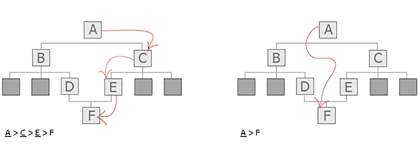
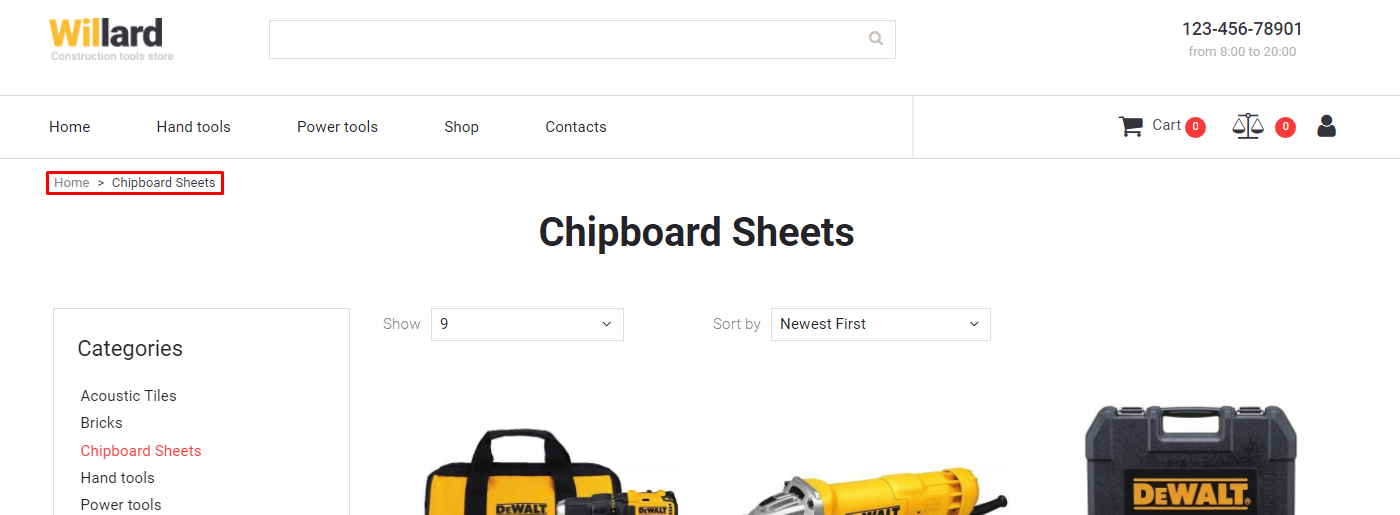
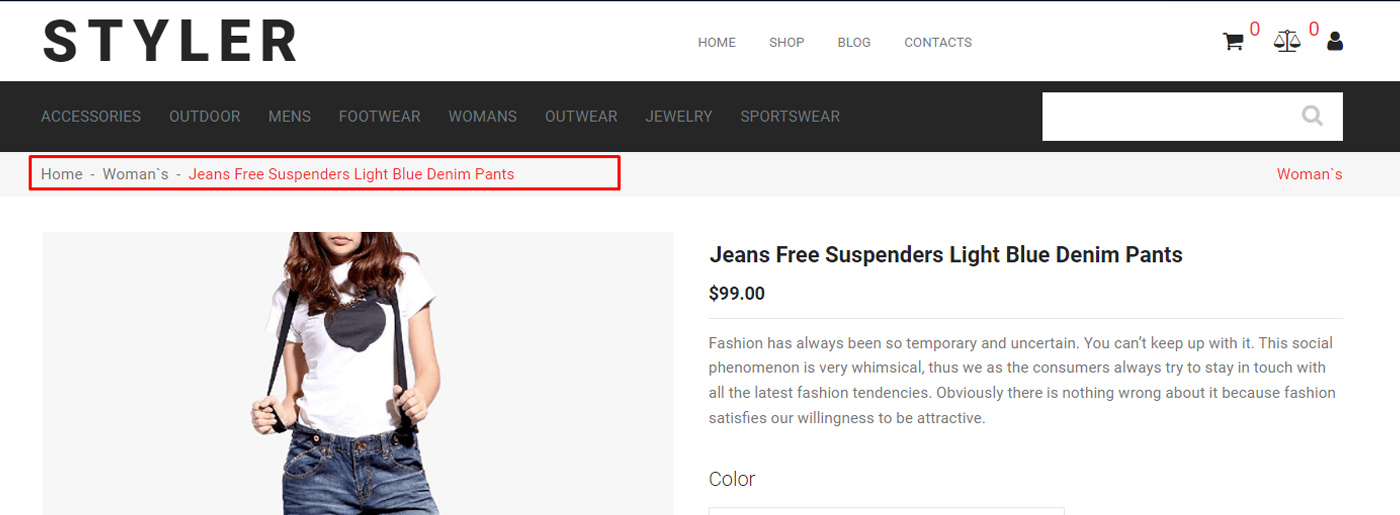
Location based one is quite popular among web designers as it directly impacts visitors’ browsing experience. This makes it abundantly clear to the visitors where they are on the website or where the page stands in the website’s hierarchy. Location based breadcrumb navigation is used in sites that have more than 2 levels of content. The purpose of this breadcrumb type is to assist in navigation.
Path Based Breadcrumb
This is another common breadcrumb navigation type that indicates a user’s steps to reach the current page. This type is usually seen on those sites where the visitors need to fill out a form that spans across two or more pages. Visitors see the links of the pages they have visited earlier, which assures them that they are going in the right direction. However, it is a fact that path based breadcrumb is not that much popular as it does the job of a Forward and Back button.
Attribute Based Breadcrumb Navigation
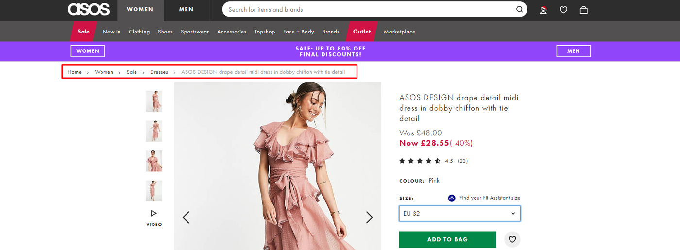
Attribute based breadcrumb does not follow a single path all the time. It is used just to describe the attribute of a particular page. This type is widely used for eCommerce websites where a single product page is accessible via different paths [also known as faceted navigation]. Say, for example, the landing page of adventure books on an eCommerce website can be accessed via three or four ways, and therefore you simply can’t put your trust on static breadcrumb navigation. Instead, you need to opt for attribution based type.
The Benefits of Breadcrumb Navigation
#1 Facilitates Navigation
It allows users to navigate a website easily. Some even treat it as a second tier navigation system. By clicking on it, visitors can move from one page to another without requiring them to use the ‘Forward’ and ‘Backward’ buttons again and again.
#2 Better Users Experience
Breadcrumb navigation provides a positive overall user experience. There is no need to spend hours fine-tune the main navigation or do something radical with the website’s main navigation to make all the pages easily accessible to the visitors as you have got breadcrumb navigation that will take care of this issue.
#3 Increases Average Time Spent on Site
Since breadcrumb contains links to other pages within the same hierarchy, visitors might likely find them interesting to check out. This will dramatically increase the amount of time users spend on the website. As some experts believe, Google and other search engines are using the data like bounce rate, average time spent on page, etc to determine the quality of a website. That means breadcrumb can help you achieve better visibility online in one way or another.
#4 Reduction in Useless Page Views
The more page views, the better, right? Well, you could not be more wrong. We need to be more concerned with the idea of average time spent on a page rather than useless page views. Now, if we don’t have breadcrumb navigation in place, people would have to jump from one section to another without requiring them to browse some pages in between. This will reduce the number of useless page views that sometimes mess with the analytics data.
#5 Low Bounce Rate
People get irritated when they can’t find the product they have been looking for. If the navigation of the website fails to help people find the information, this might result in visitors’ bouncing back from the website. One of the effective ways to deal with the problem of low bounce rate is by incorporating the idea of breadcrumb navigation.
#6 It Reflects the Hierarchy of the Website
Sometimes it is impossible for people to identify the page’s location in the website’s hierarchy. The primary navigation of most websites does not give any hint about the location of a page, which is why we should be using breadcrumb navigation.
#7 Visually Interesting
It not only makes it easier for people to browse the website quickly and effortlessly, but it also contributes hugely to the aesthetic front. It does not take much space of the design, and if you can use it judiciously, it can make the interface look more elegant and graceful. 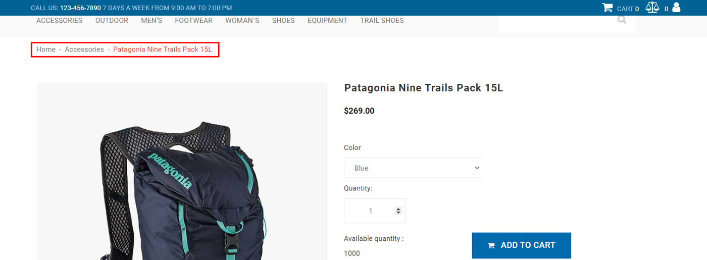
The Disadvantages of Using Breadcrumb
Every good thing has a dark side, and breadcrumb navigation is no different. It has its share of disadvantages as well.
#1 Confusing
Some websites do not need another layer of navigation at all. Yes, there are some websites whose navigation is so good that it does not need breadcrumb navigation. For example, a simple blog does not need breadcrumb because most of its articles are accessible either via the main navigation or by its search box.
#2 Clumsy
Breadcrumb navigation often looks clumsy when you access a site on smaller devices like Tablets, Smartphones, etc. It adds to visual clutter and clumsiness, especially on touch phone devices.
#3 Needs Regular Updates
Web Application based websites might run into trouble if they embrace breadcrumb navigation. Since these types of websites always make changes in their hierarchical structure, breadcrumb might lead to broken links or inconsistency in the navigation.
Factors We Need to Consider Before Using Breadcrumb Navigation
#1 How big is too big
The purpose of breadcrumb navigation is to facilitate navigation; therefore, it should not dominate the design. So, it would help if you did not make it look too big as it might overshadow other page design elements. Please don’t make it too prominent at the same time. Some websites even use gray color to make the breadcrumb look less prominent so that it does not interfere with other elements of the interface.
#2 Consistency
The design and structure should be the same throughout the site, ideally with the existing design and theme of the website. Inconsistent use of breadcrumbs will only confuse visitors.
#3 Don’t Make It Look Fancy
You should not use fancy fonts, bright colors, or weird separators because these will beat the purpose of using breadcrumb navigation. Don’t make it the focal point of the design; just make sure it is easy to locate, and that’s it – no need to go overboard with the design.
#4 Use Separator
There should be enough gap between different breadcrumb levels otherwise, people might find it tough to navigate via it. Most designers use separators like Arrow, Forward Slashes, Greater Than character, etc and they are doing a great job by helping people identify different breadcrumb levels without squinting hard.
#5 Don’t Include the Current Page in Navigation
Since people are already on the page, it does not make any sense to add the current page link to the breadcrumb navigation. It will do more harm than good because it confuses the readers.
So, these are some factors that you need to consider while designing breadcrumb navigation for your website.
MotoCMS Solution for You
This year is full of changes, and we are pleased to announce that our team has improved the design of the MotoCMS admin panel. Thus, now it’s more convenient to use. You can choose from dark and light modes and easily customize your template.
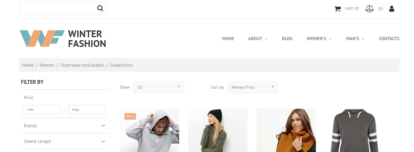
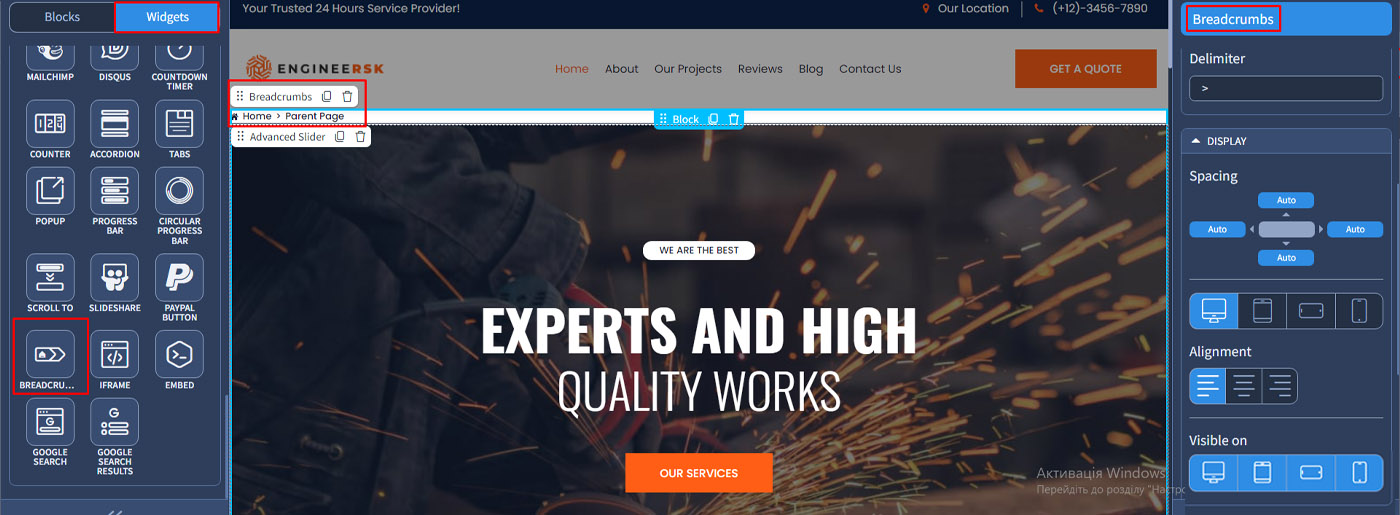
Besides, if your site doesn’t include breadcrumb navigation, you can select its widget on the left(see the screenshot) and place where you think it fits more. We hope you won’t have problems and cope with it in a few seconds. If not, you can always appeal to our 24/7 support and get answers to all your questions.


Leave a Reply