Choosing A Color Scheme For Your Website: Easy Tips
Color psychology plays a huge role when it comes to website marketing as well as attracting and retaining the audience that you want. Color has the potential to change and influence people’s perceptions of your product and service. A great example here would be Coke’s liberal use of the color red. When I mention this, I’m sure most readers get images of the red Coke can and bottle and possibly some excitement attached to the product. Choosing colors for your website is thus a great way to elicit certain reactions and get people to purchase goods or services.
We all have different preferences when it comes to color. However, there are universal color constructs that apply to the whole of humanity, regardless of race or background.
Let’s Take a Look at a Few
White is considered a pure color symbolizing purity, innocence, a new beginning, or neutrality. Use white if you have a bridal business website and want to attract brides-to-be. Additionally, white can be used for services promoting medical services or those in the beauty industry. If, for example, you have a doctor’s practice specializing in esthetic plastic surgery, you may want to use white liberally within your website. Women wanting plastic surgery usually look for a transformation in their appearance, making white a perfect visual cue.
Black symbolizes power, seriousness, somberness, responsibility, and mystery. This would make a great color for gaming websites or those that deal in business-related aspects such as investing. Additionally, black may be ideal for a website offering funeral services and the sale of caskets. Creative use of the color black would be to include it in websites that target children but are accessed by their parents. This would make parents more open to purchasing a toy or booking tickets to an amusement park if they access an all-black website. In the end, black gives an allure of trust and can bring forth images superimposed, highlighting the same thing you want to sell to a prospective customer.
Pink is associated with playfulness, femininity, youth, spring, and energy. Pink and splashes of white would be a great color scheme for websites targeting teenagers. This is especially true for young girls coming into their own and looking for some identity. An e-commerce store using pink can foster loyalty, thus increasing its turnover with time. What’s great about using pink is that the target group you want to influence is also big on peer pressure, meaning that it’s possible to establish a cult-like following if you use this color judiciously.
Blue is associated with royalty, trust, loyalty, and professionalism. This color is great for corporate websites because it appropriately communicates what a brand is about and the business culture and tradition. Alternatively, if you’re discussing topics related to a certain entity, like WPDean talks about WordPress resources and tutorials, you can use the color of that particular brand. In this case, WordPress Blue is used on WPDean as well. If you want to use blue for your business website, ensure it’s dark or royal blue. Light blue, however, is ideal for websites that want to display a burst of energy and optimism without overwhelming your visitors. Temper your choice of blue with white to create an even balance. This will also make it much easier for people to read the text on your website.
We can cover many other colors, but the idea here is that color can greatly impact your target market. To this end, it’s important to choose your website colors carefully.
Tips to Help You Integrate Color
Here are a few tips to help you integrate color more effectively:
- You can choose different hues of your desired color to add depth and contrast. This will also make it easy on a person’s eyes. This is especially true for colors such as green and blue.
- Pay attention to your website text and make sure that it’s visible. Do not use light-colored font on a dark background, as it’ll lead to eye strain, which means you’ll lose website visitors because they’ll find it hard to focus on your message and text.
- You can use a singular color for your call-to-action button or text. For a call-to-action button, colors such as red and green will influence behavior by enticing people to carry out an action, increasing conversion rates.
Color psychology can make or break your website, so choose wisely.
Here’s a selection of great MotoCMS website templates that show clever and impactful use of color:
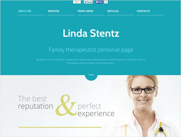
White & Blue Website Template for Medical Industry
Fresh Green Produce Website
Video Games Website Template with Dark Color Scheme
Art & Photography Website with Sliding Gallery
Black & White Website Template for Advertising Agency
Multicolored Website Template for Child Center
Bright Website Template for Music Project
Green Website Template for Gardening
Hotel & Resort Website Template
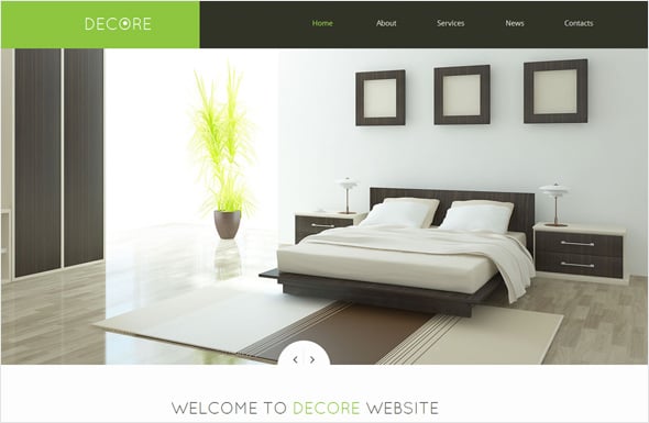
Decor Website Template with a Calm Color Scheme
Got questions, requests, or suggestions? Please leave us your thoughts, and thanks for choosing MotoCMS!


Leave a Reply