How to Choose a Photo Background for Your Website
What do you think about websites with background photos? When website owners choose a photo background for their website, is this practice worth the time or is it all just the latest fashion?
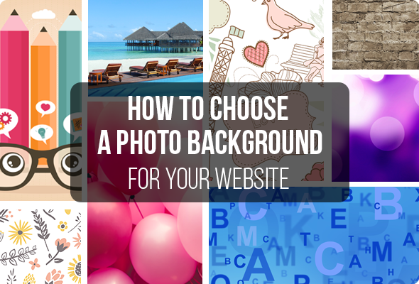
The question is disputable and it proves that online audience is highly puzzled with those big pictures placed on backgrounds of web pages.
Let’s define the most common pros and cons of using photo backgrounds.
Pros of Applying Background Images
- Background images can efficiently present any company. For example, if a car website uses large limo photos all visitors will expect to get high quality limousine rental services from this company. In case there is a photo of some popular auto brand then more likely the site promotes or sells its cars. Thus people will get a comprehensive impression without reading a line of text. It’s a sort of reading a certain headline message – but without text.
- Well-selected background photos can promote products and services. Regular web surfers are visually oriented. So if you showcase professional alluring pictures as site background they will be notable by the majority of visitors.
- If your competitors don’t apply large photography backgrounds it may help you stand out from the crowd. When other things are equal potential customers will choose a site with better and more trustworthy design.
- Another thing that background photos are good for is the news promotion. When you have a regular audience you can showcase upcoming events and new products right on the background. Everybody will see it, so when used properly large photos draw visitors’ attention and unobtrusively inform them.
Cons of Applying Background Images
- Full screen images don’t always work well for various devices with different screen resolution. However, this trap is quite easy to avoid by testing the site’s compatibility with the most popular devices. Don’t forget to check web pages rendering when switching views from landscape to portrait. And one more thing to remember: when running your site with responsive design testing tools – look how it is displayed on actual devices (as opposed to the emulators). Sometimes the result can unpleasantly surprise you and add a few hours of work.
- Higher page load time is also a reason to think about photography backgrounds with care. It’s the matter of 2-3 extra seconds. If they influence your audience a lot then you need a deeper analysis of the purposes of your background image. It might help you make a deal.
- It is said that background images are distracting to users. In some case it is really the case, however not that much. When a website background is well balanced and fits the whole layout it benefits you and draws more attention of visitors. Try to avoid small moving elements and aggressive colors. Thus texts readability remains great and users are pleased.
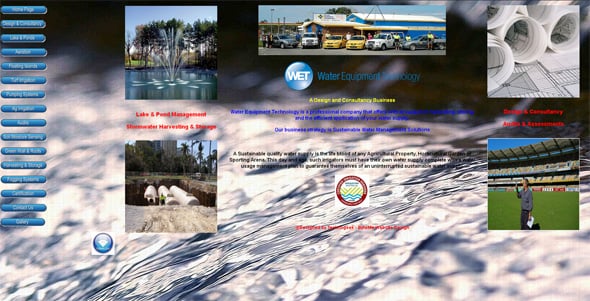
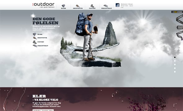
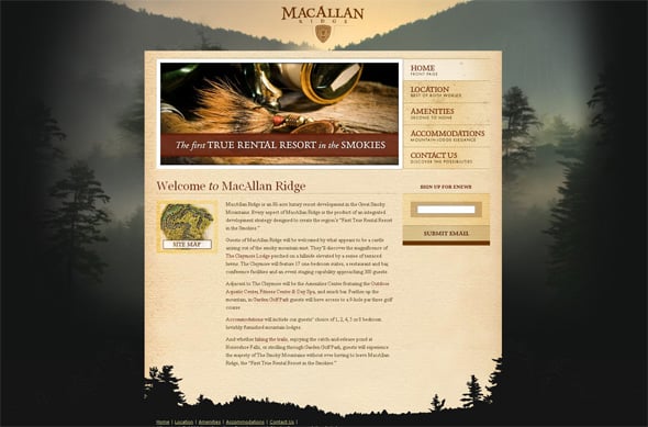
Here we’d like to show you some examples of a bad use of background images. We guess there is no need to explain why these designs are considered to be bad. Just take a glance at the screenshots to remember them once and forever.
Constellation Seven
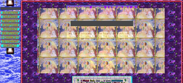
Now when all the pros and cons of using photo backgrounds are clarified we can start a deeper research of their use in web design.
If you’re quite attentive on the web you probably noted that actually there are 2 different types of backgrounds: pages background and content background. This structure allows to use different kinds of photos and images more creatively and to make texts easier to read.
When content lies down directly on body pictures it can cause a mess on the page. Previous examples of websites demonstrate a bad use of the bottom layer. It is quite destructive to mix background, colors and animation in such way.
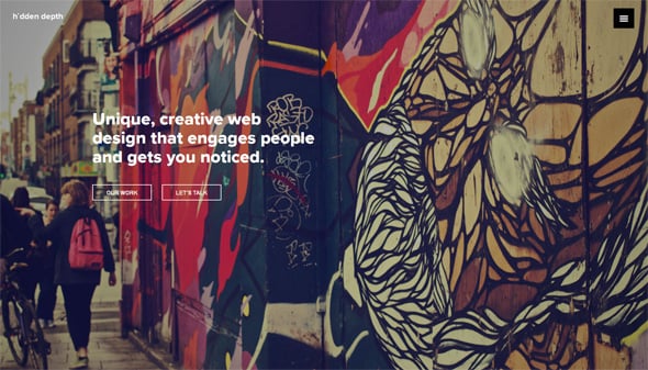
If you don’t want to use content background sections you should clearly balance the entire background and text colors, so that they look eye-pleasing. Hidden Depth website is an obvious case that demonstrates how simple text can complete photography layers. Thin ghost buttons perfectly serve this design and have something in common with trendy flat style (however, it is by no means flat).
Hidden Depth
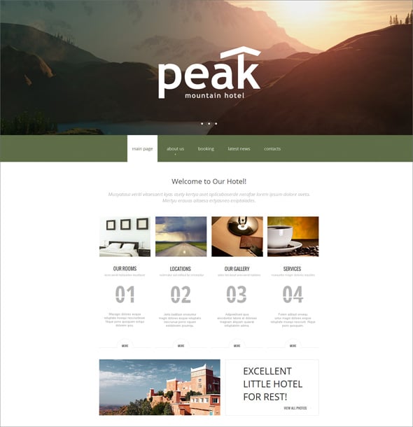
The following hotel website design is also an impressive design with header photo gallery.
In this post we’d like to accentuate your attention on common website backgrounds because they provide a discretion and seem to be more interesting for designers. Thus let’s consider which placements are good for illustrated backgrounds.
Header Background
This is a great way to dash and liven up any content-rich website without a risk to damage sites usability. This method is also good because it fits designs with both harmonious tones transitions and contrasting color combinations. If you’re a beginner designer you may need to practice colors blending effects and to remember colors matching rules.
Here we selected some free and simple color calculators that may help you be more confident of the chosen color scheme.
- Color Scheme Designer;
- Color Calculator;
- >Color Theory Simulation.
Photo headers are not so popular, however, they are well perceived by all categories of web users. That’s why if you decide to use them, you can certainly be successful. Header images can be displayed within the entire site or on the home page only.
Full-screen Photo Background
Large photo backgrounds are probably the most user-friendly elements that catch the eye. When applied to a home page only they simplify designers and developers tasks greatly. A well done professional image doesn’t imply large content sections – it requires a simple menu, logo and probably a short generic slogan. Such designs present your business for an average web user and motivate to look for more information within the site. If you have any intriguing picture that relates to your business use it and see what your site can look like.
If you’re puzzled with a question which background size is recommended then we have to upset you – it is impossible to give a definite answer. Nowadays there are too many monitor configurations that have different resolutions, though nobody knows which device your visitors will prefer. Too large images will overload web pages. Too small pics will also take some time to adjust dimensions. What’s the solution? Choose a photo background about 1680 x 1050 and test your site with one of free website speed checkers.
These tools will show you how long it takes to load and stretch/tighten a background as well as other layout elements. Choose a tool you’re familiar with or test current ones – they are quite user-friendly and effective.
When talking about full-screen backgrounds it’s almost impossible to keep silent about parallax web design. This trendy design is appreciated by common web surfers as well as professional developers. It looks really awesome.
Website Template with Parallax Effect
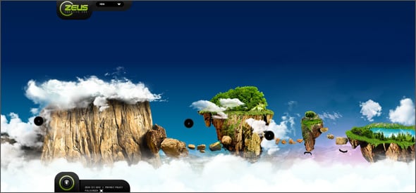
Nobody cares that parallax-based websites take longer time to load (just a second or two) or that they are too complex for mobile devices. These ‘always important’ factors pale the before beauty of parallax. So brush your doubts away and choose a photo background whether it’s parallax or not.
Front-end developers who’re always good at parallax scrolling use full-screen photo backgrounds to turn over web pages. Ratatattoo website demonstrates it in a very elegant way, so once you view it you’ll like the design.
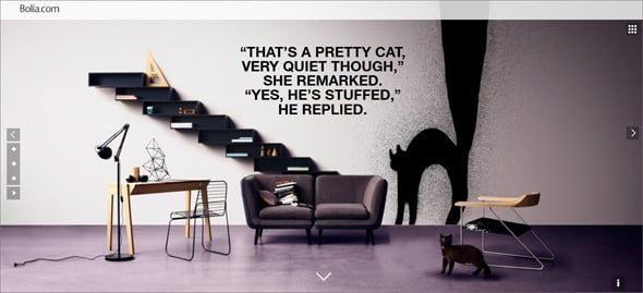
Another way to use a photo background in parallax website is to combine photo with graphic elements. The idea is pretty simple but it can be so amazing that words can hardly describe it. Spare no time to open Bolio site and to scroll the mouse wheel – the magic of the black cat on the stairs amazes.
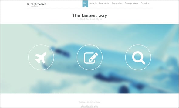
There is a tricky moment when you use full-screen photo backgrounds and that’s in the field of human eye structure. Our eye is created to perceive separate objects better then those merged on the background. It is essential and understandable for human bodies and brains. However, it happens that background colors have deeper contrast than main content. It causes a little brain confuse and our attention blows over. Thus if you want to be sure that visitors’ eyes are focused on content use pure colored backgrounds or apply light blur effect via any visual editing software like Adobe Photoshop. You can also reach a good effect if applying transparent effect to the entire background or its parts. Thus main content will be easily accepted and a photo background won’t keep visitors’ attention away.
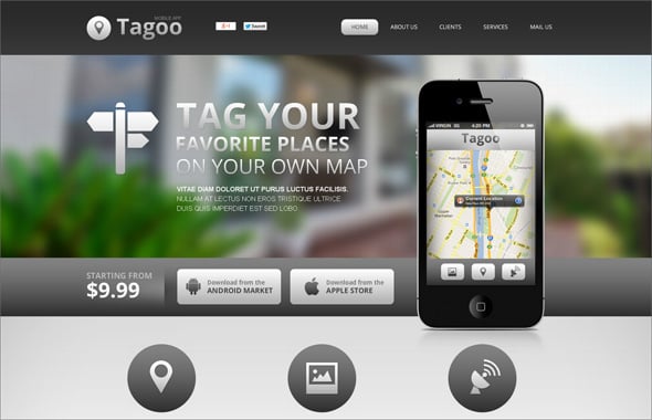
Let’s take a look at some designs that use out-of-focus photos as header or full-screen backgrounds:
Website Template for Mobile App Developers
IdeaKites

Tips to Choose a Photo Background Effectively
Now let’s summaries what we know about images in web designs. We are sure you know it well but it’s always good to have a short checklist to control all the details.
- Copy background’s URL from your server and paste it to the browser address bar to make sure the current URL displays the right picture.
- Make sure your background fits different screen resolutions. Otherwise there is a risk to get a nice site framed with an awkward default background color.
- Take a critical look at your site. Whether text is well readable and background doesn’t detract visitors attention.
- Look through site pages to make sure that all the key elements like phone numbers, search forms, products lists and others are well visible. Rich photo backgrounds can make important information become unnoticeable.
- Optimize your photo background to the web as much as possible. Remember that pictures take the majority of pages loading time. JPG and PNG are considered to be the best image formats for the web.
Now you know everything to decide whether you like websites with photo backgrounds or not. Your site can bring a real chance to get the word out, so hold on and don’t be upset if something goes wrong. A good photo can solve all your troubles and amaze potential clients! Do go ahead and create really stunning websites with photo backgrounds.







Leave a Reply