Killer Logo Design Tips for 2015 to Make It Trendy
Your logo is important – in fact it could end up becoming one of your most valuable assets. Some logos transcend language and cultural barriers, becoming iconic in their own right. It’s the basis of your success and the identity for your business.
The concept of a logo has become a fixture in our society. Researchers estimate that we see between 3,000 – 20,000 branded messages every day, which means yours has to stand out to have any chance of success whatsoever.
The way we relate to a brand is actually quite complex, involving a rational assessment of the product and emotional value we attribute to it. When choosing a logo, this impacts how we choose colors, fonts, images and even the size of the logo that we use.
5 Cool Logo Design Tips for 2015
What may have worked in the past, may not work today. It’s a complicated business, but we’re tried to make it easy for you – with 5 killer logo design tips for keeping your brand trendy in 2015.
Choosing a Font
Your font is the recognizable aspect of your brand. Chosen wisely and it can convey much more about your brand than just words.
Did you know that fonts generate certain responses from visitors? Whether it’s the simplicity of Sans Serif, the slight retro aspect of a Modern font, or the approachability of hand-written fonts. In fact, logotype choice is a complex area of study.
The choice is yours of course, but when you’re making it, current contemporary logos are staying away from novelty fonts and going for classy and sophisticated fonts.
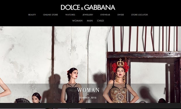
In many cases brands use their strong font as the basis of their brand style. E.g. Dolce & Gabbana use Futura SH fonts family, and Marc Jacobs use Engravers Gothic. It’s the core of their visual identity and is arguably as recognizable as many worldwide brands.
Dolce & Gabbana
Marc Jacobs
If you’re going for simplicity, style and authority, ask yourself whether you even need a logo at all or can you do it all with a typeface? It works for eBay, it can work for you.
An Iconic Brand
Some brands like Twitter or Facebook are known just by their icons. It’s a great place to be, and really demonstrates the impact a strong visual identity your logo can provide.
When choosing logo templates there are a number of different routes, all of which will have a big impact on the way your brand is perceived. One of the major new trends is social media, which for some older logos can be a challenge. The biggest issues is the transferability of your logo across all platforms, which is why the icon-style logo is more important.
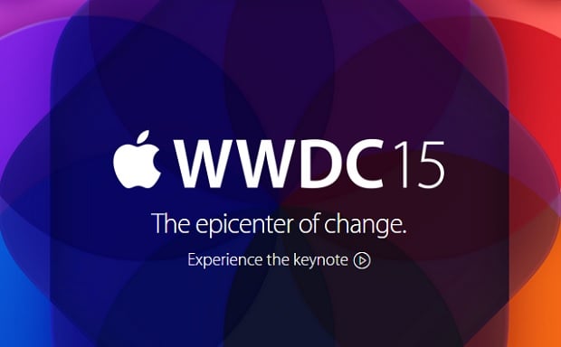
Icons are the perfect choice for your brand. They can be resized and repurposed for any application. They can be colorful or black and white. Whatever you choose, an icon is bang on-trend.
Apple
Using an existing icon is the easiest and cheapest way, and when matched with a well-chosen font can be the perfect brand for your business.
Vector icons can be found at various stocks and places like Behance, providing you with asses to various projects and designers. If you’ve got the money and the time, you can get one art-worked by a designer, offering you the ultimate in control and flexibility.
The Color of Money
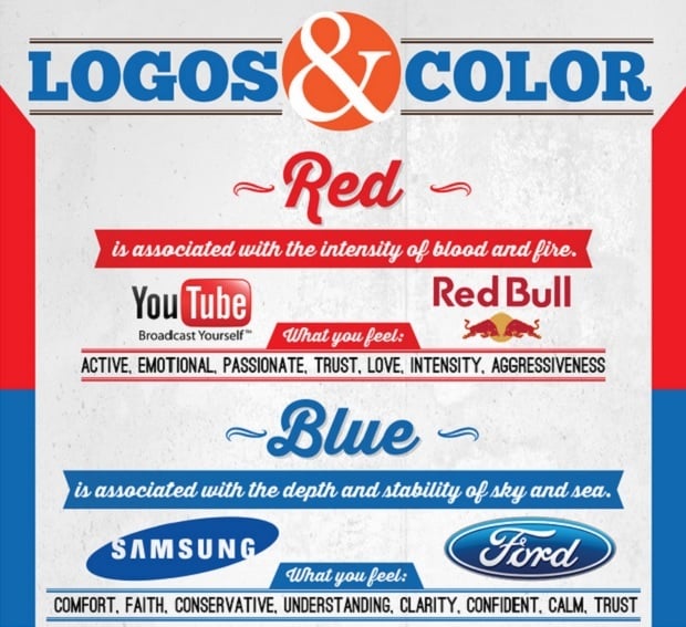
Black is classic, red is aggressive, blue is cool and yellow is sunny. There are tons of infographics like the one below that give you a snapshot of just what color means for you and your brand. There are no rules when it comes to modern design – it’s whatever you want it to be.
Logos & Color Infographic
(click the picture below to get the full version)
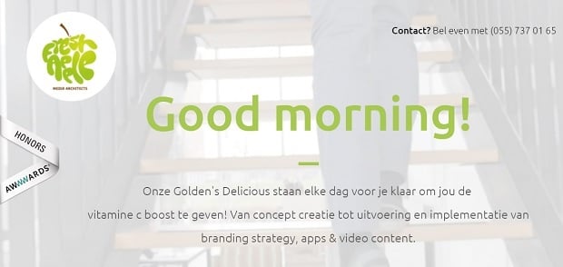
One of the big trends is mosaic pattern logos. The shapes themselves can be formed of multiple colors and of different shapes. It’s a popular approach, used really well in the example below.
Fresh Apple
Light colors may not show up on digital screens, and other bold colors may have associations that you may not want to create, so choose your colors wisely.
Shapes themselves need to be chosen carefully, with strict controls on their usage. It’s easy to stretch and contort them, ruining the effect.
Staying Modern by Keeping It Retro
Rather ironically, one of the most compelling modern trends is retro. It may have started with the cupcake business channeling our inner domestic-goddesses, or just that we got sick of progress and wanted something we could rely on and trust.
Retro logos allow you to channel your inner creative and can work for certain types of brands and businesses. From a creative perspective, they allow huge amounts of freedom and offer a really exciting and stylish approach.
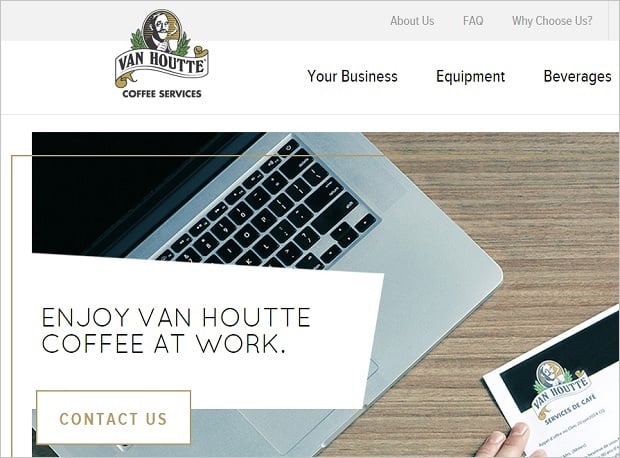
Fresh Apple
If you want to go-retro, be aware that what’s current now may not always be that way. It’s also likely to be more expensive to create a genuinely new and unique retro logo.
Working to a Script
The world’s most iconic logo Coca Cola uses a script font, and if it’s good enough for them, is it good enough for you?
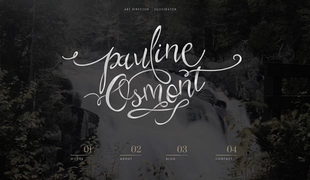
A script logo, or one that’s appreciably hand-drawn is the perfect antidote to the sometimes clinical digital world. Calligraphy, brush-stroke design and hand-written fonts are all a nice way of creating a personal and contemporary brand look.
Fresh Apple
Many designers tend to create bespoke brand identities that genuinely engage and inspire your customers. You don’t need to create something as extravagant, but using hand-drawn elements in your logo is a contemporary and classy approach to creating a brand.
Conclusion
The logo itself has developed over time. As we become more accustomed to seeing logos and advertising everywhere, our tastes have changed and become more sophisticated. Whatever logo type you choose, it has to fully embody your brand and your proposition to the market. It also has to work in every format – online and offline. Most of all it needs to appeal to your customers – that’s the most important thing.





Leave a Reply