6 Retro Web Design Distinctive Features with Examples
The old is finally making a comeback in the sphere of web design in the form of ‘retro’. Once discarded for being old and not ‘cool’, retro is now being treated as the ‘in’ thing in web design.
Revival of the Past
The term ‘retro’ is actually a shortened version for ‘retrospection’ which means looking back or remembering. So, basically retro web design is a style where designers pay a tribute to the glorious designing style of the past by recreating the art forms in their own unique way.
Since retro web design is all about relieving the past trends, it can help a website stand apart from other sites as most of the present day designs are built around the latest trends like flat design, minimalism, etc.
Careful use of motifs, objects and trends of the past can help create a nostalgic environment that might assist the website to capture attention of the targeted audience. By making people revisiting the trends of the past, you will be able to connect with your targeted audience on a deeper emotional level.
Retro Web Design Types
Retro design can be conveniently categorized in the following 4 types. Careful analysis of each style will help us understand their distinctive features.
Bauhaus
This style has its roots in Germany and it aims to eliminate anything or everything that even remotely looks like distraction. The idea is to focus on the core part of the design and remove any kind of excess. In short, Bauhaus aims to create an art form that focuses primarily on simplicity. Some of the prominent characteristics of Bauhaus design style are simple texts, use of primary colors, thick lines, use of geometric shapes and more.
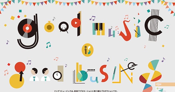
Don-guri website has successfully captured the essence of Bauhaus art by focusing on simple geometric shapes, flat colors and texts.
Art Deco
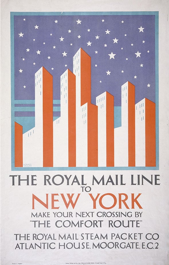
Art Deco is a form of visual art representing the design style that gained prominence during 1920s and 1930s. Art Deco is a curious combination of Machine age materials and different craft motifs. Some of the prominent traits of Art Deco are beautiful and gorgeous ornamentation, bold geometric shapes, use of rich color combinations and more. It is a modern style that focuses on the rise of the machine culture and its impact on the society. Yellow and Gold colors are used to symbolize the wealth and the opulence. Mass production is certainly one of the crucial characteristic to symbolize industrial revolution of that era.
Art Nouveau
Art Nouveau is an art form that was born out of the angst of the modern art of the 19th century. This art gained prominence during the late 1890 and has been inspired by different natural forms. Art Nouveau tries to create a harmonious relation between different elements and natural forms. Art Nouveau distances itself from straight lines and embraces floral structures to carve out a niche for itself. Some of the prominent characteristics of Art Nouveau styles are:
- Use of artistic designs on everyday objects;
- Breaking away from rigid restrictions of classical arts;
- Use of pastel colors;
- Use of flowing lines.
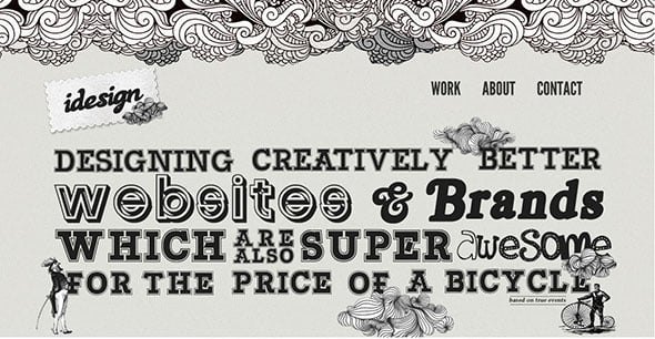
iDesign has successfully portrayed the beauties of Art Nouveau on its website by using floral shapes and cool typography.
Dada
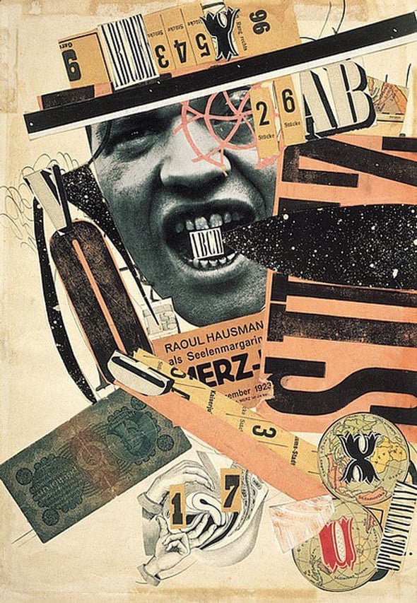
Dada is an artistic movement that came as a reaction to the negativity of the First World War. It has drawn its sustenance from different avant-garde movements like Expressionism, Constructivism, Futurism, Cubism and more. The idea behind Dada is to mock nationalistic attitudes and material values. Since Dada art is so distinct and varies widely, it is difficult to describe its characteristics:
- Use of red and black colors to create contrast and to grab attention of the audience;
- Use of print, collage, and illustrations to create a stunning art form;
- Placement of elements haphazardly.
Retro Web Design Distinctive Features
Now we are going to discuss the main features of the retro web design style along with must-have elements to give your website a chic vintage look.
Colors in Retro Web Design
If you are trying to give your website a retro feel, you need to make sure that you are not using bright color combination as it goes against the premise of retro design. The use of bright color palette is a big No-No with retro design.
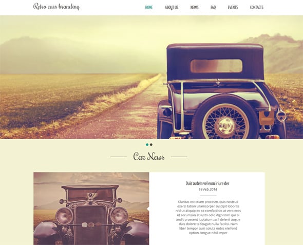
Saturation plays a crucial role in the retro design. Reduce the saturation level to some extent to make the images look old. This is a common trick employed by the majority of web designers to add a vintage feel to the images. This technique is illustrated within the above-mentioned example – Car branding website template.
Some designers show some degree of rigidness when it comes to retro web design. They tend to follow the old classic rules of using only two colors to ensure that the design is print-friendly.
Shapes in Retro Web Design
Retro design is commonly associated with different geometric shapes like starbursts, rectangles, circles etc. Make sure that you are not using overtly complex shapes or structures because Retro design style is marked by simplicity. Straight lines are often accompanied by different shapes and floral designs to create a long-lasting impact.
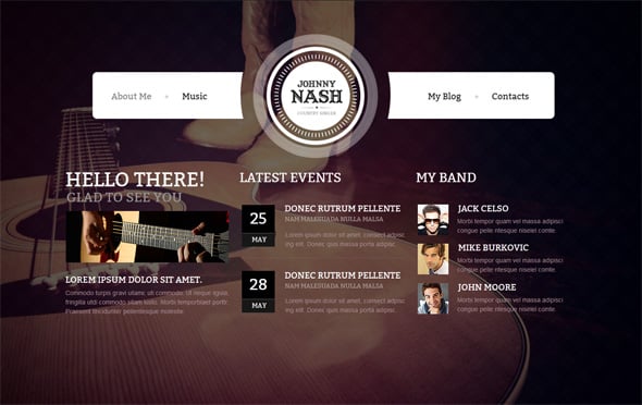
Country music website template is designed in retro style and original circular logotype proves this well.
Retro Web Design Typography
Typography is definitely the 2nd most important element in retro web design. The design will lose its impact and appeal if you choose the wrong font. Even the best color palette will not be able to save the design from a possible disaster.
You need to choose a font that helps in the process of making the design look a bit old. Traditional modern or stylish fonts would not help at all. Some popular retro fonts are – Zorus Serif, Bobber, Streetwear, Canter, Sesame, etc.
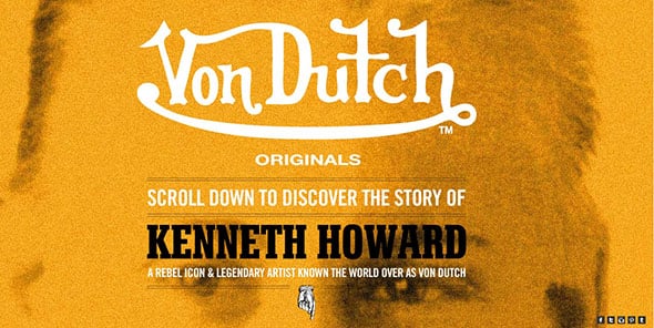
Vondutch website is a masterpiece as far as the clever use of typography is concerned. The designer has used different font types throughout the website to produce the desired impact.
Retro Web Design Textures
Without the right texture and the right amount of noise, the design will never look retro. Paper texture is widely used to give the design a vintage look and feel. Coffee Stains, crumpled papers, wooden texture etc. can do miracle with the design. Unless you are making some serious attempts to find the right texture for the design, the design will never be able to rise above mediocrity.
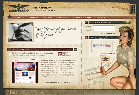
Targetscope uses torn out paper as texture to give the design a retro feel.
Retro Web Design Badges
Most of the websites that have embraced retro look seem to have been using badges to give their design a radically different look and feel. The badge needs to look rough; add some noise or pattern on it to give it a hard look.
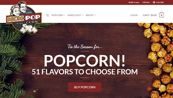
Mom & Popcorn website uses its logo as a badge, which is a powerful retro design element, to make its website look different.
Ornamental Borders in Retro Design
Ornamental border is something that will probably never die as long as retro design is around. Designers use creative or fancy borders to give the design a true retro look. However, there is nothing wrong in using simple border but the impact will not be that powerful.
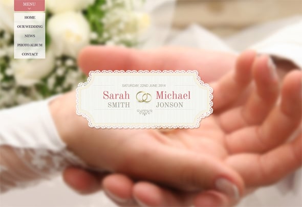
This wedding website template is a good example of how to use ornaments in web design and not overdo.
In conclusion, Retro design trend helps us relieve the past and add a creative twist to the current web designing trends.




Leave a Reply