Kindergarten Website Design
Similar templates
- Overview
- Reviews (2)
Description
Looking for a perfect template for the best kindergarten or childcare center? We've got plenty of them. Here we want to show the amazing advantages of this landing page. But never forget that we always have an extended range for every niche. The kid world isn't an exception. You can always browse other thematic templates like our child care website template for kids learning center or kindergarten website template for child care center. Or you can choose any other website template of any topic and adjust it to your vision. The same rule works for this kindergarten website design. It isn't supposed to be for kindergartens only. Take it if you like it.
Kindergarten Website Design: First Impression Rules
Look at Its Stunning Design
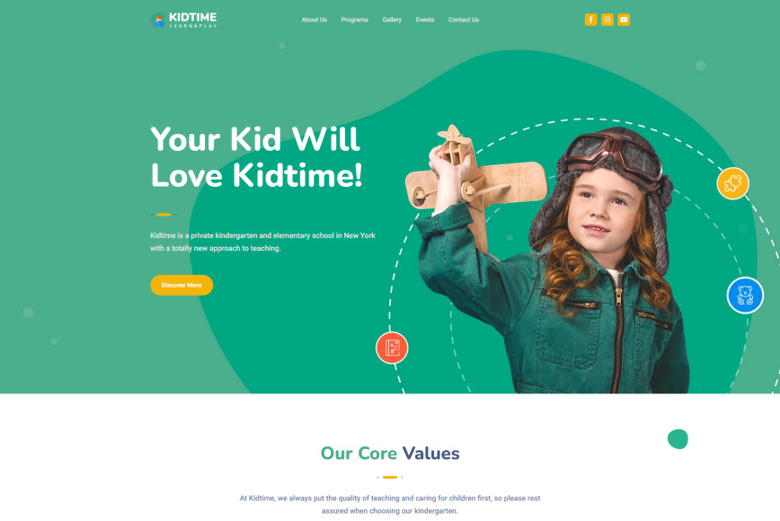
In most cases, websites have just one chance to attract potential customers as the competition in most businesses is enormous. A landing page is a leader when we speak about a good first impression. It's compact, vivid, and sensibly structured. At least, when we talk about Moto's one-page templates. The most important task for a website owner is to find the right words to send their great message to the audience. Check out major features of the kindergarten website design which make it more credible:
- trendy color scheme that is both bold and calm for kids and their parents to have some artistic pleasure;
- amazing funny and positive real photos for enhanced sense of happiness and comfort;
- smooth transition between blocks;
- contrast yet pleasant fonts to increase readability and not to irritate your readers.
Special Attention to Details
In this kindergarten website design, we developed every smallest detail with children and parents' tastes in mind. Fonts, icons, photos, colors, lines, curves, shapes, spots, widgets are meant to serve the best for kindergartens, child care centers, or other kid activities - corporate or individual.
Fully Customizable Blocks and Meaningful structure of the Kindergarten Website Design
The one-page kindergarten website design consists of various default blocks with amazing opportunities for altering and transforming. The first block contains a catchy slogan to attract a reader's attention, to make a credible promise and briefly explain your idea. Then you can describe your values so that your reader could understand whether they match with their expectations. In the About Us section you draw a small but concise picture of your brand, describe your mission, vision, and story - the message that can build the necessary image of your company. Take advantage of bright bulleted lists and blocks with icons and small generalisation to emphasize on the most essential pieces of information. Also, numbers speak fast and vividly so if you have some amounts to share or be proud of (years of experience, numbers of happy clients, etc.) don't hesitate to post them.
Now that you gave important general info, you can go to the details that your potential clients will be interested in, like programs, classes, activities, events. Add everything you consider important to the kindergarten website design. Use favorite sliders to show the best high quality photos comfortably. Introduce your team and make your center much more credible. Add your educator's qualifications, experience and something that can let each of them stand out positively. And don't underestimate the power of a blog when you deal with learning, growing up, health, and safety. Your future client will appreciate your professionalism and sincerity. Real reviews will also be perfect for you and interested parents.
Landing Page, Multi-Page, E-Store - No Limits
The MotoCMS strives for freedom of creativity and no web development limits. Choose the one-page kindergarten website design, or our multipage daycare website template for child centers, or set up an eCommerce website; our goal is to provide customers with everything they need for the best website building experience. And remember that you can always ask our expert customer support for help.
Customer Ratings & Reviews(2)
The editing approach of the new template's type is very appealing to me. I'm eager to use these themes for regular sites and MotoCMS 3 for eCommerce sites
A Moto 4 template for our kindergarten works perfectly fine for now. I was afraid about the downtime to launch it, but it took them less than 2 hours. Impressive service!


